New on Typekit: Fresh faces for spring 2018
It’s been a whirlwind month! We’ve added new foundry partners we’re excited to share with you, boosted our offering for folks on free plans, and there’s more than ever to explore in our Marketplace.
No matter what plan you’re on, there’s something for you in this month’s roundup of new type.
New in the Marketplace
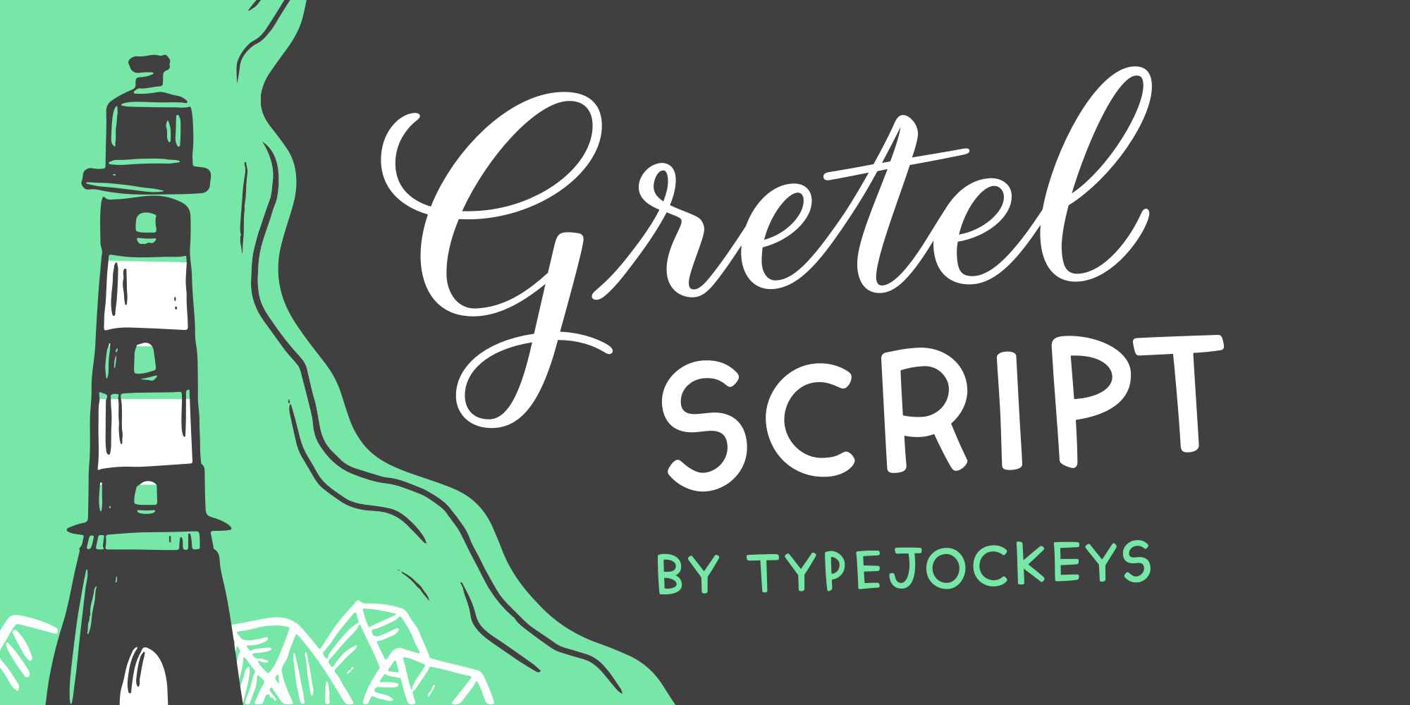
Gretel Script is a three-style type family packed with potential — thanks especially to the caps style, which is ideal for working in text that needs to be a little more clear without being a harsh departure from the lively flow of the Grande and Piccolo styles. Designed by Michael Hochleitner, Christoph Schütz, Simon Liesinger, and Franziska Weitgruber from Typejockeys, Gretel is based on the calligraphy of Natascha Safarik.
You’ll also find more new type from Typejockeys in the subscription library: Freude, Henriette Regular and Compressed, and Ingeborg Block and Striped.
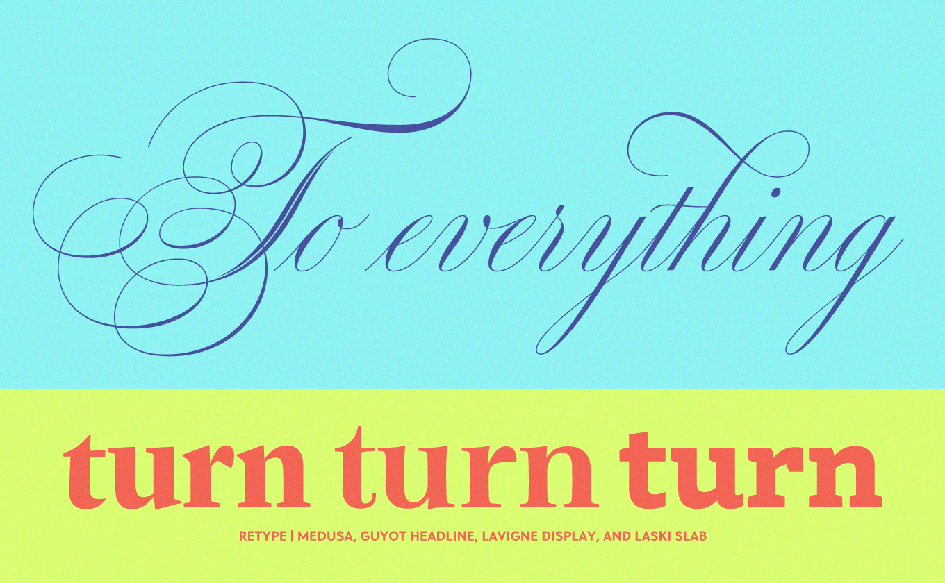
Two new foundries are joining our library from Type Network, and you’ll find sixteen additional families from Type Network foundries in Marketplace this month. Guyot is the newest release from Retype, a small foundry established in 2007 by Ramiro Espinoza and Paula Mastrangelo in The Hague, Netherlands. In designing Guyot, Espinoza took inspiration from typefaces attributed to French punchcutter François Guyot, who worked in the early 16th century. Medusa, also by Espinoza, is a fantastic sprawling script intended to embrace the wild ornamentation of formal English handwriting as it was practiced in the mid-19th century.
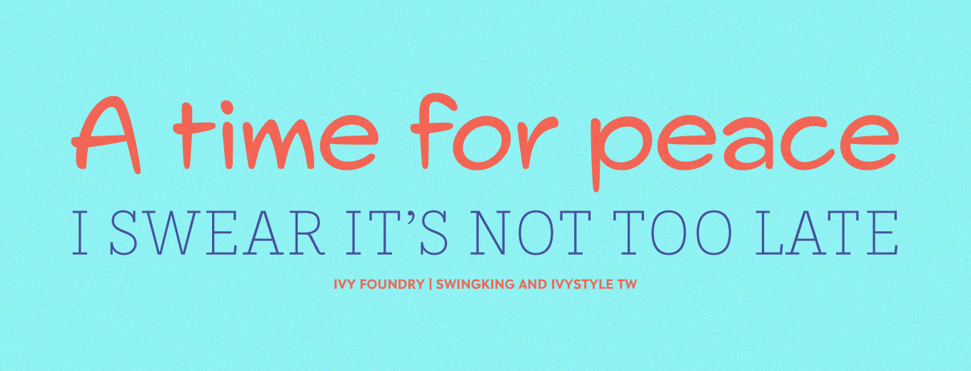
Ivy Foundry‘s Jan Maack designed Swing King in collaboration with Danish illustrator Erik Sørensen, and the typeface includes unique signs and symbols that accentuate the lighthearted feel of the sans-serif. If that’s a little more freewheeling than you need, Ivy Style Sans is a bit more subdued — and also check out Ivy Style TW for a unique “typewriter” style that feels great to write in.
Other Type Network partners with new offerings in the Marketplace this month include Lipton Letter Design, Newlyn, and TYPETR.
New in the subscription library
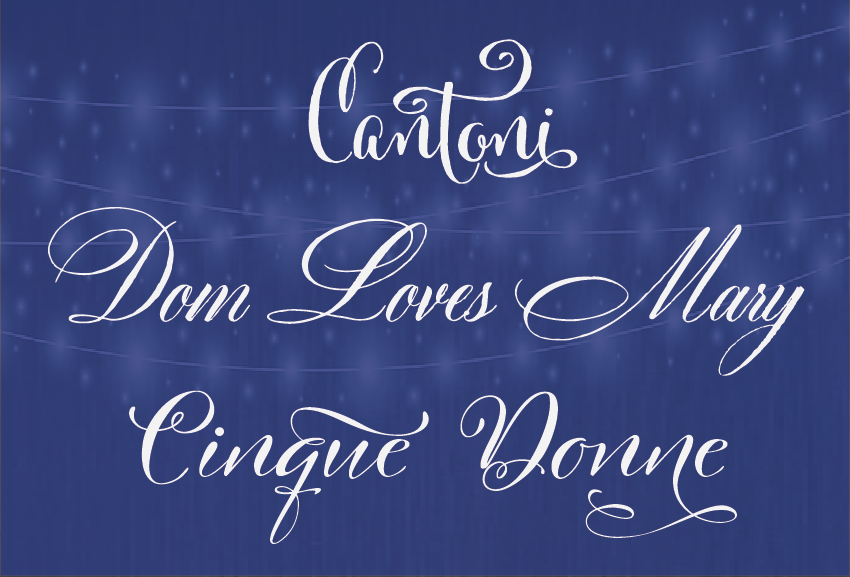
We’re delighted to welcome Debi Sementelli to Typekit this month, whose playful style shines through in each of the three script families she’s added to our subscription library. Dom Loves Mary is a neat one to try out when you’re aiming for an elegant look, as it comes with an all-caps text style that can thoughtfully balance the script when used in combination.
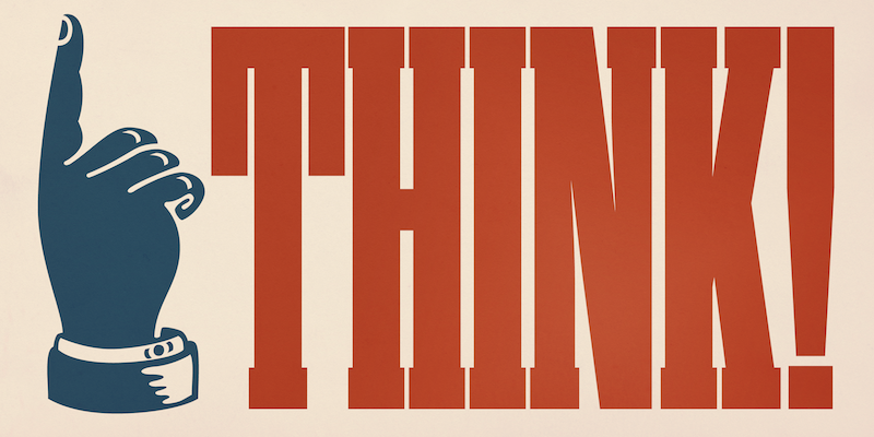
Designer Ryoichi Tsunekawa added 31 of his Dharma Type families to our library earlier in March, which is a lot of fonts seeing as most families include multiple styles (Rama Slab includes 18!).
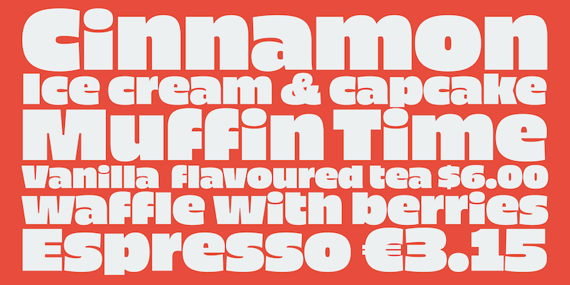
Piepie was an immediate hit on the team; we even worked it into an Instagram compilation on Pi Day. You may recognize Bebas Neue from the Dharma Type collection as well — it’s a popular standby for clean, bold headings.
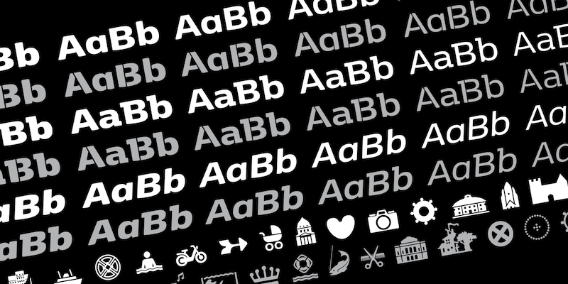
Designed by Morten Rostgaard Olsen, København from Fontpartners takes inspiration from the Danish capital city — particularly in the Pictos style featuring arrows, ornaments, and several landmarks. We’ve added København Sans, Stencil, and Sans Stencil too — a total of 20 styles altogether.
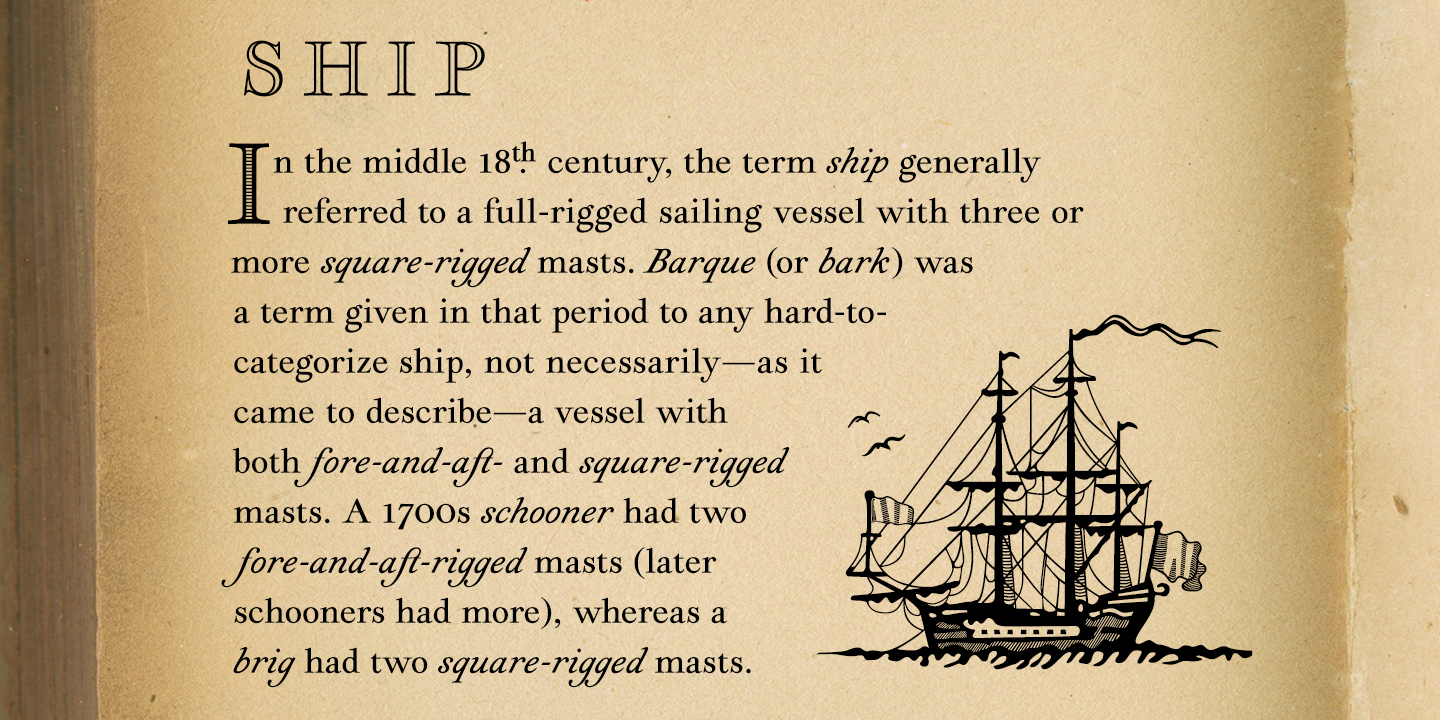
Brian Willson at Three Islands Press specializes in historic type that seems especially well-suited for antique maps and correspondence. The aptly-named Geographica is modeled after the handwriting of an 18th-century cartographer. It includes plenty of cartographic ornaments, too! All styles are available for purchase in Marketplace, and we’ve added the Regular, Italic, and Hand Regular styles to the subscription library. Look for Professor and Viktorie in the library, too.
New for all plans
We’ve added around 150 open-source fonts from Google to our Limited Library, including popular picks like Oswald and, for Devanagari support, Kadwa.
And for even more global script support, we’ve added 12 fonts from 9 different families from Swathanthra Malayalam Computing — a huge boost for Malayalam support on Typekit.
So many! But which fonts do I have access to?
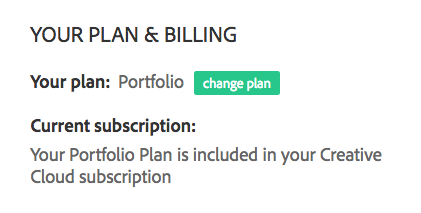
Not sure what plan you’re on? The fastest way to check is to visit your Account page on Typekit when you’re logged in with your Adobe ID (the same one you use for your Creative Cloud sign-in).
When you visit the Browse page (which is where you’ll end up most of the time anyway when you’re logged in), you’ll see a menu bar near the top, just under the Search field.

If you’re logged in and see a “My Library” tab here, these are the fonts included with your current plan. There’s no extra charge for these — go ahead and use them!
- All Families — Yup, this is all the fonts we have. Make sure you have water and someone knows where you’re going before you dive in here.
- Full Library — These fonts are included with most paid Creative Cloud subscriptions (exceptions include things like the Photography plan) and with any standalone Typekit plan.
- Limited Library — You can use these fonts without a paid plan! You’ll need an Adobe ID if you want to use them on your computer, but that’s it. Great way to get a feel for how Typekit works if you aren’t ready to commit.
- Marketplace — You don’t need a subscription plan, but you do need to pay. There’s one-of-a-kind stuff here you’d otherwise have to contact a type foundry directly to get, and once you purchase a font, you’ll have permanent access to it.
Why pay for type? Well of course, it’s up to you whether you do. Some fonts are free, and it’s usually because their creation was heavily subsidized by a company like, well, Adobe. Or Google. Plenty of great type innovation happens on teams like these, but there are a lot of type designers who work outside of these big companies. Unless they’re personally motivated (and probably financially backed) to make their work open-source, selling the fonts they design is how they make their living.
In any case, there’s a lot of type to choose from out there, and we’re excited to see what you do with it. Let us know what you think!
2 Responses
Comments are closed.
😍😍😍
+1 for adding Oswald to the library