Fun, interactive updates to our Source Han Serif showcase
Adobe Typekit designer Wenting Zhang’s work on the Source Han Serif website won honorable mention at Awwwards for web design. She doesn’t consider her work done, though — and the site continues to evolve with her vision in really neat ways.
When Adobe Type considered how to make a major marketing splash with the companion to the enormously popular Pan-CJK Source Han Sans, Wenting was tasked with designing a standalone website to showcase the type. Wenting is a designer at Typekit, and also a student of type design at the Type@Cooper program in New York, so this was a great opportunity for her to unleash her design skills in a typographic context.
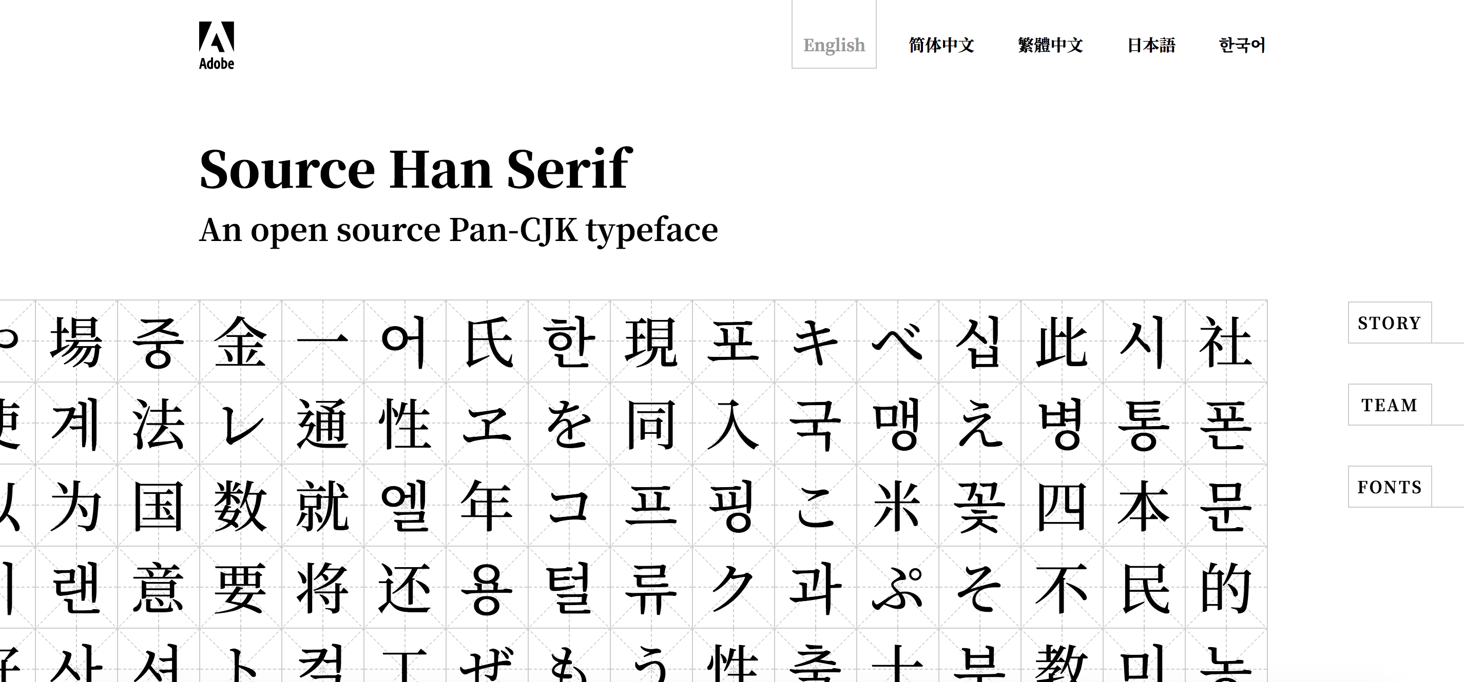
From display image to typographer’s tool
Wenting wanted to present the beautiful Pan-CJK typeface in a more interactive manner. The glyph map at the top, which displays the most frequently used glyphs for each featured language, was a natural point to experiment with hover state behavior.
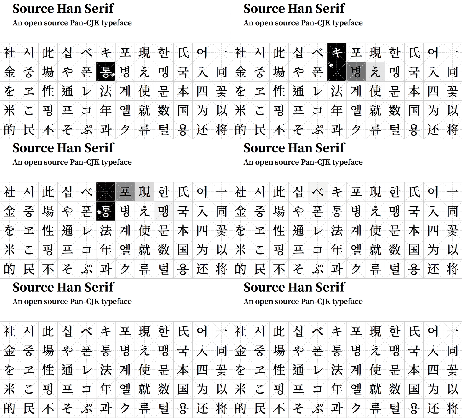
Wenting got feedback that people wanted to examine the glyphs in closer detail. She’d had something like that in mind herself, imagining that the static cells could be active links. After she made a round of updates, tapping on each character cell now toggles a detail view modal.
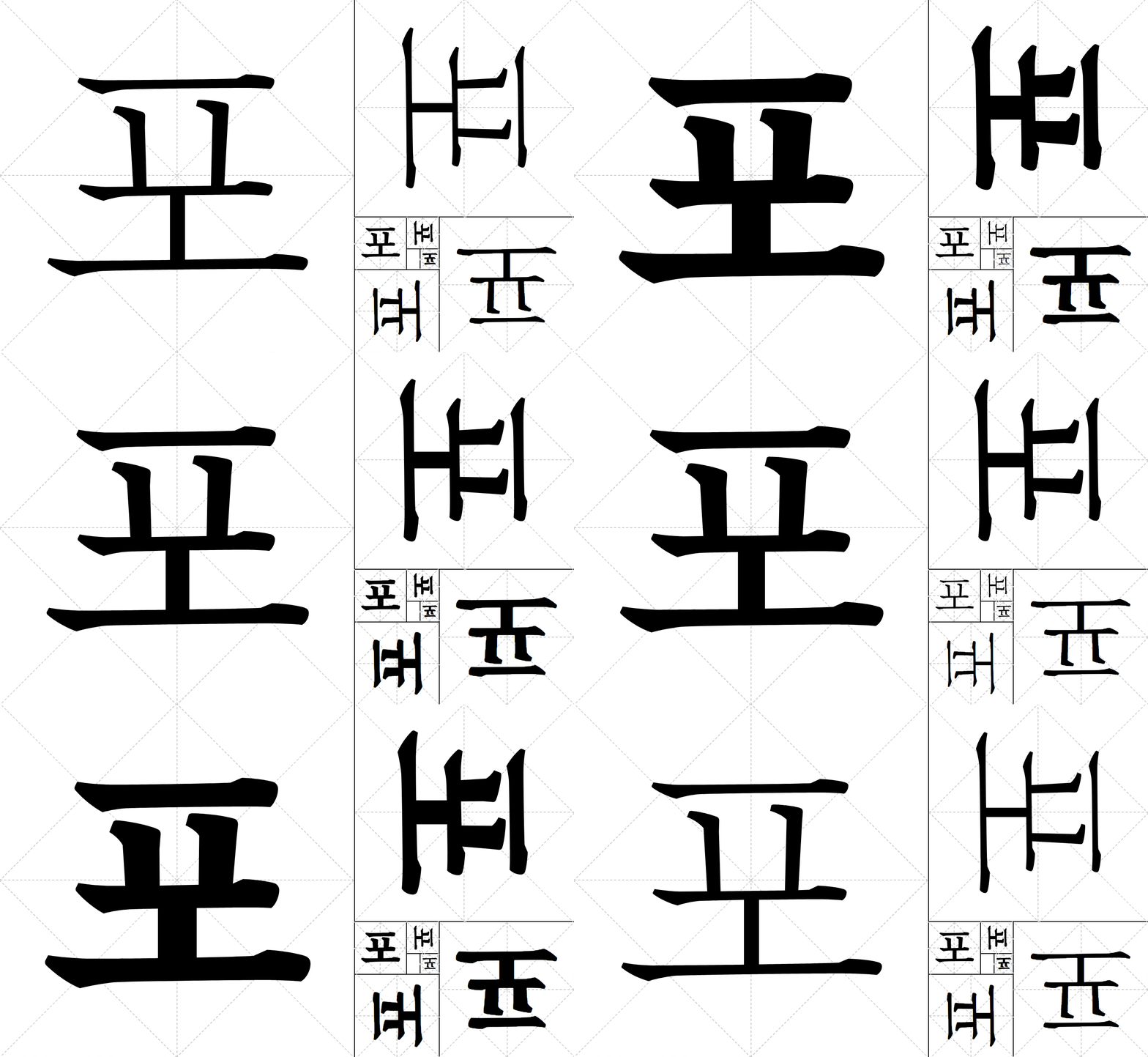
Why show the glyphs in so many rotated dimensions? Wenting explains that the rotated view is intended to mimic a common type design technique: designers will often flip a character around to study the spacing more closely.
Designing for regional authenticity
An important feature of Source Han Serif that informed Wenting’s design is its support for regional glyph variations. Having options to switch among regional glyph designs solves a major problem for users of Pan-CJK type, and currently Source Han Serif is one of few typefaces in the world that can solve it. As a result the Source Han Serif site is an important showcase for everything a well-considered Pan-CJK typeface can do.
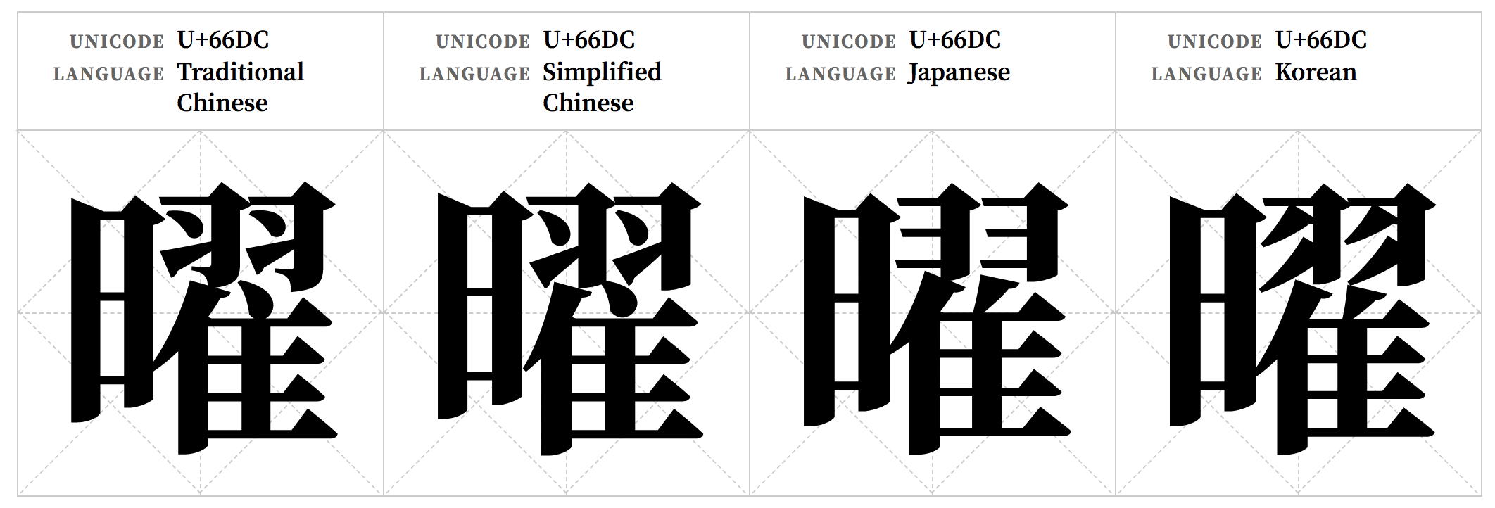
One example of the regional differences in a shared glyph.
Why are these regional differences so important to highlight? Wenting explains that the attention to detail makes a huge difference when people read text written with a typeface that does — or doesn’t — support the variations. Without that support, the reading experience simply feels “off.” Some readers might even say that a page using (for example) Japanese glyph variants when writing in Simplified Chinese “feels Japanese,” despite the glyphs being technically shared between both languages.
Wenting’s goal was to make the site even more sensitive to specific language considerations and design conventions. As other Chinese, Japanese, and Korean-speaking designers saw the initial version of the site, Wenting got valuable feedback that she decided to incorporate into her updates.
For example, she made more use of vertical layout for Traditional Chinese and Japanese designs, while taking a slightly different tack with Korean (where vertical layout is mostly obsolete) and Simplified Chinese (where it is less common).
Type testing from a designer’s point of view
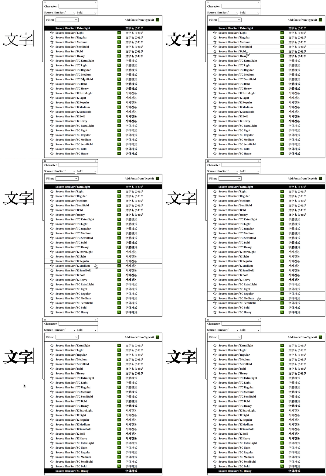
Wenting plugged in more functionality for the originally-static illustration showing Source Han Serif in a design application. Changing the font selected in the “menu” now results in actual changes to the glyphs just as it would in a real design application — not only weight variations but also reflecting the differences between Korean, Chinese, and Japanese variants of the same glyph. As with other aspects of the site that take the regional glyph variations into account, Wenting said this makes for a much more authentic experience for designers working with different East Asian languages, and is more inclusive of the diversity among pan-CJK type users.
Visual dynamics

Wenting was pleased to further develop some of her initial ideas for the site, and as she scanned the site with fresh eyes she came up with even more ideas to make it more dynamic and add visual interest — such as the staggered animation that brings a neat cascading effect to the chart showing different weights for the typeface.
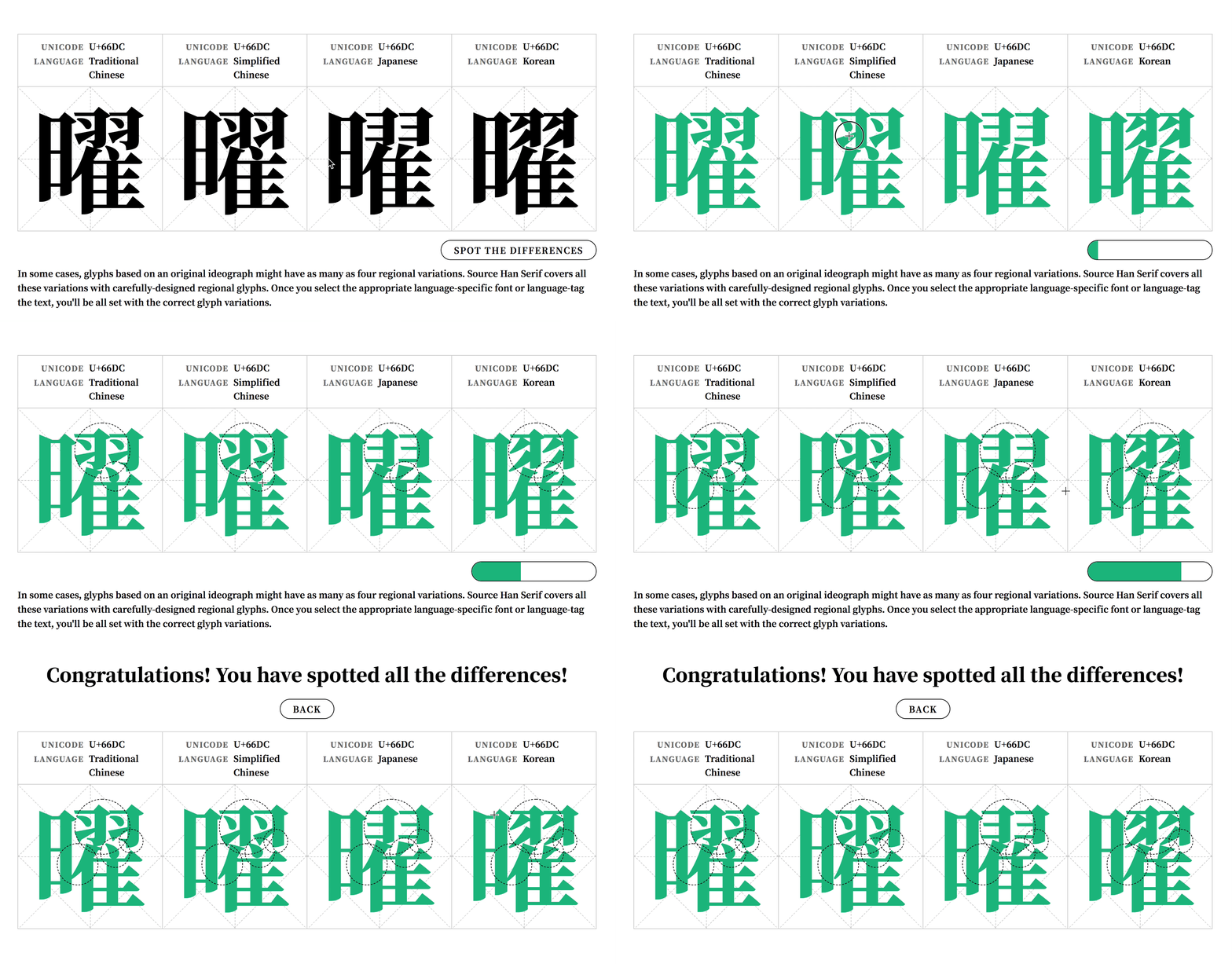
Hidden in the site is a simple game to spot the differences between region-specific glyphs. This was actually part of the site at the original time of launch. It’s a fun feature and showcases the attention to detail that went into the typeface design.
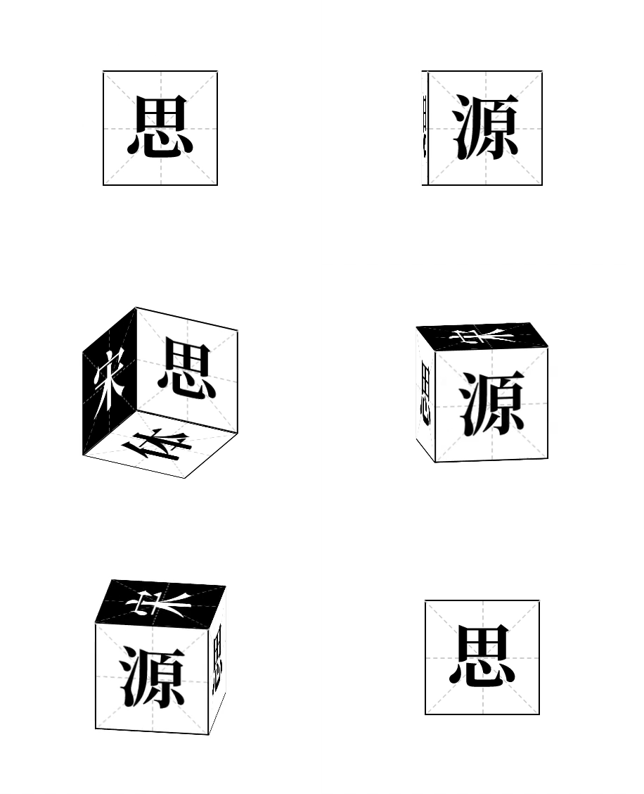
One last feature Wenting is excited to share can be seen just as you load the site for the first time. An animated cube appears, and if you read Chinese, the glyphs on each side of the cube are intended to be read in sequence as “思源宋体宋(送)思源” repeatedly. Playing with name of the typeface in Chinese (思源宋体), the cube represents Wenting’s best wishes for the users of Source Han Serif: “May Source Han Serif bring you a stream of ideas.”
Visit the Source Han Serif website to see Wenting’s work for yourself.