Four Japanese foundries add their fonts to Typekit
We are delighted to announce that four Japanese foundries have added several of their typefaces to the Typekit library.
Visual Design Laboratory, Jiyu Kobo, Dai Nippon Printing, and Fontworks are our newest foundry partners, representing a substantial expansion to our collection of Japanese type with a total of 74 new fonts.
Visual Design Laboratory
The ethos of Visual Design Laboratory (VDL) is to balance the natural beauty of letterforms with rigorous standards for readability and legibility. VDL offers a comprehensive collection known as “VDL Designers Fonts” (VDLデザイナーズフォント), which is sure to resonate with designers seeking a typeface that’s highly individual while maintaining a broad appeal.
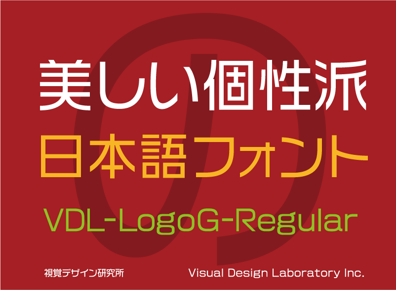
By eliminating the decorative elements as much as possible in VDL Logo G, the characters appear much more balanced and consistent. Alignment between horizontal and vertical elements, with kana characters designed to appear slightly larger, keeps a sense of stability and makes this a great choice for logotypes.
VDL Logo G Regular is just one of the 36 fonts now available from VDL in the Typekit library. See the foundry page for the full list.
Jiyu Kobo
Jiyu Kobo was established in 1989, and is perhaps best known for the Hiragino font family that is built into Mac and iOS software. We’re delighted to welcome four fonts from their Yu-Minchotai family to the Typekit library.
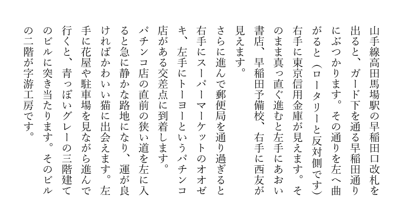
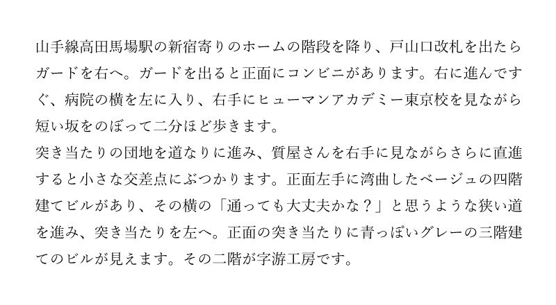
Yu-Minchotai R was developed with novels in mind, particularly those seeking a more traditional style that would suit historical settings. The typeface features a combination of contemporary bright Chinese characters with traditional kana characters for its distinctive style.
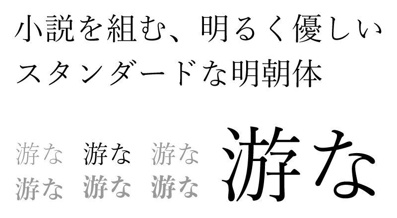
Yu-Minchotai 5 Kana R and Yu-Minchotai 36 Kana R are designed to be used in conjunction with Yu-Minchotai R. Yu-Minchotai 5 features a classical and soft shape, marked with soft lines; meanwhile Yu-Minchotai 36 features the expressive quality of the writing brush, lending a distinctive style to the overall shape of the characters.
Dai Nippon Printing
DNP has been developing and maintaining the Shueitai type family since the company started (as Shueisha) more than a century ago. Shueitai has been a consistently popular family among publishers and readers alike, thanks to its readability and graceful line drawing. The wide variety of styles packed into the Shueitai collection, including Mincho, Gothic, and Maru Gothic, makes it a fantastic selection for designers working across a wide range of projects with varied needs.
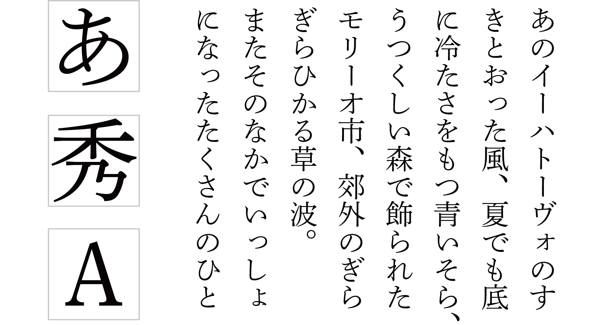
DNP Shuei Mincho Pr 6 L is beautifully used in body text for books and magazines — which traditionally uses Mincho style. The brush styling is especially outstanding in the “い” and “に” characters, with line thickness carefully calibrated to achieve good legibility for readers. Horizontal lines are set slightly thicker than is typical for many Mincho fonts, aiding overall readability with minimal flickering of the thin lines.
DNP is adding a total of 20 fonts to the Typekit library. See the full list on their foundry page.
Fontworks
Fontworks developed alongside the digital revolution in print publishing, providing innovative typefaces to support the move to digital production in Japan. Fontworks is the home of the Tsukushi type family, used in countless publications today. The foundry is a member of the Softbank Technology Group, which puts them right at the source for many important developments in font technology.
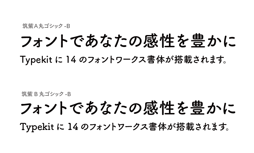
The round gothic body of Tsukushi A and B Maru Gothic has proven popular, receiving the 2010 Tokyo Type Directors Club award. Unlike most other round gothic typefaces, tight and small counter spaces in Tsukushi Maru Gothic make this typeface feel less casual and more mature. Fontworks has added a total of 14 fonts to the Typekit library, four of which are from the Tsukushi type family.
2 Responses
Comments are closed.
Wonderful work! Congratulations for the award!
They look awesome, I’m impressed! Japanese is a hard language because not so many really good fonts, but with Adobe it’ll change soon!