Fonts from House Industries are now on Typekit
We’ve long admired the work of House Industries, and today we’re delighted to welcome eight of their fun and iconic typeface families to Typekit. Founded by Andy Cruz and Rich Roat in 1993, the design studio is based in Delaware and known for creative collaborations with the likes of Heath Ceramics, the Estate of Charles & Ray Eames, and New Yorker magazine.
All of the typefaces we’re adding from House are available through Typekit Marketplace. Whether you have a paid Creative Cloud plan or not, you can purchase fonts from the Marketplace and use them for web or sync. We’ve also added seven styles to our regular library, so those of you with subscription memberships get a neat boost to your collections too.
See the whole offering from House on Typekit. We’ll walk through a few of them here to get a feel for House’s unique, unforgettable style.
Chalet

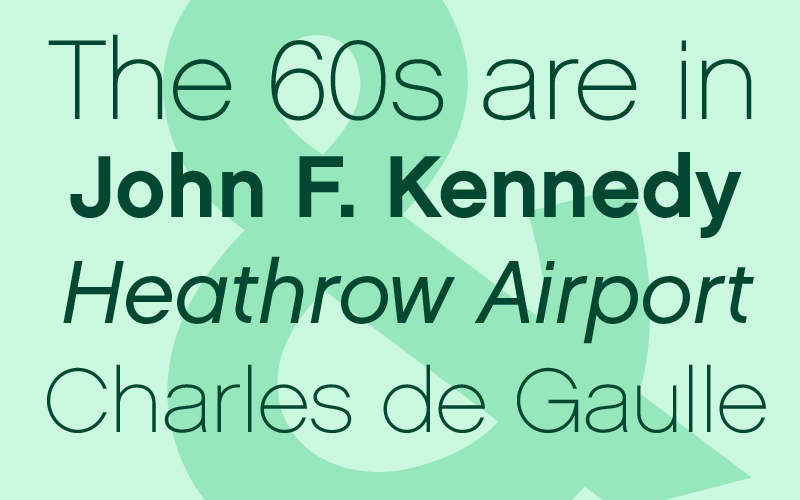
Chalet styles (from top to bottom) Paris 1960, New York 1960, London 1960 and Paris 1960.
Designed by Andy Cruz and Ken Barber, Chalet gained its name as an homage to a fabricated clothing designer they named “René Albert Chalet,” jokingly riffing off what they considered a trending fixation on Swiss design. As a sans serif, Chalet really does hit the mark. We’ve added six different styles to Typekit — Paris, London, and New York 1960, as well as the obliques for each. While the most apparent difference between the cities is weight (New York, naturally, is boldest) each style has a decided personality all its own. London 1960 and its oblique are both in our subscription library, and you’ll find Paris and New York in Marketplace.
Sign Painter

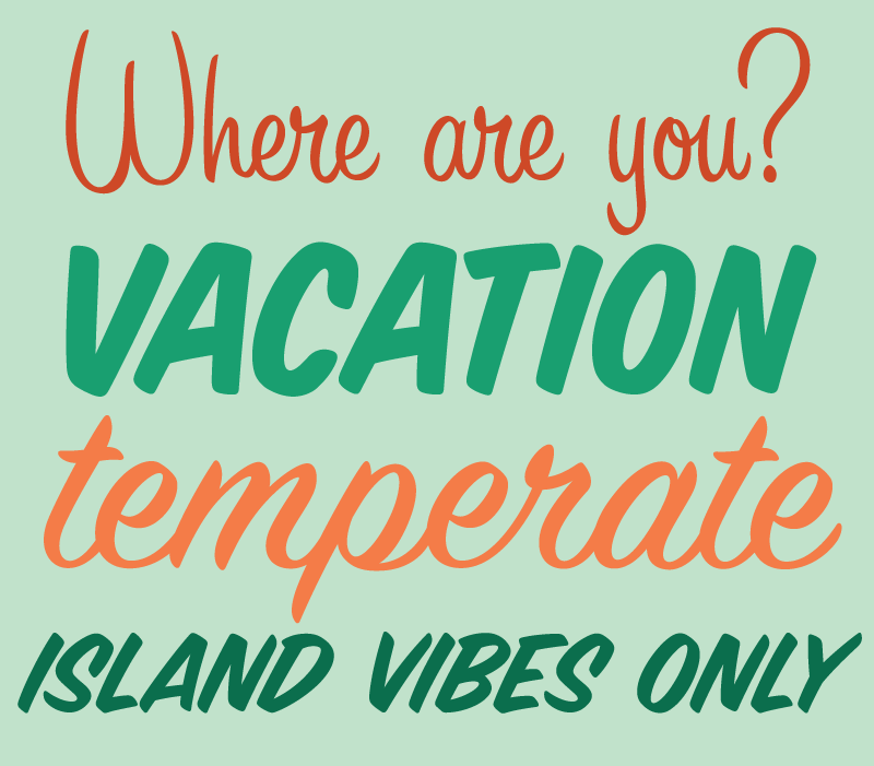
Sign Painter, showing (top to bottom) House Casual, House Slant, House Script, and House Brush styles.
Sign Painter by Ken Barber is classic House design, and many of its styles are likely to be instantly recognizable. We’re adding seven styles to Typekit, each with a distinctive voice but the same assured construction. A little goes a long way when you use stunning fonts like these — after all, they’re made for display! Each design can be tied back to an actual sign painting style used by people who make hand-painted signs for a living. We’ve added Informal and Slant styles to our subscription library, and all styles are available for purchase on Marketplace.
Burbank

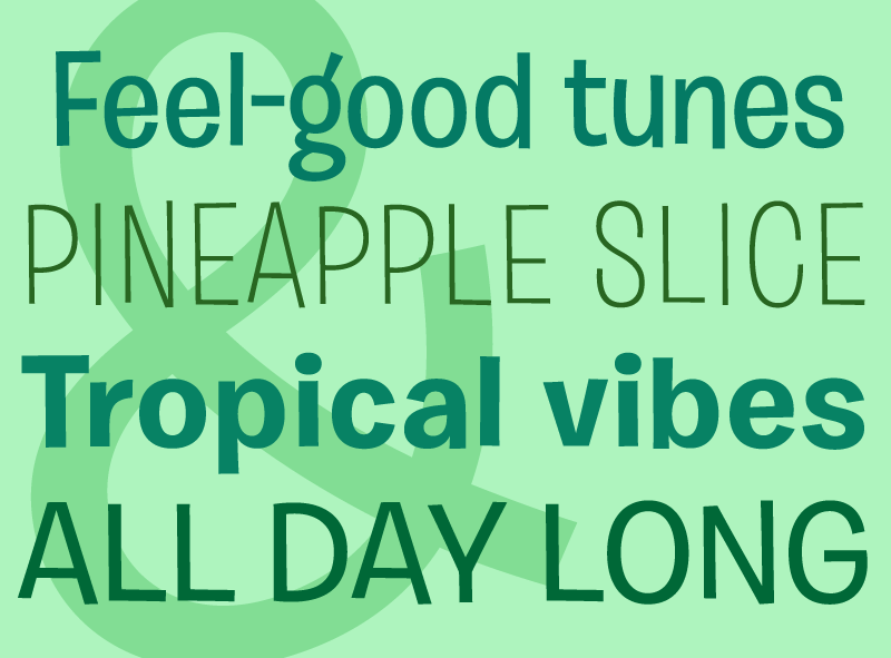
Burbank, in (top to bottom) Big Regular Medium, Big Regular Light, Small Bold, and Small Medium. All specimen art by Ariadne Remoundakis.
Tal Leming designed Burbank over the course of ten years, and the immense attention to detail pays off in a wonderful way for this animated typeface. Normally you’d want to be very selective about using an outspoken style like this, but Burbank is so well-balanced in its asymmetry that it plays well in a number of situations where similar typefaces might be too distracting. We’ve added eight styles of this one to Marketplace.
Of course, the best way to assess a typeface is to try it out for yourself — have a look at everything we’ve added from House, and let us know how you use it in your designs!
2 Responses
Comments are closed.
Looking so nice! Love it! Thank you!
chalet is a sweet font, good work!