Sites We Like: Lost My Name & Oakland Public Library
For many of us working in type, our love of words and reading started early. Today’s profiled sites share that theme, along with thoughtful type selections that we hope will inspire the next generation of type designers, too.
Lost My Name

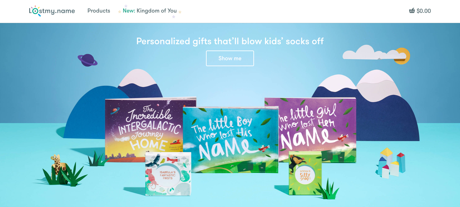
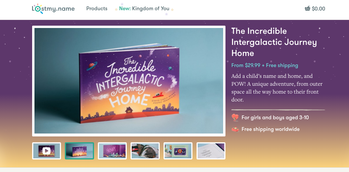
Lost My Name is the title of just one of the books you can personalize from this fun website. The adorable illustrations clearly steal the show here, but we do love Adelle Sans for the friendly-looking and well-balanced text throughout — with just a few uses of Freight Text for a serif counterpart.

Oakland Public Library

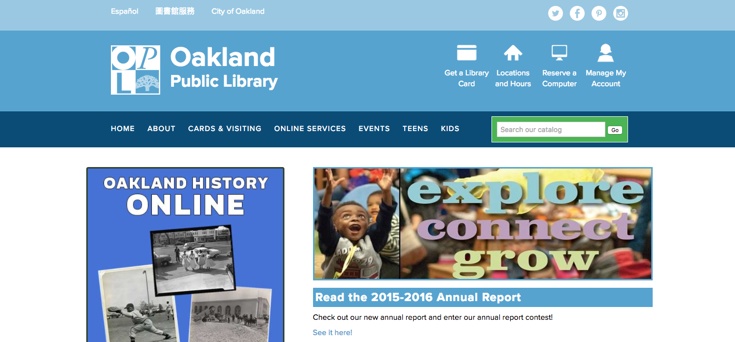
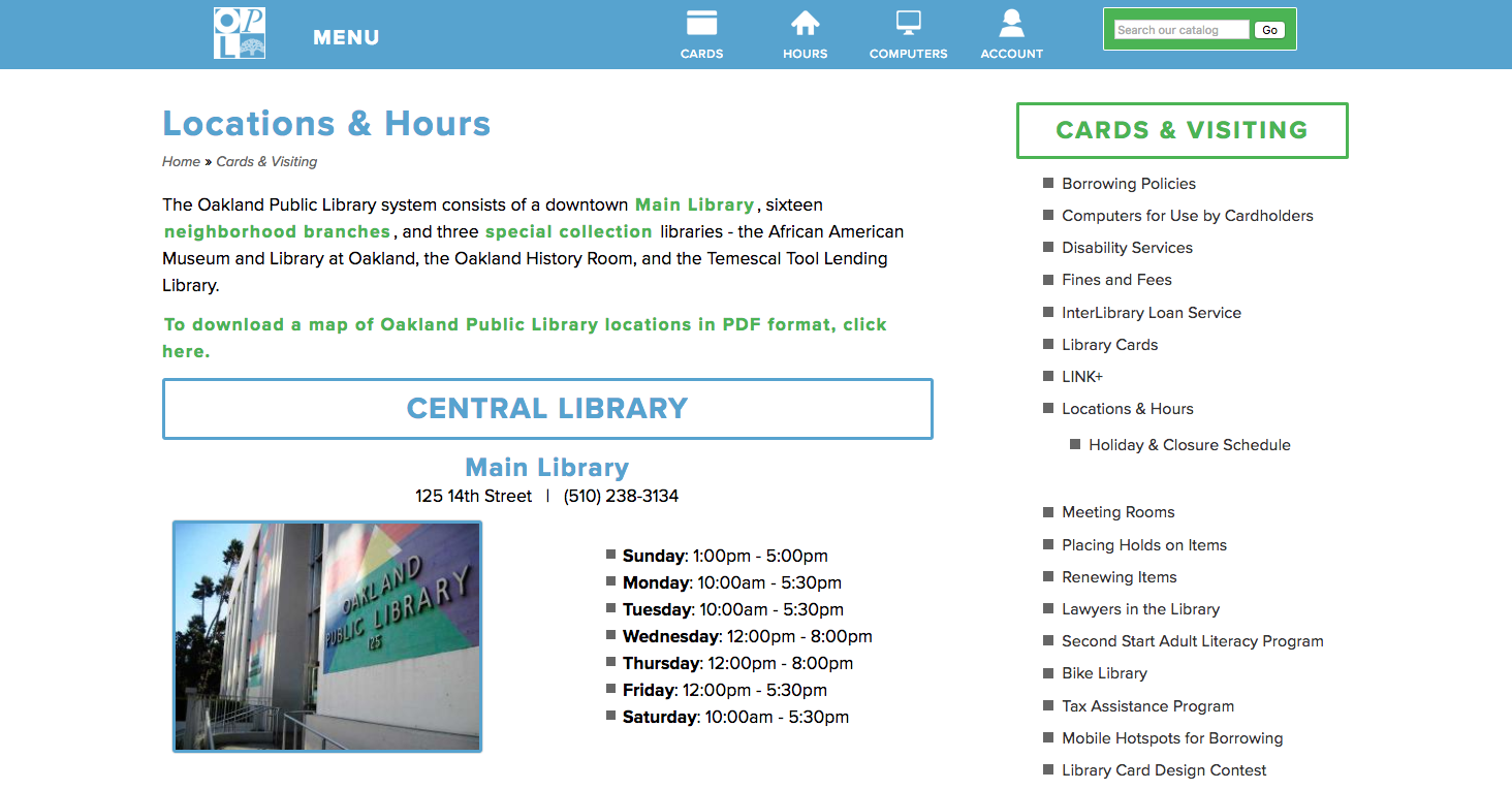
We were delighted to find Proxima Nova on the Oakland Public Library website. The sans is a popular choice for good reason: it’s incredibly flexible no matter how much information you have to display, and it has an unflappably friendly, open feel to it.

That’s it for this week. Share sites you like in the comments!