A Few of Our Favorite Things
 As we prepare to snuggle down for our winter naps and say farewell to 2016, a few of us on the team decided to take a look back at what happened at Typekit this year and select some of our favorite additions to our library, our service, and our industry.
Favorite Addition to the Typekit Library
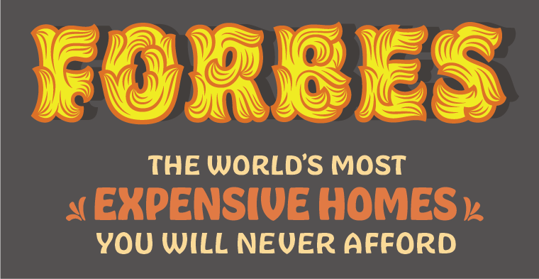
Hobeaux Rococeaux (top), Hobeaux (“Expensive Homes”), and Hobeaux Rococeaux Sherman by James Edmonson
“I have a deep love and respect for Hobeaux and Hobeaux Rococeaux from OH no! Type Co. Such a focused, inventive, and sensitive design project, hiding underneath some of my favorite promotional tactics of the year!” – Dan Rhatigan
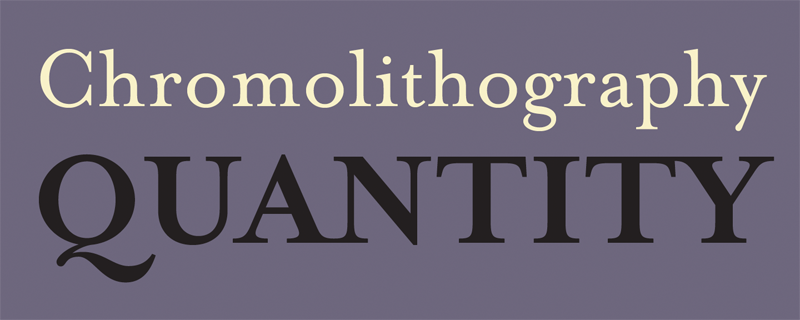
Mrs Eaves by Zuzana Licko
“The Emigre fonts, an important addition culturally, and a big win for Typekit customers. If I had to pick one typeface, Mrs Eaves.” – Tim Brown
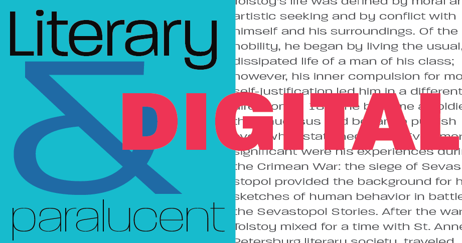
Paralucent by Rian Hughes
“This is like picking your favorite child! I really like Essonnes by James Todd, Paralucent (Device Fonts) by Rian Hughes, and Viktor Script (OH no! Type Co.) by James Edmondson and Erik Marinovich.” – Ariadne Remoundakis
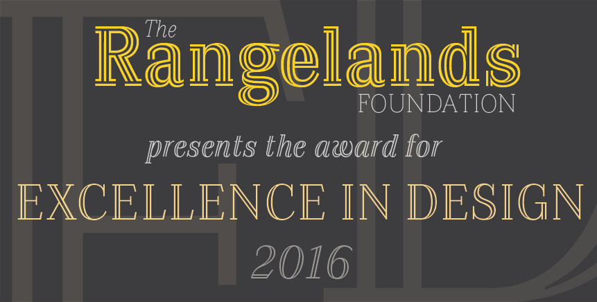
Azote by Thomas Jockin
“I started playing with Azote (by Thomas Jockin) pretty much as soon as I saw it. I think there’s a lot of fun in its design, and it’s neat how the heavier weights introduce more complex shapes.” – Sally Kerrigan
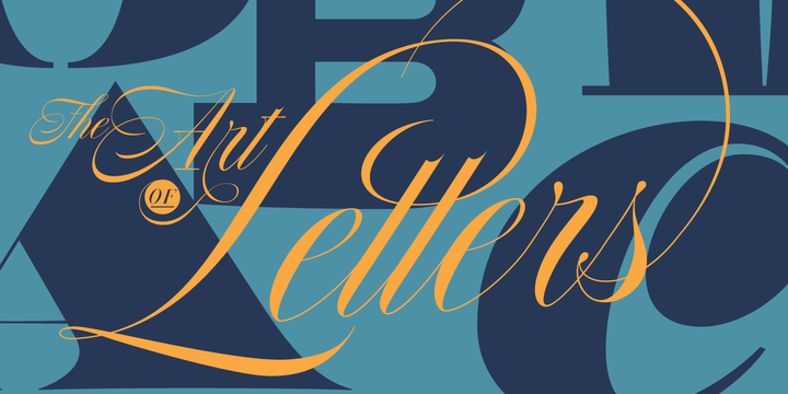
Nautica from Resistenza Type Foundry
“I adore Roxand Gataud‘s Bely (TypeTogether), which also won the SOTA award in 2016. The display version is the textual embodiment of the 😍 emoji and makes me want to start a long-form magazine site just to use it on the regular for headlines. I also had way too much fun playing around with the stylistic alternates in Nautica from Resistenza.” – Meghan Arnold
Additional Faves:
- Spumante from Laura Worthington Type (Liz Galle)
- Cardea from Emigre (Molly Doane)
- Eloquent JF from Jukebox (Ben Welch)
- Retina from Frere-Jones Type (David Demaree)
- Sutro from Parkinson Type (D.D.)
Favorite Typekit Feature Addition
“Is there anything that could top the introduction of Typekit Marketplace, and the new batch of type foundries that joined us along with it?” – D.R.
“The people! We welcomed so many awesome new team members this year.” – L.G.
“Hands down, redesigned font detail pages. Their simplicity and balance is incredible. They made room for Marketplace (imagine it in our old design), they offer so much potential for adding features tastefully, and they make us (and our foundry partners) look great.” – T.B.
“Joining the team to work on some launch events surrounding Typekit Marketplace was the personal highlight of my 2016. I’m happy to be part of something like TkM that can amplify the work of so many talented type designers. It’s been awesome to collaborate with awesome people in the industry and I’m looking forward to more in 2017.” – M.A.
Favorite Type Industry News
“The collaborative development of variable fonts made me pretty giddy, since I think the new spec will allow all kinds of cool things to happen” – D.R.
“The corporate collaboration around, and public response to, variable fonts.” – T.B. (Molly and Ben also echo the variable fonts sentiment.)
“TYPEKIT MARKETPLACE!” – D.D.
“The increased visibility of women in the type industry, spearheaded by the incredible ladies behind Alphabettes. Great to see Typographics at 50/50 gender representation with its speakers this past year.” – M.A.
3 Responses
Comments are closed.
Hi, I say thank you for the information on this website. I am very pleased to visit this website. Because of the knowledge I grew. Success is always for you.
Mrs Eaves is a great addition. Looking forward to using this in a project soon.
It was awesome seeing a bit of behind the scene of the Hobeaux design when James Edmonson gave a talk in Denver last year! Such amazing talents everywhere! Really want to use Mrs. Eaves somewhere! May be on one of my print design projects…