Sites We Like: Hoover-Mason and The Charleston Museum
Here at Typekit we know that great type gives personality to a story. With that in mind, this week we’re shining the spotlight on two sites that effectively use web type to explore different aspects of American history.

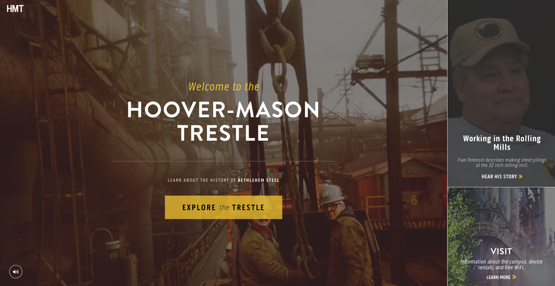
The Hoover-Mason Trestle website tells the story of Bethlehem Steel, once one of the most prominent steel manufacturers in the United States. The site is anchored by Brandon Grotesque, a geometric sans-serif that echoes the strength of steel framework. Elsewhere, practical yet unique Pill Gothic quietly draws the reader into the narrative.

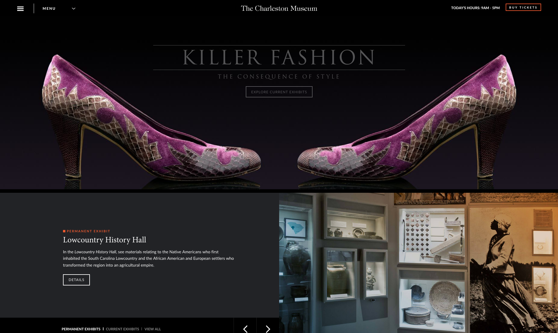
The Charleston Museum celebrates the history and culture of the South Carolina Lowcountry. At first glance, Trajan‘s classic letterforms lend a sense of time and antiquity to the site. Smaller text is set in the understated Minion typeface, while sleek Lato keeps the page rooted in modern times.
We hope you enjoyed the sites we liked this week. Tell us some sites you like in the comments!