Sites We Like: Ghostly Ferns and John D. Jameson
Today we’re looking at two design-oriented sites whose personalities are complemented and enhanced with thoughtful type selections.
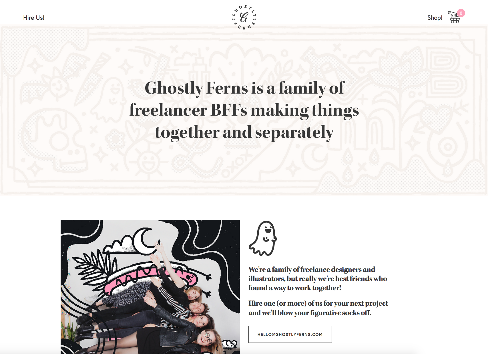
The creative collective known as Ghostly Ferns features Kepler Bold Display on the home page and in their web store. This high-contrast and playful serif font immediately captures the imagination of the group, while the graceful sans Europa works steadily on the sidelines for each call to action.
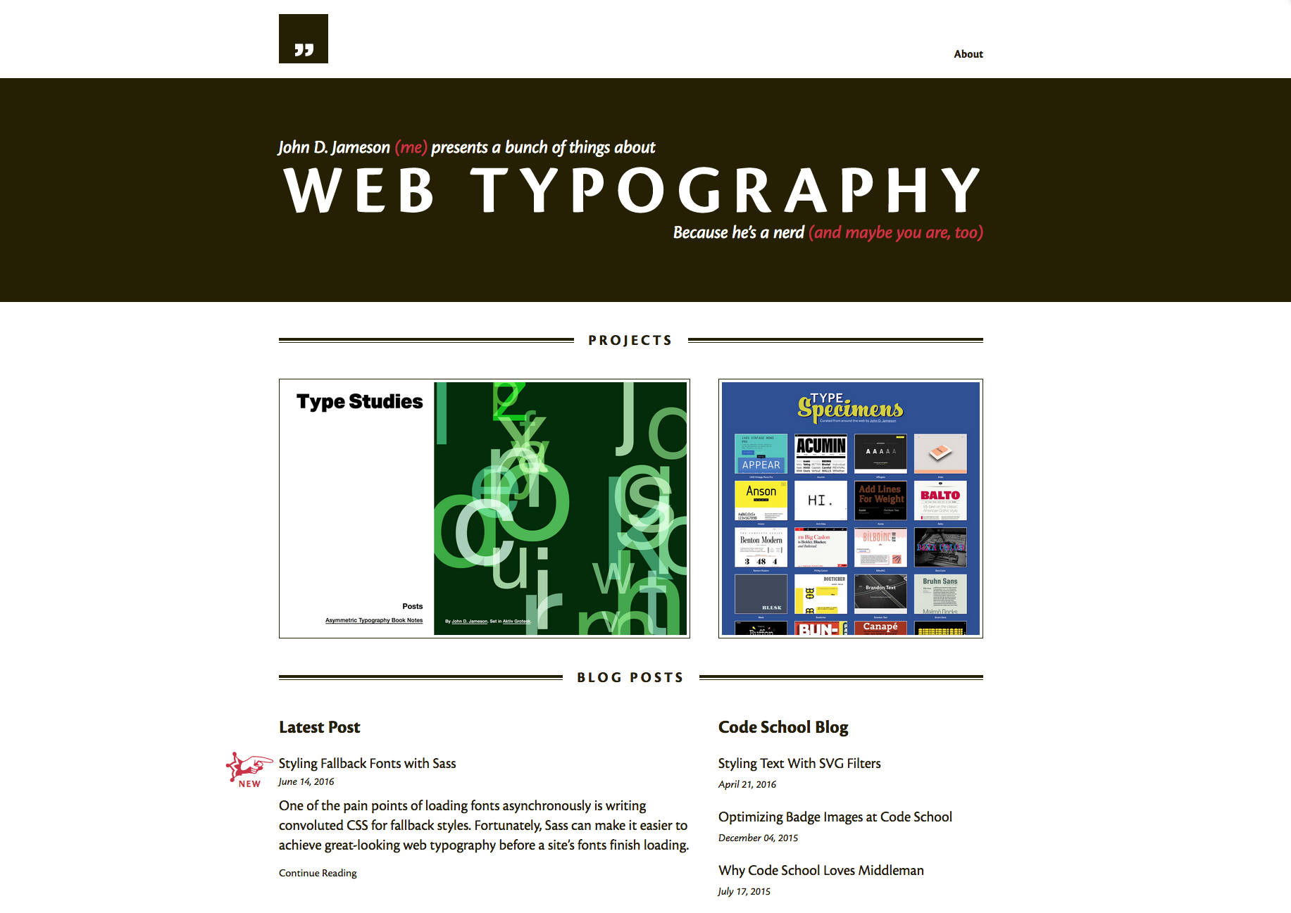
The blog of John D. Jameson is a resource for type nerds and web designers alike. Cronos dominates the page, but the different weights that have been employed add variety to the site as well as cohesion. An excellent model for the very subject being discussed.
That’s it for this week’s sites; share sites you like in the comments!
2 Responses
Comments are closed.
Hey Molly,
Really like your examples. I’ve recently completed a new site focusing on a Typography First approach. Would be great to hear what you think!
http://anartfulscience.com/Typography-First.php
Cheers, Stephen
Hi Stephen – Glad you liked the post, and thanks for sharing your site! I’ve added it to our database and you just might see it in a future Sites We Like…