Retina from Frere-Jones Type available to host on Typekit
Today we’re happy to announce the release of a new typeface – 17 years in the making – that has already been vetted by the financial tables of the Wall Street Journal, and has its place reserved in the Museum of Modern Art. Retina from Frere-Jones Type is a special typeface, prestigious not simply because it is acclaimed, but because of the research and ingenuity for which Tobias Frere-Jones is known.

Retina designed by Tobias Frere-Jones, with contributions by Graham Bradley, Nina Stössinger, Tim Ripper, Dave Foster, Octavio Pardo, Ksenya Samarskaya and Colin Ford.
About the design
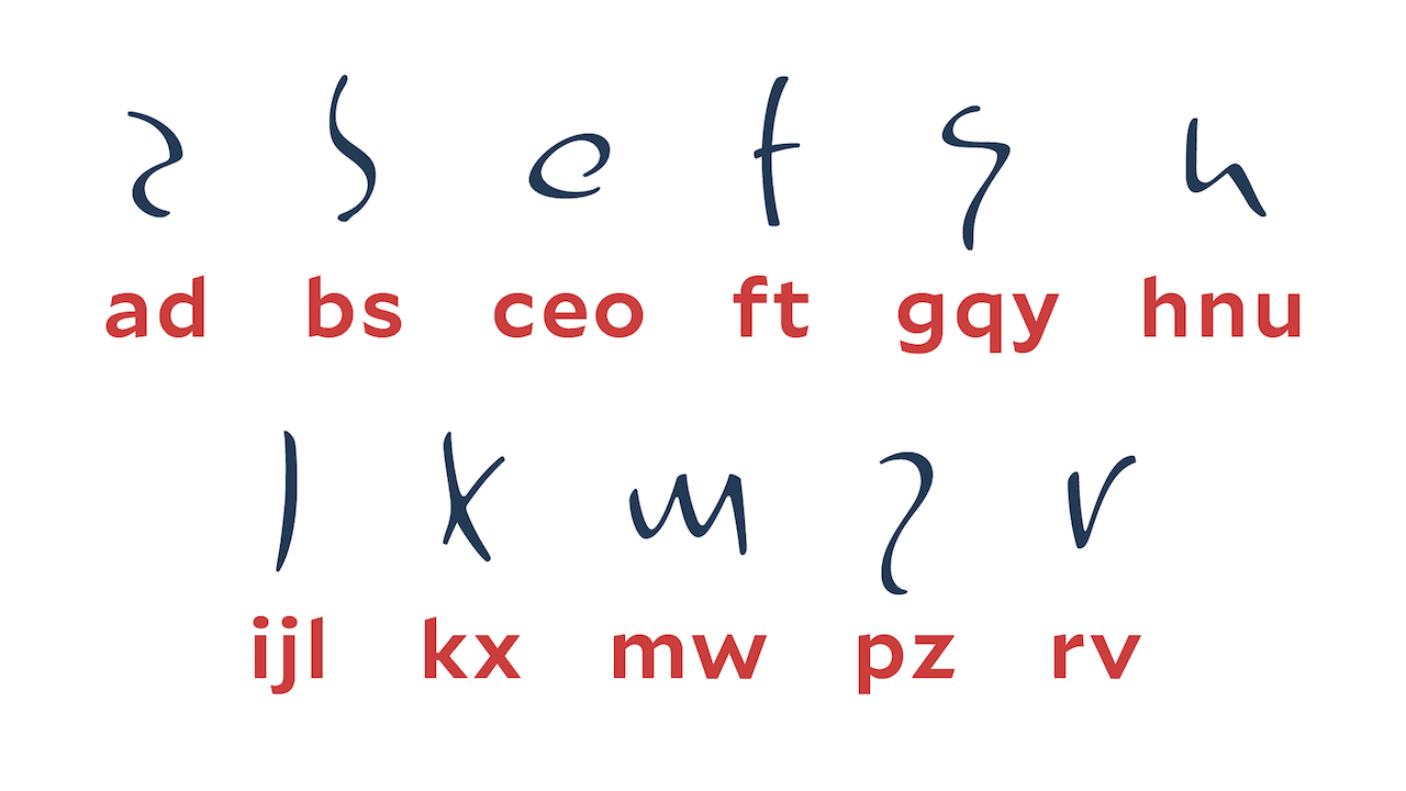
Retina began as experiments in noisy, grungy typography, when Tobias was a student at RISD. He was a fan of Neville Brody’s FUSE project, and sought to discover what exactly would make letterforms illegible. He designed private, experimental fonts that targeted specific aspects of reading and deliberately made them difficult. He wondered:
“If the distinction between one character and its neighbors were no longer reliable, or if the identity of an individual letter were deliberately vague and could be confused with others, would our experience as readers be able to step in and resolve that ambiguity, or not?”

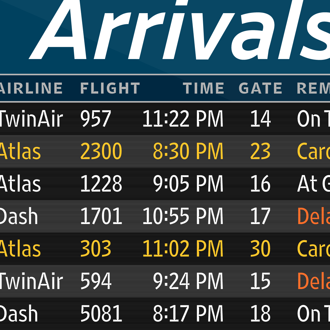
Tobias returned to these ideas in 1999, when clients approached with challenging scenarios for fuzzy TV screens (PBS’s Art21) and tiny newspaper type (WSJ). For these clients, Tobias designed young versions of Retina as the practical antithesis of his early legibility experiments, incorporating his experience working at The Font Bureau on newspaper and bitmap typefaces. The result is a typeface with remarkable clarity, both on screen and in print.

All artwork courtesy of Frere-Jones Type.
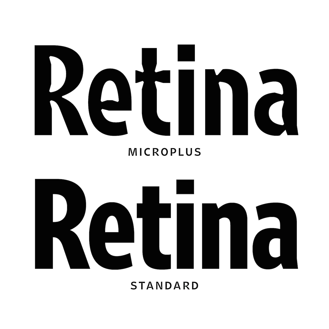
Today, Retina is commercially available as a much fuller and more capable typeface than it has ever been. It comprises a range of weights and widths that have been recalibrated for use on the web, as well as MicroPlus styles – the genesis of the family – that have been battle-tested in the harsh conditions of newspaper agate (the traditional name for an extremely small size of type, 5.5pt) and “duplexed” for perfect copy fitting.
“Duplexing” means that changing font-weight won’t change the amount of horizontal space that MicroPlus glyphs occupy — so emboldening text on hover, for example, or switching to a thinner variation for white-on-black type won’t cause text to reflow or change width.
I was able to ask Tobias a few more questions about Retina:
Q: Aside from its legibility, can you say more about the style of Retina?
A: The crux of the strategy was to identify one event in each letter that identifies it as unmistakably, unambiguously not something else. That’s why the cap R has a curve that dives way in, and then a leg that juts way out. As I see it, these are the most ‘R’ parts of that shape.
Q: Was it hard to wrangle all that individuality?
A: Yeah. Especially because “every glyph for itself” was part of the spec. But once I understood how to get just enough cooperation among these letters, so they’ll work with each other and make useful contributions to the overall word shape, that’s when it started to hang together.
Q: Do you think its legibility makes Retina good for signage and UI?
A: I do! One additional use for these micro sizes is, ironically, very, very large sizes seen at a great distance. This is another thing in the back of my head – the proposal David Kindersley made for the British Highway System. They ultimately went with Calvert’s design, but Kindersley had this entirely different thing. It had serifs, which you don’t expect on a highway sign, and a bizarre allocation of weight/proportions. I could not make sense of it until I realized he’d basically drawn a 4pt master — meant to be seen from 0.5 miles away, however many arc seconds of retinal size that is. Essentially the same thing. I’d love to try out street signs with this.
Q: What other typefaces does it go well with?
A: Because the apertures are so open (more for optical reasons than anything aesthetic), it has a kind of unexpected sympathy with oldstyle faces. A book designer friend of mine paired it up with Dante, and it looked really good. It’s odd that although Retina’s design is not historical at all, it worked out really nicely with this sensitive consideration of type history.
Use Retina on Typekit
To use Retina in your kits, select the web license from Frere-Jones Type and transfer it to your Purchased Fonts library. While Retina isn’t available for syncing through the Creative Cloud app, the perpetual desktop license from Frere-Jones Type will enable you to use it in any of your desktop programs.
4 Responses
Comments are closed.
Wait… “switching to a thinner variation for white-on-black type”? Thinner? Unless you’re talking about backlit signs, you generally need a heavier weight, not a lighter one, for reversed-out type. And looser tracking.
Well, white-on-black *on screen* needs a lighter weight. Of course, in print, it needs a lighter one.
This is so great! I love innovations!
Awesome! Great additions to my design collection!