Launched! See the new browsing UI on Typekit today
Back in August we shipped a preview for a major update to Typekit’s font browsing interface, and many of you have helped us test it and offered great feedback over the last few weeks. Today we’re excited to release Typekit’s new look to everyone, along with a few additional improvements we’ve made since last month’s preview release.
What’s new in Typekit’s UI
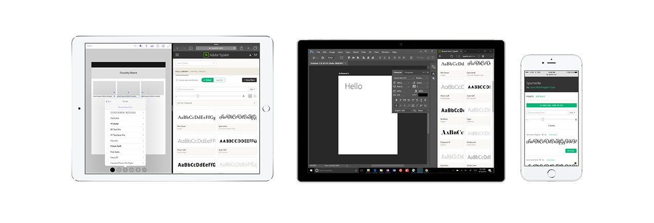
First off, Typekit now has a beautiful new responsive design. Our font browser and family detail pages now look great on screen sizes ranging from phones to giant widescreen displays. We’ve optimized them for touchscreens too, so Typekit works well on iPad Pro as well as hybrid PCs like the Surface Pro.

Expanded font previews: We built wider type previews in both browsing and family pages, with custom sample text and full support for our default character set.
Simpler filters & navigation: The new My Library collection, which you can select from the new and improved scope bar, shows all the fonts you can use with your plan, including any fonts you may have purchased from some of our foundry partners for use on Typekit. We also simplified filtering by sync or web use to a simple checkbox that shows or hides web-only families, and last but not least, we made it possible for you to reclaim some screen space by hiding the filter bar once your selections are dialed in.
More expansive font families: We reorganized fonts into new, more typographically expansive families, combining all the widths, optical sizes, or other variants of a typeface in a single unit. For instance, the family page for Acumin now shows all 90 styles, where before that typeface was spread across five different pages.
New family pages: We added a new Sync button next to each syncable font on family pages, allowing you to add or remove a font from your sync selections with a single click. Those pages also now include a Details tab, giving you a wealth of “back of the baseball card” information about each font in a family: how it’s named in both font menus and CSS, detailed web font specimens, language support information, and more.
Lastly, we made some nice improvements to pagination and filtering, to make navigating our catalog smoother and easier.
Added since the Early Access release
Of course, we didn’t stop working after our Early Access release. Here’s what you’ll see today in addition to all that:
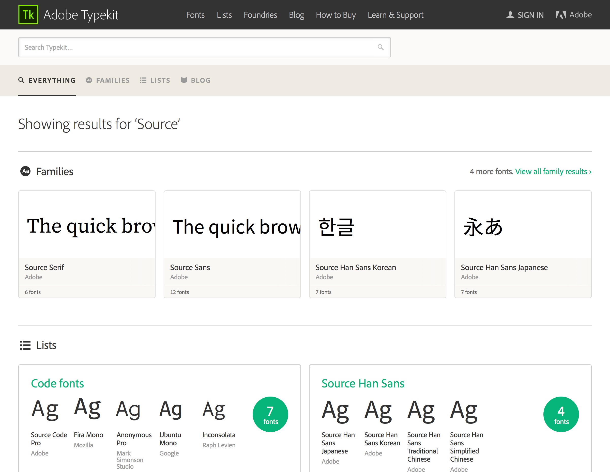
Redesigned search pages. Typekit search now shows our new, bigger families, and we’ve updated the look of the search page to match the rest of the redesigned UI. Search by typeface, designer, or foundry, and we’ll show you everything we’ve got.

Big localization improvements: Last month’s Early Access release was largely complete for English-speaking, Latin-script-writing users, but was missing some features and translations for our international customers. Typekit’s new UI is now localized into Japanese, French, and German, and the new inline type tester on family pages now also supports previewing Japanese and other non-Latin fonts.
Little fixes: Though the new Typekit was already noticeably faster in some places than our previous interface, we didn’t stop there—we’ve improved web font loading performance throughout the site. When browsing fonts, family cards now consistently show regular-weight fonts, and your browsers should now automatically scroll back to the top when flipping between pages.
See something we missed? Have feelings about that shade of green? We’d love to hear your feedback. Let us know what you think.
Updated October 10:
We’ve had some questions on the redesign, and so are calling out two of the changes here for clarity:
How do I filter out the web-only families, so I can see what is available for sync use?
We’ve changed how this works a little — you can now uncheck the ‘Include web-only families’ checkbox to view only families which include fonts that you can sync to your computer.

Unchecking the “web-only families” box will show only the fonts you can sync to your computer.
Hey, where’s my “sync all” option?
Some of the families have dozens of variations, so syncing them all would quickly push many users over the sync limit on their Typekit plans. The option to sync an entire family in one go is gone for now; we’re thinking about the best way to handle it in the new, expanded family detail pages.
16 Responses
Comments are closed.
There’s no option to sync an entire family anymore or to sync from the preview page. These are time saving features for my workflow.
Hi Jeremy,
Thanks for your feedback. We’re looking into making syncing multiple fonts a better experience. If you like, we’d love to hear more about your workflow or anymore feedback you may have, please reach out to support@typekit.com
~ Jake
I ALWAYS sync the whole family.
Why can’t you decide between synchronized and web fonts anymore in the filters? Often I’m just looking for fonts I can try out on my computer, not web fonts, and it’s not possible anymore to search for them specifically.
Hi Christian,
We’ve changed how this works a little — you can now uncheck the ‘Include web-only families’ checkbox to view only families which include fonts that you can sync to your computer. Hope this helps. If you have anymore questions or feedback, please feel free to email support@typekit.com
~ Jake
Ah, I missed this checkbox, as I didn’t expect it at the top, but rather in the dark filter area, where you could define web- or desktop-fonts earlier.
Looks great!
Just wondering, have the family descriptions been dropped? Is this intentional?
Thanks, Tim!
The family descriptions were temporarily dropped from the new design, because we still have to migrate over that text from the old web font families to the new, expanded ones. We’re gonna bring back descriptions as soon as we can.
Something that always puzzled me: Typekit does not mention the designer of the font anywhere. To me, this seems like Amazon selling books just by title and publisher, without naming the author. Especially for designers represented by large foundries, shouldn’t they be named somewhere?
It is not just a matter of giving them credit – some type users might want to search for fonts by designer. Different typefaces by the same designer often work together well as a pair.
This is definitely on our list for the future. We have a lot of data about font designers in the font files themselves, but we need to figure out how to index and present that information in a satisfying way.
When typing in the search field, the old UI gave me suggestions, which I found very useful. Has this been deactivated?
Yeah, unfortunately. Part of the UI redesign involved re-building the whole UI in a newer technology stack, and we haven’t found the time to bring over this feature just yet. A few people have been asking for it and it’s high on my list of things to work on as soon as we can get to it.
Good to hear these things are planned for the future. Keep up the good work!
I’m really liking the new preview layout. I find it a great deal more functional for previewing typefaces then the previous iteration. Also the ability to see the typefaces in numbers and symbols is long over due. Great Job.
I’m glad to hear it’s a work in progress. Two points:
1) I think the idea of “unchecking” an option that includes something is confusing, user experience-wise. It takes some thought to decide what to do to get what you want, especially since the other category is not named. For new users, they might think “well then what do I get instead, if I uncheck this option?” It’s not clear that there are no sync-only fonts on Typekit, either. (I assume that’s the case.)
2). It’d be very useful to show how many fonts I’ve synced and how many more I can sync according to my plan. That could solve the Sync All issue, or help it. Seeing something like “85 synched/100 allowed” next to my user name or somewhere similar would be great.
Slightly unrelated question (and probably a very stupid question!), but it has been bugging me. How do sites like typekit show so many fonts on a single sample page and yet the pages still load quickly. Do they not need to download to the visitors browser in the normal way?