New fonts on Typekit from BAT Foundry
We’d like to welcome our newest foundry partner to the Typekit library: hello, BAT Foundry! BAT is based in France and managed by type designer Jean-Baptiste Levée.
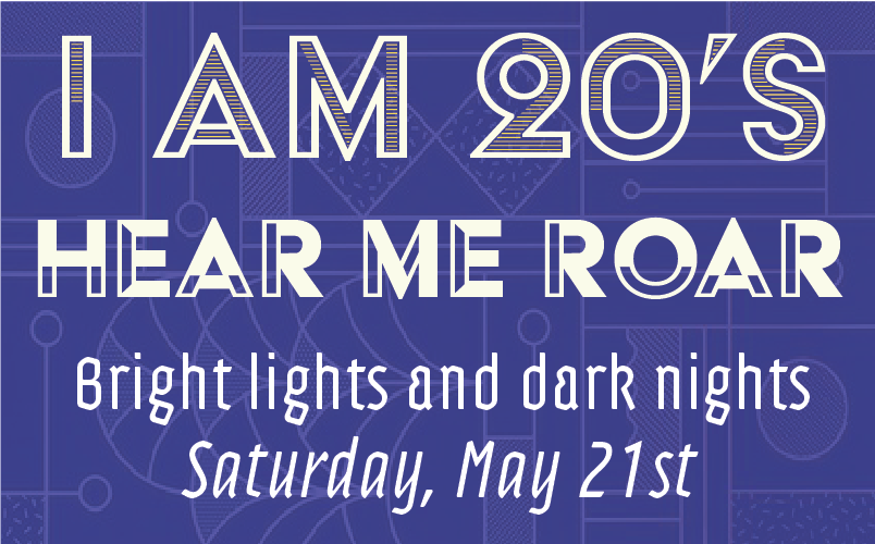
Acier is BAT Foundry’s revival of a typeface by the same name, designed by Cassandre in the 1930s. Levée is the first designer to bring this typeface into digital form, having redrawn the styles from scratch. It evokes art deco style, but also stays true to its name (acier means ‘steel’ in French) with sharp, precise edges and chiseled details. We’ve added five different text styles to the library: Strokes, Solid, Noir, Gris, and Outline.
Adso by Bruno Bernard is a reintroduction of blackletter forms into the modern world, moving beyond its usual grouping with decorative display faces. Though the blackletter influence is obvious in letters such as the lowercase a, the typeface is appropriate for a wide range of uses and includes 12 variations.
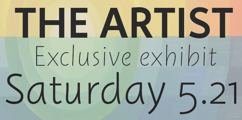
Instant was designed by Jérôme Knebusch, with each variation representing a speed: the slower, the heavier. The lighter weights have a handwritten feel, while the heavier weights appear more uniform. These distinctive personalities make for a very natural pairing when two weights are used together.
These are a lot of fun to play with — let us know where you end up using them!

