New fonts from Resistenza & Thomas Jockin
We’ve got new fonts! Our latest additions to the library are from two new foundry partners — Resistenza and Thomas Jockin, both independent and with great designs we can’t wait to see in use.
Thomas Jockin
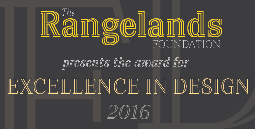
Thomas Jockin is the graphic and type designer behind TypeThursday, a monthly speaking event in Brooklyn and published interview series geared towards, as he puts it, “people who love letters.” Thomas’s typeface Azote was inspired by the 1968 Mexico Olympics logo and uses multiple lines to add weight to letters. Even as more lines are added on, each letter maintains its proportions and harmony with those around it. We’ve got a soft spot for the lowercase g in Bold. Azote is available for both web and sync, and comes in four weights with italics.

Azote Light, Italic, Regular, and Bold
Resistenza Type Foundry
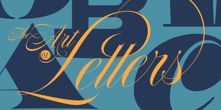
Resistenza Type Foundry is run by Giuseppe Salerno and Paco González, from Italy and Spain respectively. They specialize in handwritten typefaces, calligraphy, and scripts — many more of which you can find on their website. Resistenza’s Nautica is a beautiful script that brings modern flair to traditional Copperplate forms. With three weights to choose among and combine, you can add a subtle vibrance to your designs — a level of versatility that’s rare to find in script faces. It’s available for both web and sync, so you can enjoy its elegance on the web and on your desktop.

Nautica, from Resistenza Type Foundry.
2 Responses
Comments are closed.
These are beautiful! Is there any progress on giving California Education members access to Typekit? My students are so disappointed not to have access.
Hi bonniebarrett, please get in touch with our support team at support@typekit.com for help with your question!