Choosing and pairing typefaces for cookbooks
We teach a cookbook design class at TypeEd, which demonstrates how to set up a book proposal to pitch to a publisher and guides designers on how to format different types of content along the way. A common question we hear at the beginning of class is, “How do you choose typefaces?”
There are many ways of setting up typographic systems, and we learned early on that choosing and pairing typefaces can be compared to the classical approach to cooking: Choose ingredients that will serve the overall flavor of the dish as well as complement one another. Too many ingredients, and the flavors conflict. Too few, and the dish tastes bland.
If you choose fonts that work together, and set them beautifully, you’ll create a harmonious reading experience.
A recipe for typographic success
A deliberate typeface choice not only communicates the cookbook’s concept, but also helps save typesetting time.
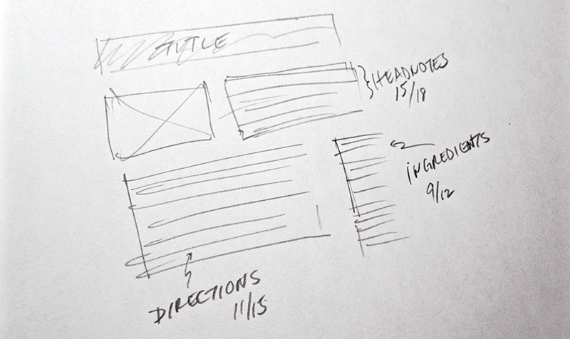
Sketch of a basic recipe page layout.
We’ve found that combinations of three distinct typefaces will work well to communicate different content types, and create an ideal cookbook reading experience. You can opt for fewer, depending on how many content types there are in your book.
- Choose a primary typeface for the body copy of the foreword, introduction, headnotes and recipe directions. For example, a serif typeface.
- Pair it with a secondary typeface to create hierarchy and for the ingredient list, sidebars, glossaries and indexes. (If you started with a serif for your primary, for example, you might choose a sans serif typeface here — or vice-versa.)
- Garnish with a tertiary typeface for headers, chapter breaks, chapter titles and main book title. (For example, you might try a script typeface here.)
It’s important to read the content first and note what details you see along the way; numerals, fractions, accents and other glyphs present. Not all glyphs are represented equally across different typefaces, and knowing the content beforehand helps you to avoid unforeseen typesetting issues.
Also, think about how people read the content. Cookbooks are typically read while standing up and walking around the kitchen, so look for body copy and hierarchy typefaces that can be read from a distance. Opt for typefaces that are easy to scan; ones with large character heights and widths, and with little stroke contrast.
Primary typeface: The main course
Body copy is what your readers spend the most time with, and visually it makes up the bulk of the content, so let’s choose this one first. We’ve found these guidelines useful when choosing a body copy typeface:
- Seek characteristics that correspond to your overall book format. If you are typesetting a book larger than 9″ x 12″ and are planning on having lots of white space, you could opt for a big, roomy typeface such as Stevie Sans or Museo Slab. If you are setting a small, travel-sized book, consider a slightly condensed family with relatively tight letter spacing such as Cronos Pro or Adobe Garamond Pro.
- Consider a typeface with language support. If you’re thinking of translating the cookbook into other languages, you may want to consider using a typeface that has broad language support. Some foundry websites supply character set specimen sheets listing available glyphs, like this PDF sheet for Maple from Process Type Foundry.
- Opt for double-story characters over single-story. From a distance, the lowercase a may look like a lowercase o, so to assist readability for older readers or in low-light situations, choose typefaces that have two stories in the lowercase a.
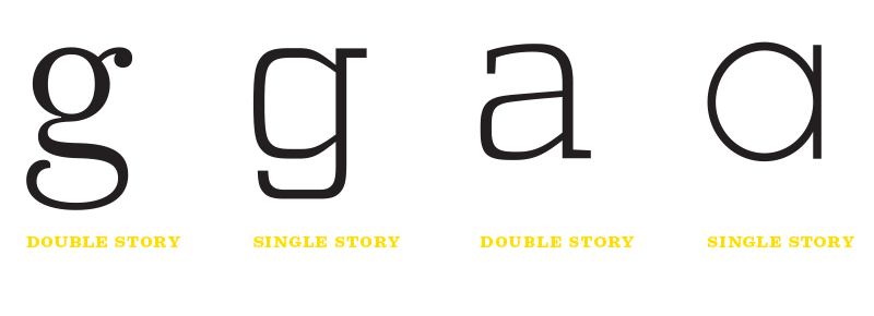
Single- versus double-story characters.
- Go for default old-style numerals. Some typefaces have built in old-style numerals as their default setting, which is perfect for reading body copy. Some typeface libraries will allow you download and install a free font to test out, so you can determine if the typeface has old-style set up as default, or you can use your Creative Cloud account to sync fonts from Typekit to check. When you find one, it will save you tons of time of playing the ‘find and replace’ game with your lining numerals and your glyph palette.
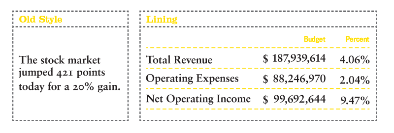
Old-style figures compared to lining numerals. Old-style numerals are best for body copy, since they blend more naturally with the text.
Once you’ve narrowed down the typeface, choose the font variation that you’ll use for the bulk of your copy — ideally a weight that is not overly light or thin, for easier reading.
Secondary typeface: The side dish
The second typeface will bring attention to blocks of body copy. It’s used for building hierarchy in subheads, and can also be used for ingredients, sidebars, glossaries, and indexes. This is important because we don’t typically read cookbooks from cover to cover — we use hierarchy as navigation to find what we’re looking for.
You may want to choose a typeface from a different classification than the primary typeface, but doesn’t detract stylistically. Or make it simple: if your body copy is serif, pair it with a sans serif. These are the guidelines we generally use when finding a secondary typeface to pair:
- Choose a typeface with simple fractions. This way you’ll save yourself hours in building them by hand. The best ways to demonstrate fractions are either vertical fractions (or em fractions) with the diagonal bar, or the narrower nut fractions (or en fractions) with a horizontal bar. Some fonts have simple pre-built common fractions, found in the glyph palette. Unless the cookbook author specifies an unusual measure (say, five-twelfths of a cup), the simple fractions will suffice.
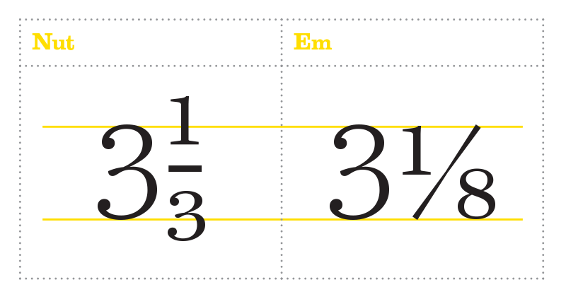
Choose a suitable style for fractions that best supports your recipes.
- Look for similar x-heights. If you plan to use this typeface for sub-headings, consider a family that has a similar x-height to your body copy choice. This way, run-in subheads won’t look too out of place when set next to body copy.
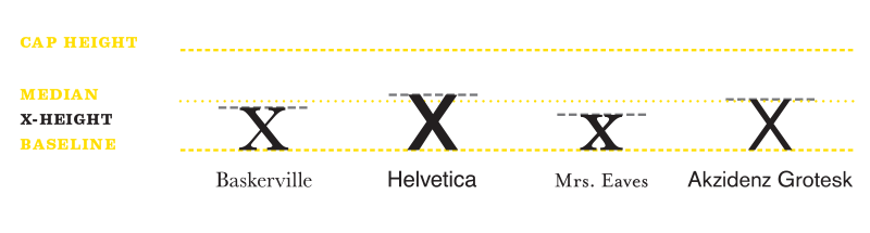
Comparing the x-heights of different typefaces.
- Decide on a family that has at least 4 fonts for variety and hierarchy. You’ll want to have flexibility in creating hierarchy and emphasis within sidebars, glossaries, and indexes, and a typeface with a variety of weights will give you the option to have more levels of pacing down the page. If you set up a system that designates the bold weight for sidebar headers, stick to that choice for the full book; a consistent typographic hierarchy will help to communicate context quickly.
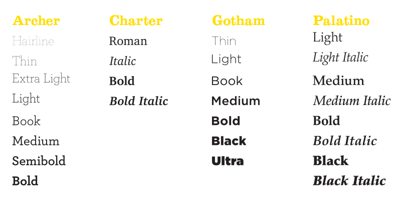
Some typefaces will give you more weights to play with than others.
Tertiary typeface: The garnish
Now that you’ve laid the foundation with the primary and secondary typeface, it’s time for a little fun. A display or decorative typeface is used for recipe titles, section breaks, headers, and your book title to carry the theme throughout. If your titles and headers are short, then you can have a little fun with this choice, because readability will not be an issue.
Pastry cookbooks may opt for customized script type, French cookbooks may use a Gothic to emulate a classic menu, and a UFC fitness cookbook might use heavy slab serifs or stencil type for a “masculine” look. Whichever you use, be sure to use style to communicate the content, not to decorate the pages. Simple works better. If you choose a typeface that’s too trendy, the cookbook might begin to feel dated within a few years.
Once you’ve chosen all your type, set up your hierarchy in the character styles and paragraph styles palettes in InDesign. Go with a simple, thoughtful, and straightforward system. Your typographic hierarchy will help the reader scan and comprehend the information quickly and easily.
Sampling of delicious pairings
Cookbooks will mix and match typefaces for different contexts, but for the most part they use at least three. Here are examples of pairings that work well.
Einkorn Cookbook: Recipes for Nature’s Original Wheat by Carla Bartolucci
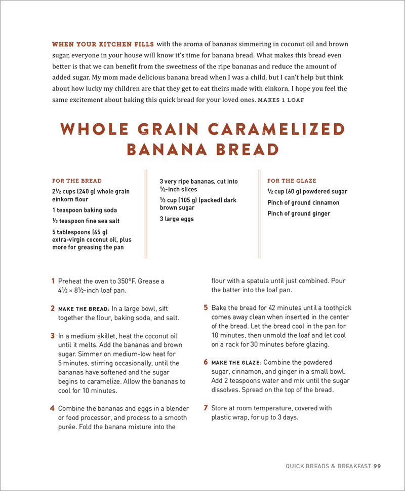
Recipe Title: Brandon Printed One
Run-In Subheads: Museo Slab 500
Headnote Copy: Cambria Regular
Ingredients & Directions: DIN Medium
Footer: DIN Light
Thanksgiving Cookbook: Recipes for Turkey and All The Trimmings by Fine Cooking
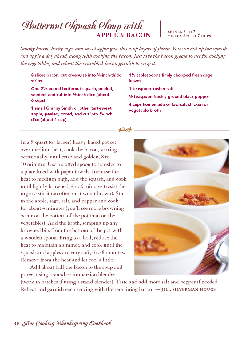
Recipe Title and Footer: PopplExquisit Medium by Berthold (Script)
Headnote Copy: Granjon Italic (Serif)
Ingredients: Avenir Heavy (Sans Serif)
Directions: Granjon Regular (Serif)
Combined, three well-chosen and paired typefaces make a balanced cookbook, and will also make your job easier — whether you’re typesetting something as small as a few recipe cards or as large as a hardbound tome. The relationship between all three creates an appetizing and cherished memento that’s a joy to read.
Which of these pairings do you think work best? Have you noticed any other cookbooks with beautiful type? Share your favorites on Twitter, and flag us down at @TypeEd.