Sites We Like: Deus Customs, Owen & Fred, & S.W. Basics of Brooklyn
When you’ve only got pixels to lure customers to your online shop, the type you choose goes a long way.
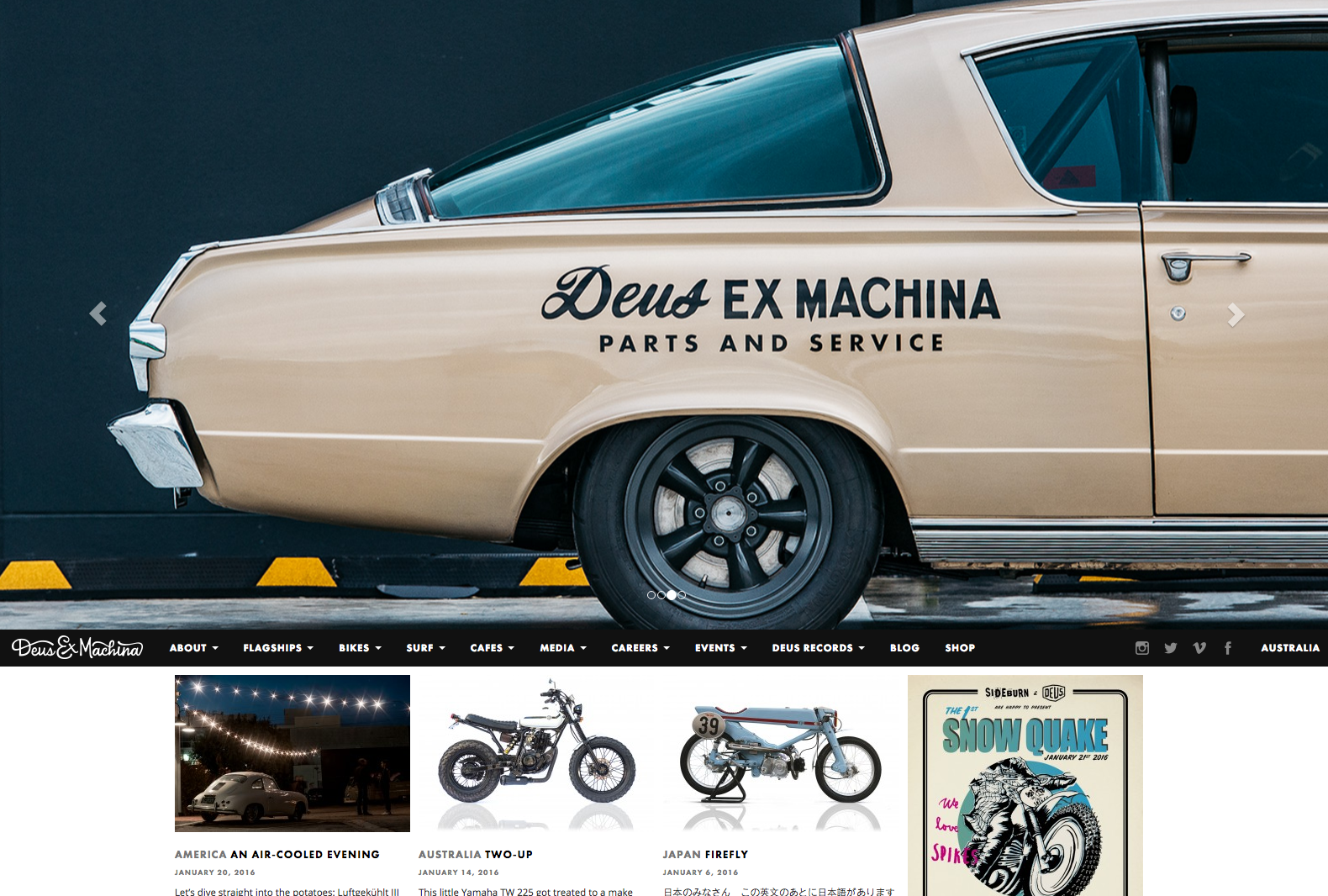
Deus Customs

Sweet, sweet motorcycles. Maybe the bikes on Deus Customs speak for themselves, but the written details look pretty good too, with headings and navigation in Futura PT and body text in Open Sans.
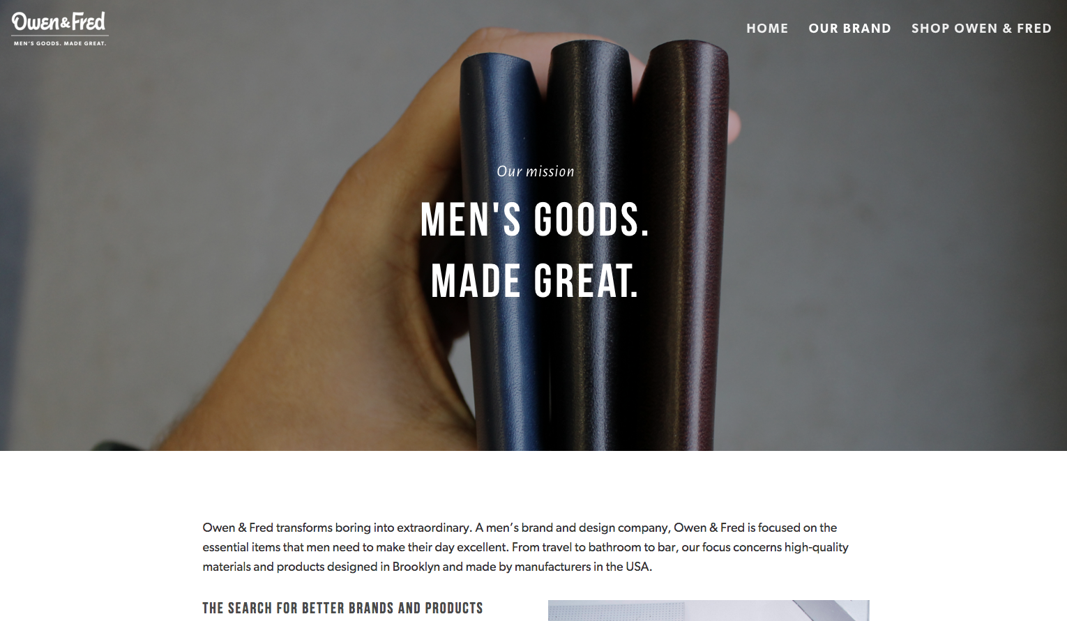
Owen & Fred

Bebas Neue headers paired with Gibson body text: it looks like clarity done right to us, and sets the perfect tone for the website of design-minded Owen & Fred.
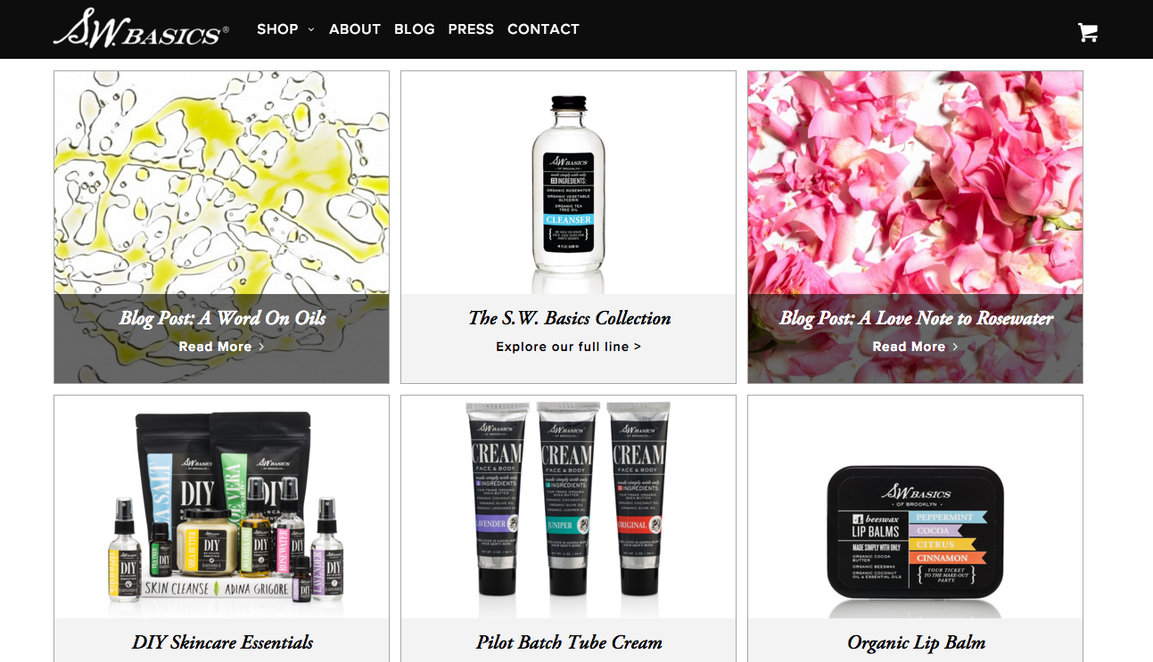
S.W. Basics of Brooklyn

S.W. Basics of Brooklyn gets down to the essentials with their line of skin care products, and the classic type on their website suits their no-nonsense approach perfectly. Proxima Nova carries the body text and navigational headers, and Adobe Garamond makes for a lovely serif complement.
That’s it for this week; share sites you like in the comments!