Sites We Like: Duffy & Chen Design Associates
We’re blown away by the work brand design firms do when it comes to seeing the big picture — and breaking it down into all the beautiful details. (Including typography, to be sure!) Here are a couple sites we noticed from this busy corner of the design world.
Duffy

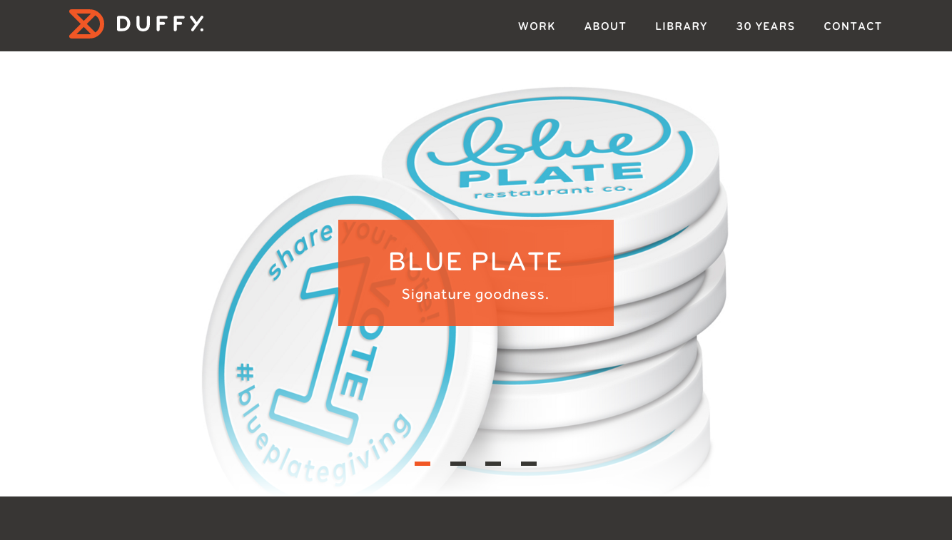
In operation for 30 years, Duffy has an impressive catalog of case studies and iconic brand design work to show off on their website. Bryant makes just the right amount of impact in the all-caps headers and site navigation text, with clean geometric shapes and a softened character thanks to the rounded terminals. (Bryant is available directly from Process Type Foundry, and Typekit can host the fonts in your kit.) For body text, Effra‘s slightly more angular edges provide a good visual contrast.
Chen Design Associates

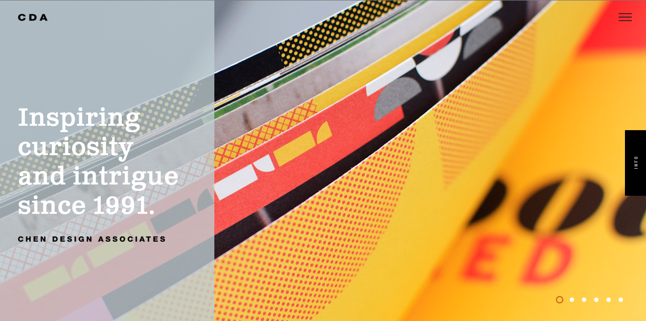
The website for Chen Design Associates does a great job of balancing beautiful images with well-written blurbs about the business and their brand design services. Clarendon Text works nicely here, giving a sturdy weight to the pockets of text, and big blocks of background color give the text an extra level of vibrancy.
That’s it for this week; share sites you like in the comments!