New fonts on Typekit from Delve Fonts and Phil’s Fonts
We’ve long enjoyed having fonts from Delve Fonts and Phil’s Fonts on Typekit for use on the web, and with today’s additions to the library we’re delighted that both foundries have made their entire Typekit offerings available for sync as well. Enjoy the broadened availability, and let us know what you think of the new additions!
Delve Fonts
Discourse
Dave Bailey went beyond the classic characteristics of “Western” wood type for this design. The extremely thick horizontal strokes, fun curves, and pronounced notches all make this typeface sturdy yet whimsical. There is a lot to work with too; both a light and heavy weight, each with its own shadow, outline, and fill versions. Check out the specimen from the Delve Fonts website (PDF) for more detail and instructions on how to layer the font.

Stenciletta (Regular and Bold) and Stenciletta Solid (Regular and Bold).
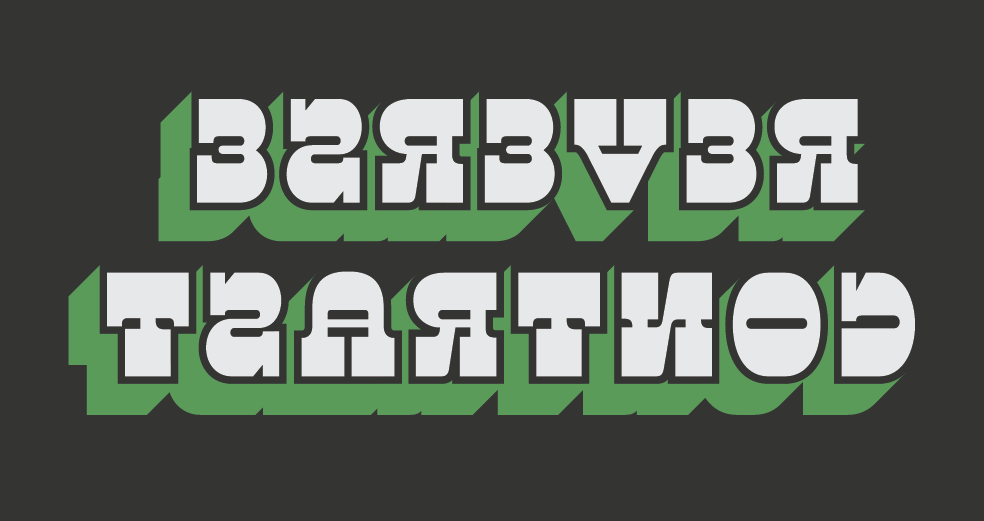
Stenciletta
Joachim Müller-Lancé was inspired by construction and signage in creating this stencil font. He manages to make the slanted bridge work well even in the letters which have no diagonal strokes or curves. Regular and bold weights are included, along with a solid option. For two-tone letters like those in the specimen, try the Right and Left families together. Check out the specimen (PDF) for more details.
Phil’s Fonts
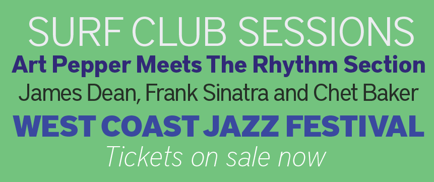
District Pro
District Pro Light, Bold, Book, Black and Thin Italic.
Designed by Kienan Smith and Dylan Smith, this sans serif has a wide variety of weights and styles. It is fully equipped with small caps and extensive foreign language support, making it a great choice for text.
More fonts for Freight in the library
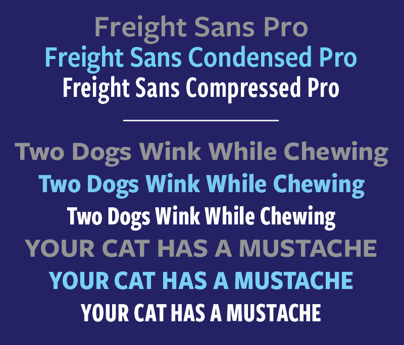
Finally, we’re adding four new Freight fonts to the Typekit library: Freight Macro Pro, Freight Neo Pro, Freight Sans Compressed Pro, and Freight Sans Condensed Pro.
Freight Macro and Neo were designed by GarageFonts as extensions to the Freight family. Freight Macro Pro is a slab serif while Freight Neo Pro is a sans serif with high contrast, and both work well for either display or text settings.
Freight Sans Compressed and Condensed are also great companions to Freight Sans Pro, which you may already be using on Typekit as it’s been in our library prior to this release. These additional widths can add versatility to your designs — both for web and print.
All these new additions to the library are available for both web use and syncing. If you don’t have a Typekit subscription, it’s free to try out and take a look around.