New fonts on Typekit: Mostardesign
Recently we added a great selection of fonts to the Typekit library from French foundry Mostardesign, established in 2004 by Olivier Gourvat. Check out a few of their typefaces as we welcome the foundry to the library, and give them a try in your projects; we’d love to hear what you think.
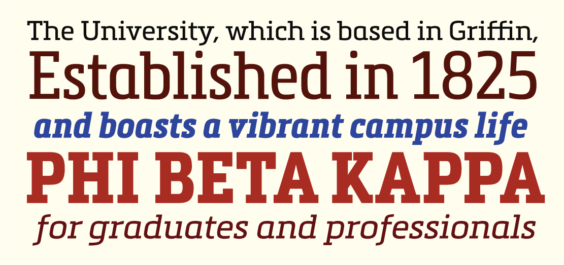
Sofia
Sofia. All specimens by Ariadne Remoundakis.
Sofia Pro is a fresh geometric sans serif whose huge open counters give it a somewhat casual, almost playful appearance. It was built with versatility in mind, too, boasting eight different weights from Ultra Light up through Black. And if you’d like a slightly gentler variation on this same flavor, we’ve added Sofia Pro Soft to the library as well.
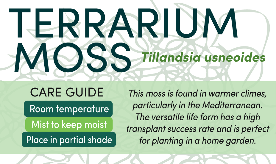
Metronic Slab & Metronic Slab Narrow
Metronic Slab.
A slab serif with a decidedly blocky character, Metronic Slab can perform brilliantly as either a text face or for big slabby headlines; the dominant serif shapes at the larger text sizes scale down gracefully at text sizes for an uncompromised reading experience. Nestled in there is a set of 60 icons to play with, too. We’ve also added its condensed-width sibling Metronic Slab Narrow to the library.
Kyrial
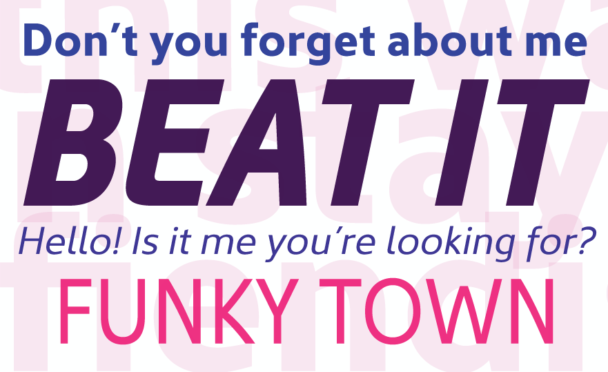
Kyrial.
Kyrial Sans is a versatile, understated sans serif whose subtle personality emerges upon close inspection of features like the rounded bottom corner on the capital ‘E’, or the slight curve on the leg of the ‘k’. It makes for a clean, smooth text face, and the heavier weights are suitable for headlines.
All the new typefaces from Mostardesign are available for use on the web, and many of the styles are also available for syncing. If you don’t have a Typekit subscription, it’s free to try out and take a look around.
4 Responses
Comments are closed.
These are seriously on point
Kyrial sans will be nice for my blog. It look very nice.
Very Nicee Font
Kyrial looks really awesome. Soft and elegant so I would use it to commercial banners.