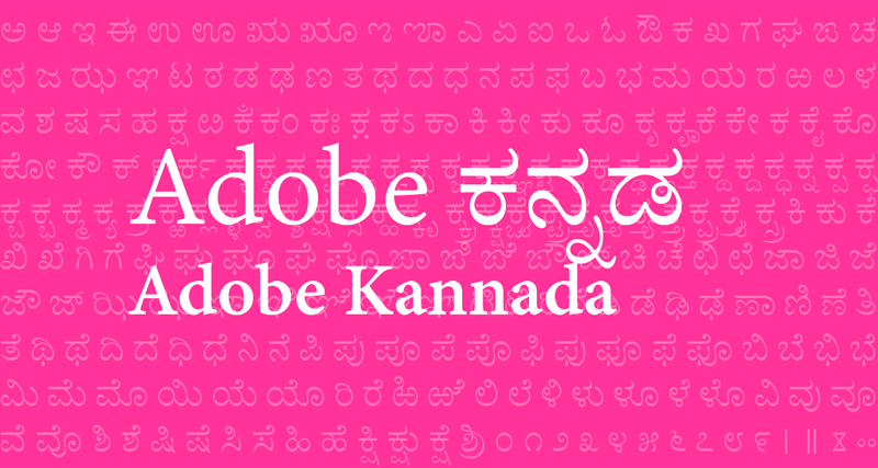
Adobe Kannada: A new type for an ancient script
We’re delighted to announce the release of Adobe Kannada, the latest installment in our font development program for the languages of India. Adobe Kannada was designed by Erin McLaughlin, with Indian fonts expert Fiona Ross consulting on the design. The Adobe Kannada fonts are available via sync to paid Creative Cloud subscribers. Additionally, almost all of Adobe’s Middle Eastern/North African and Brahmic typefaces are now available for syncing.

The design team
I personally came in contact with Erin during my own studies at the University of Reading through her blogging on eclectic Indian typography and design. She later attended the university, also focusing on Brahmic type design. As part of her Master’s work, she designed the quirky Devanagari face, Katari. Her novel, adept approach impressed me, and we were excited to bring her in to work on Adobe Kannada.
As with our other Indian type projects, we were delighted to have Fiona on board to share her guidance in every aspect of design, including the suitability of the design approach, specifics of letterform construction, and guidance on appropriate parameters such as stroke contrast and letter proportions.

Kannada hand-painted lettering, Bangalore, India
A brief history of Kannada
Today, the Kannada script is used primarily in the Indian state of Karnataka to write the Kannada language, though it has also been used to represent other minority languages including Tulu, Konkani, Kodava, Badaga, and Beary. Historically, the written form of Kannada evolved in tandem with Telugu script. The manuscript forms of these scripts, which can be seen in codices written on palm leaves, were of a monoline style and were considered regional variants of the same writing system. It was not until the advent of printing in India that these two scripts began to be codified in type and diverge in appearance. The higher-contrast style that is popular today originally emerged in the mid-19th century and was popularized especially by the Basel Mission Press in Mangalore.
As with the other Adobe Brahmic fonts projects to date, the main intended usage for this design is for continuous text settings intended for printed outputs. Erin shared some of her insights from the design process:
Influential Kannada typefaces such as those used by the Basel Mission Press, Linotype’s Kesari design, and Monotype Kannada informed the shape the letterforms and styling. Adobe Tamil was a secondary inspiration for the treatment of details such as stroke differential and treatment of curves.
The contrast of the Regular weight is somewhat lower than most Kannada text faces, resulting in more legible letter forms at small sizes. The Bold weight follows cues of traditional typefaces, adding strong contrast to the horizontals, leaving the interior of the shapes clear and crisp. The scale, weight, and kerning of the subscripts were tested extensively, so that they integrate smoothly into texts.

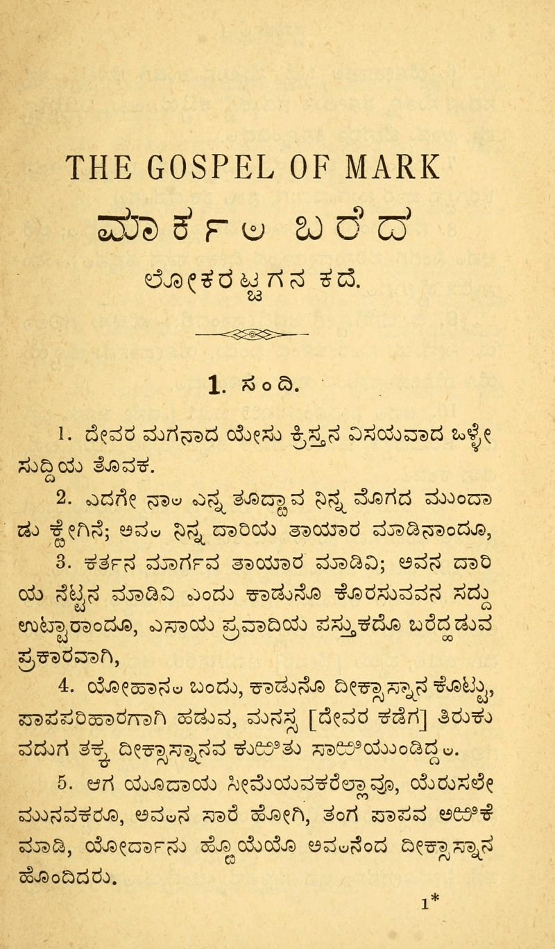
The Gospel of Mark in Badaga language, Kannada script,
published at the Basel Mission Press, Mangalore, India, 1896
Technical arcana
As the font engineer on this project, I tried to treat the technical aspects with the same attention, care, and drive for excellence that Erin put into the visual design of the type forms. I attempted to follow the philosophy of including only as much information as necessary and no more, which in this case has the practical result of keeping font size smaller and more dynamic. This means I have limited the glyph count as much as possible without sacrificing proper Kannada script shaping, and have worked to ensure that kerning is only applied to combinations that are likely to occur.
Adobe Kannada relies on contextual kerning for correct placement of subscript forms instead of mark placement (the other route typically employed for positioning glyphs relative to each other in OpenType fonts). This is a simpler, more robust solution for Kannada fonts, which otherwise usually don’t require mark placement . I have also tried to ensure that the OpenType shaping instructions have been formatted as concisely as possible.
Availability
With the release of Adobe Kannada, we hope to raise the bar and provide a design for this writing system that is significantly better than other options that are currently available for this purpose. With a paid Creative Cloud subscription, you can sync this font and use it in any desktop application.
We’ve also added our entire collection of Middle Eastern/North African and Brahmic fonts to the Typekit library for syncing, with the exception of Myriad Hebrew Cursive; this includes Adobe Arabic, Adobe Naskh, Myriad Arabic, Adobe Hebrew, Myriad Hebrew, Adobe Thai, Adobe Devanagari, Adobe Bengali, Adobe Gujarati, Adobe Gurmukhi, and Adobe Tamil.
Enjoy the fonts, and let us know what you think! If you have any questions or need help getting started, get in touch at support@typekit.com.
One Response
Comments are closed.
This is a very elegant and beautiful font. Well done.