Sites We Like: Cockscomb & Thistle
We talk about food a lot here at Typekit HQ, and we love it when good food and typography align. We spent a while perusing both of these featured websites; we’ll leave it for you to decide whether we were studying their type pairings or their hours of operation.
Cockscomb Restaurant

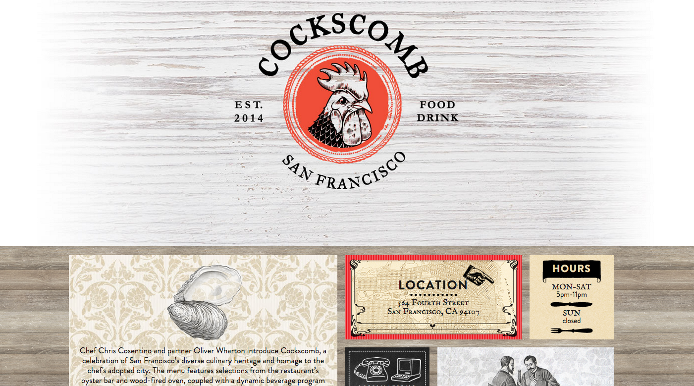
Small caps, big personality: Cockscomb restaurant uses English Small Caps all over their website in an unusual pairing with Brandon Grotesque, resulting in a distinctive character for the page—warm, confident, and slightly offbeat. (The stern-looking rooster helps, too.)
Thistle

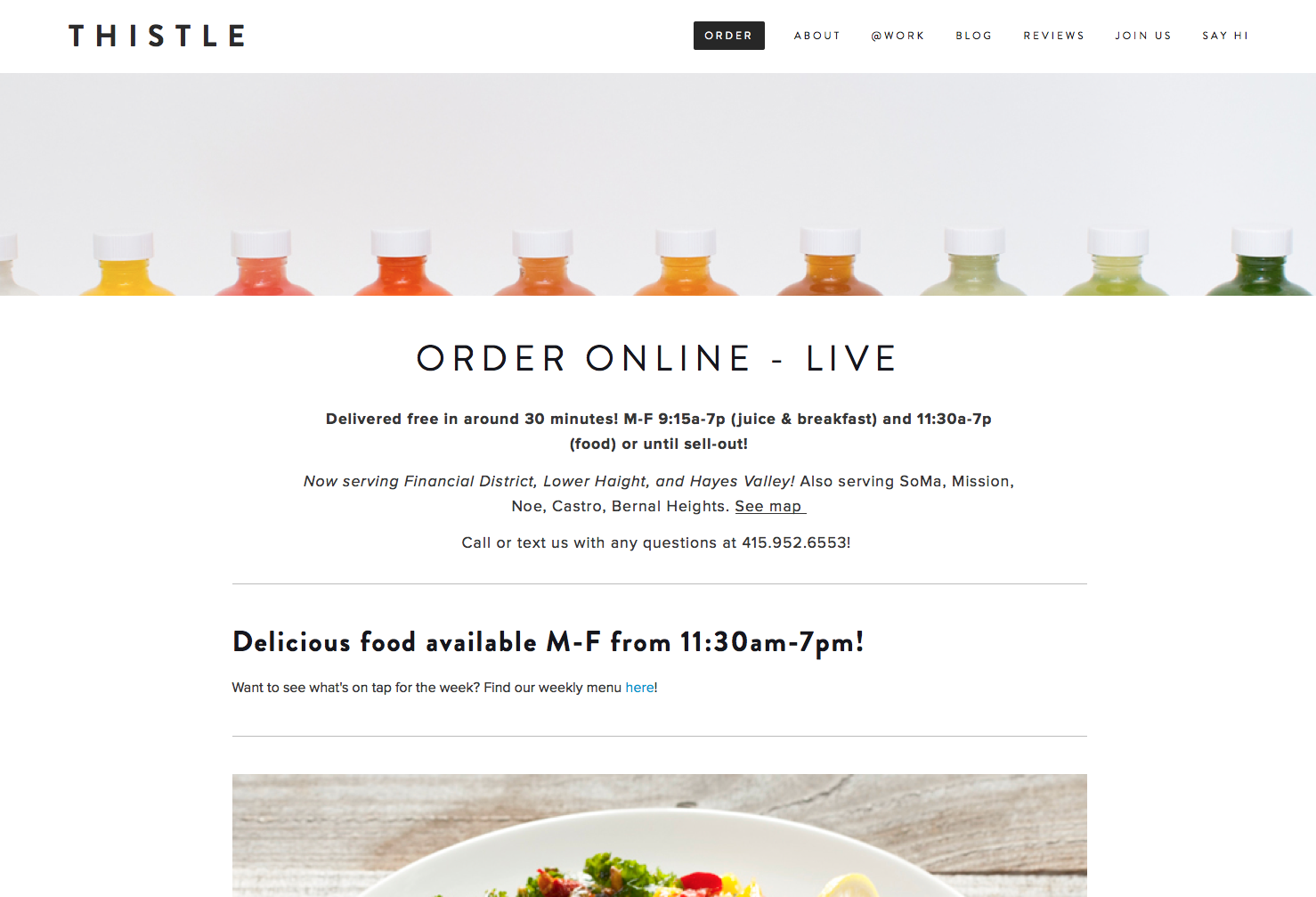
With a tempting rainbow of cold-pressed juices and other fresh foods to show off, Thistle uses color to its advantage on this website. Headers are in Brandon Grotesque, and body text in Proxima Nova—clean, simple lines that make the page feel spacious and don’t distract from the lovely food photography on display.
That’s it for this week; share sites you like in the comments!
2 Responses
Comments are closed.
May I humbly submit a recently launched project of mine for “Sites we Like” consideration:
http://leafly.com/stateoftheleaf
A responsive, embeddable, and easy to update infographic that summarizes cannabis legalization efforts, price trends, popular marijuana strains, and other key industry data.
(By the way, the click an icon to log in thing on the comment box seems to be broken in Safari and Chrome.)
Thanks for the suggestion, Scott! And we’ll look into the login thing you mentioned; thanks for pointing it out.