Sites We Like: Moonbase, Planetary, & SpaceX
There’s little that captivates the imagination like the idea of outer space and exploring beyond our home planet. This week we’re looking at a few sites that feel the pull of the stars — including one that actually does the space thing for real.
Moonbase

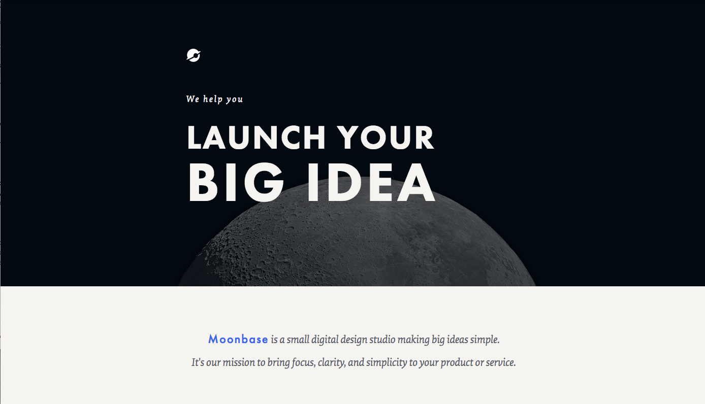
Iconic geometric face Futura PT retains its position as the typeface of the future on the Moonbase homepage, making a bold entry as the title header and appearing in tidy subheads throughout the rest of the page. They’ve taken pains to pair it carefully with serif Elena, sometimes even on the same line of text (no small feat!).
Planetary

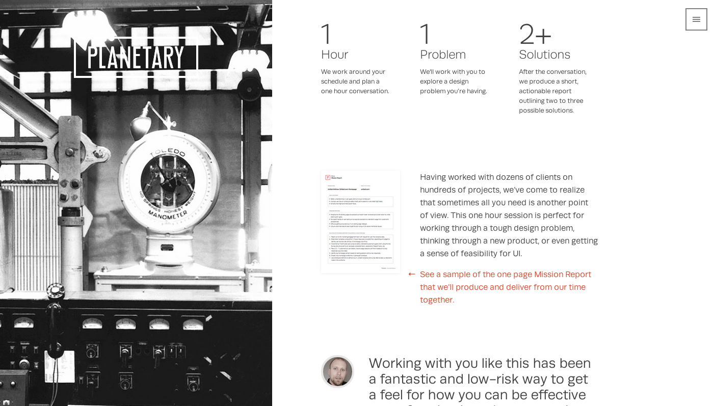
Consulting firm Planetary uses workhorse sans-serif Runda for nearly all the text on their homepage, but with a thoughtful mix of size and weight that keeps the design from feeling too static. We love how the open feel of Runda keeps the body text flowing, and the shapes are sturdy enough to make for solid header text as well.
SpaceX

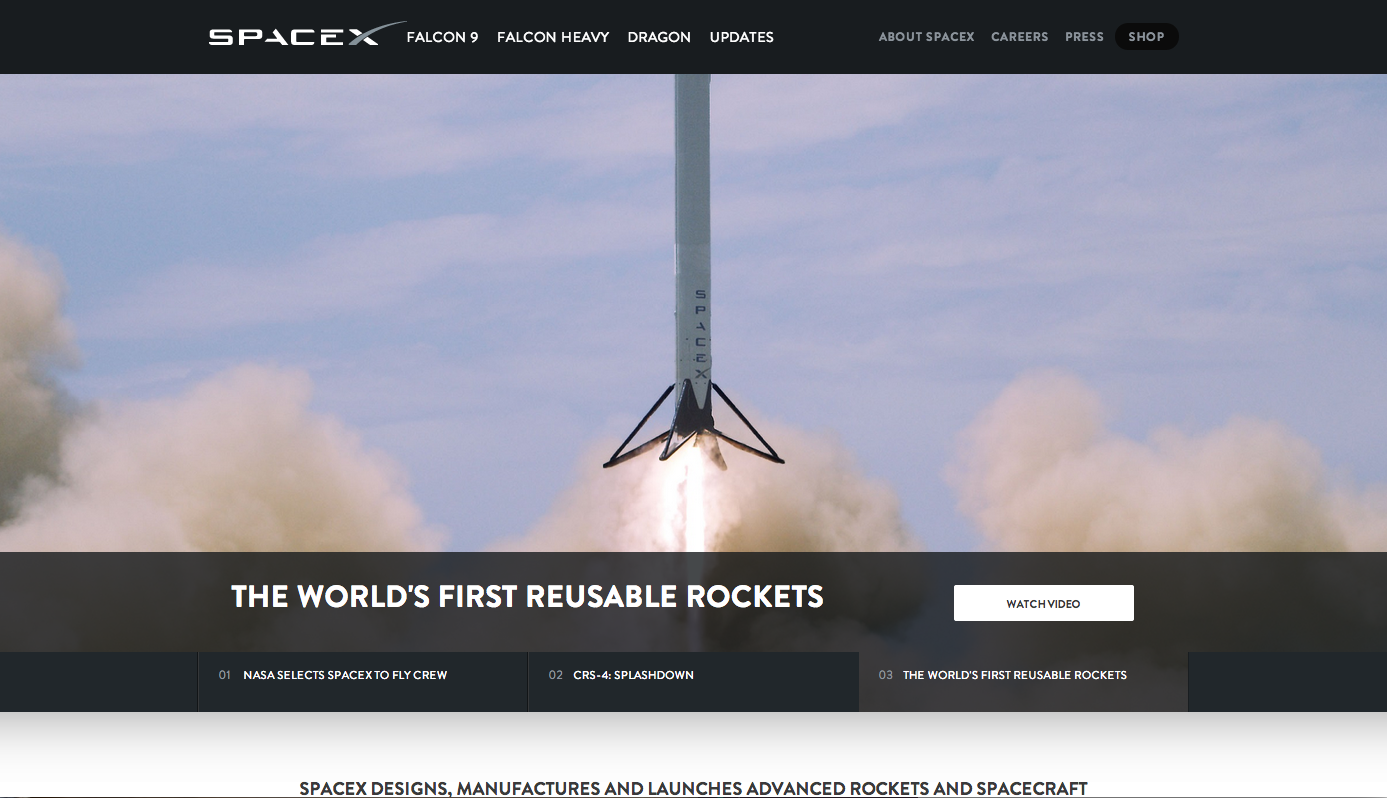
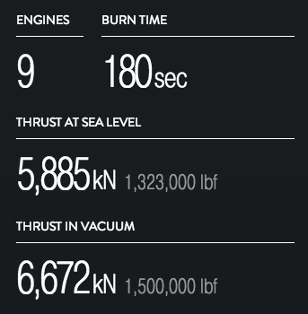
Space metaphors are all well and good, but let’s talk for a minute now about actually going to space, where geometric typefaces surely reign supreme. SpaceX leads with Brandon Grotesque on their rocket-powered website. Drill down for details on specific rocket launches, and you’ll find some beautiful Pragmatica Condensed for the numerals (and a few fun scrolling animations).

That’s it for this week; share sites you like in the comments!
Update 11/24/2014: Sometimes we misidentify fonts, too! We updated the Planetary.io profile after a brief mix-up.
One Response
Comments are closed.
Hi, I’m David, half of Moonbase.
Just wanted to say thanks. It’s such a great compliment that you are having us here!