Sites We Like: Menagerie & J. Stark
This week, we’re looking at two sites with painstakingly-crafted pieces of functional, physical design: some very tangible holds for indoor climbing, and beautiful collection of handmade leather accessories. We love the attention to detail on these websites, the economical design sensibility — and, of course, the typography on display.
Menagerie

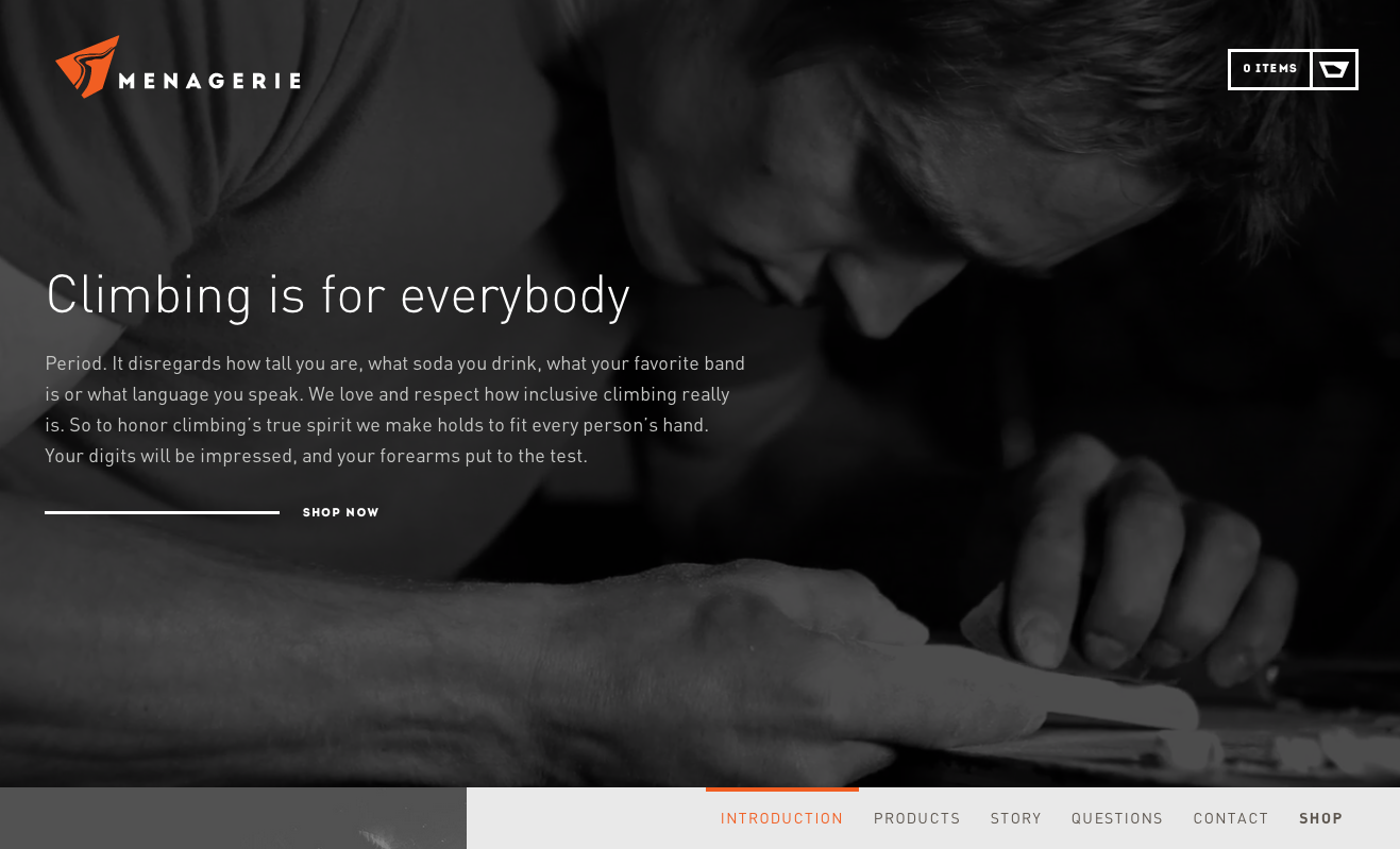
The Menagerie website is a candy store for climbers — particularly anyone setting up their own routes — but even those of us inclined to stay on level ground can appreciate the excellent choice of FF DIN for the typeface on this page. The text acts as a graceful counterpart to the photography, effortless to skim while letting the images take the visual lead.
J. Stark

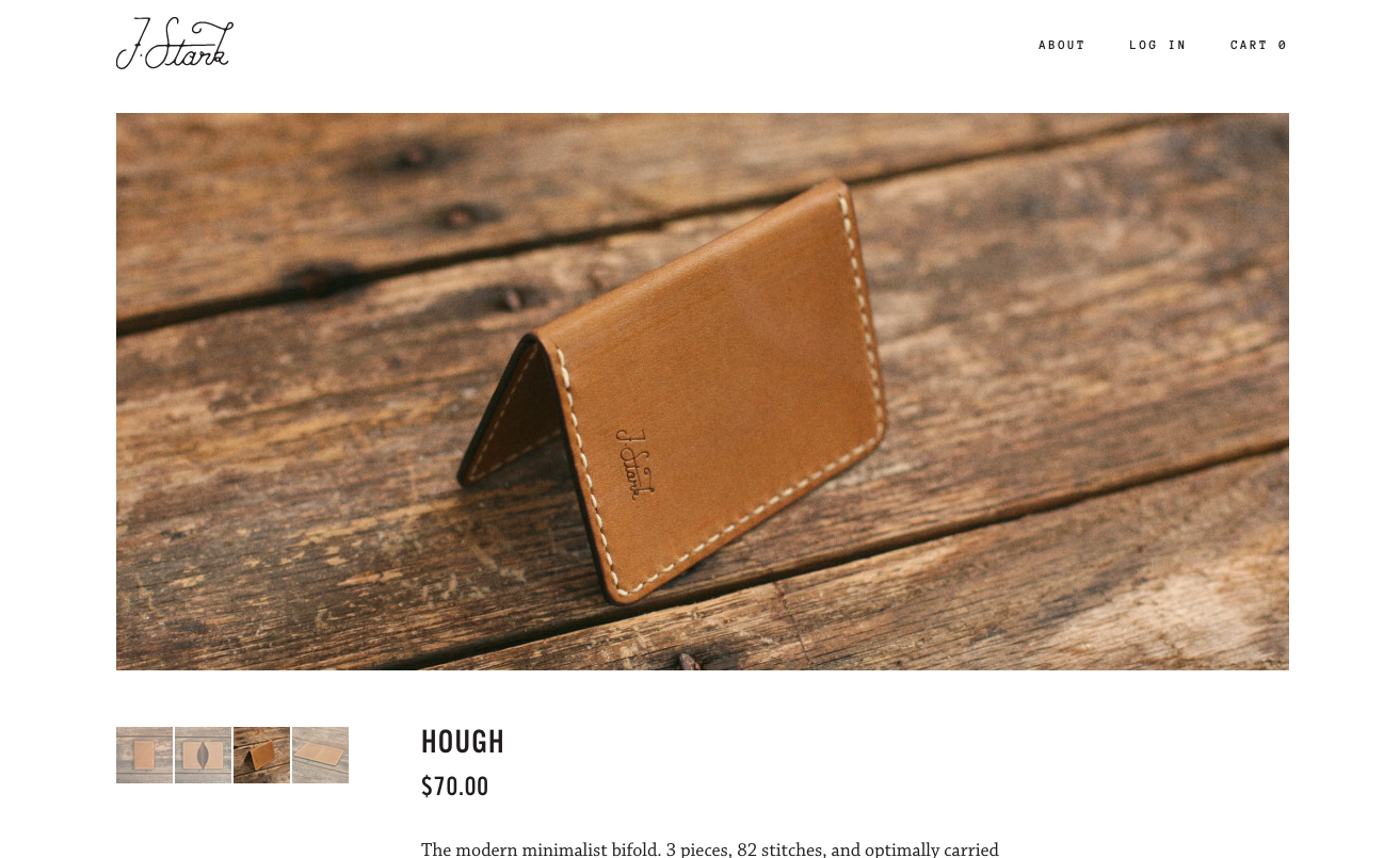
Photography also counts for a lot on the J. Stark website, where it showcases the fine crafting that goes into their catalog of accessory products. We love the type combination on this page, too; Anonymous is put to surprisingly effective use outside its usual life as a code font, while Alternate Gothic No. 3 D makes for perfectly weighted headings (and great numerals), and the body text appears in lovely, poetic Chaparral.
That’s it for this week; share sites you like in the comments!
3 Responses
Comments are closed.
Any chance of getting FF DIN on Typekit? With desktop sync? 🙂
Up that. FF Din on typekit would be nice.
Thanks for your interest! No immediate plans to make FF DIN available for sync, but I will make sure it’s on the request list for you.