Catching up with Ken Lunde on Source Han Sans
We’re planning to talk with some of the foundry partners who worked on the Source Han Sans project alongside lead designer Ryoko Nishizuka, as it was an unprecedented team effort and would not have succeeded without the broad range of contributions. Before we go down that path, though, it seemed appropriate to spend some time talking to Dr. Ken Lunde, who oversaw the entire collaboration.
Ken has worked at Adobe for nearly 25 years. David Lemon, Ken’s manager for the past 15 years, recalled that in 1991, when Ken was hired, “At the time we didn’t have anyone who understood Japanese character sets and encoding requirements, and could ensure the fonts did what they should. Although he was still in graduate school, we were convinced Ken Lunde was the guy we needed.”
Talking to Ken today, it’s indeed hard to imagine a more perfect role for him.
What was your first project after your joined Adobe?
My first task was to work on Cube, which is the multiple master-based element technology that was used for Kozuka Mincho and Kozuka Gothic, and was pivotal in Source Han Sans. I was tasked to build the first working Element Library that was based on Heisei Mincho W3, and it was through this work that I discovered that we needed more than three design axes (the three design axes were why it was originally called Cube). Each of these axes represented a design attribute, such as width, height, and weight. I believe that I used up to four design axes for that proof of concept font, the fourth axis being for the degree of curvature for curved elements.The end result, which included approximately 300 kanji keyword glyphs, was presented to Adobe co-founders John Warnock and Chuck Geschke late in 1991.
David described the shape of Ken’s career at Adobe, saying, “From the very beginning, Ken has been the one who made the final builds for Adobe’s East Asian fonts. Wrangling 20,000 or 30,000 glyphs at a time is a demanding task, which Ken approaches thoughtfully. He’s devised a number of proofing processes to catch most glitches, and automates nearly every step in Perl.”
How did you learn Japanese? And how did you get interested in this line of work?
I learned Japanese in college because my major, linguistics, required one year of a non-Indo-European language. I narrowed my choices down to Arabic and Japanese. I obviously chose Japanese. Keeping in mind that I made this decision in 1985, and given the events that transpired in the Middle East in the early 1990s, I am glad about the decision that I made. It was like a fork in the road. The Arabic fork would have meant a lot of sand in my boots, because I was still in the military at the time.
My interest in font development arose from this interest in Japanese character sets and encodings. Fonts need to map characters of a character set, encoded in a particular way, to glyphs in the font. Developing fonts is a natural extension to my original interest, because it provides the underpinnings or foundation for fonts.
Fast-forward 23 years. Your book, CJK Information Processing, is the definitive reference for everything related to East Asian text handling. What led you to write the first edition?
There was a genuine lack of information about CJK character sets and encodings, and writing a book about this topic seemed like a good idea at that time. What actually prompted the first book was someone taking my earlier writings on the subject of Japanese character sets and encodings, and turning them into a published article that made little sense. I figured that someone would eventually do the same thing at the book level, and I could preempt that by writing a book on the subject. What surprised me the most was that the book was translated into Japanese two years later, because there was no equivalent book written in Japanese.
Let’s talk about Source Han Sans. What does this project mean to you?
Source Han Sans provides a large number of customers with a set of high-quality fonts that provide a consistent look and feel across various East Asian languages, and comes with the right price tag: free. This project also gave me an opportunity to work more closely with our team in Tokyo, and with type foundries in East Asia. I find it very gratifying to have worked on a project which provides such great value to so many people.
For a long time, I have been interested in building a font using the OTC (OpenType Collection) format, and this project gave me that opportunity. In my opinion, OTC is the ideal deployment format for Pan-CJK fonts, because it provides a best-of-both-worlds approach. First, this format is compact because the multiple per-language font instances all share the same CFF, which is the largest table of the font. This format advertises multiple font instances in application font menus, one for each supported language. In addition, each font instance includes the ‘locl’ GSUB feature, which allows access to the glyphs for the other languages through the use of language-tagging. Adobe InDesign is an example of an app that can consume the OTCs, and take advantage of the language-tagging functionality. The pain point of the OTC deployment format is lack of support in Windows.

Ken wearing his CJKV Type Development lab coat and holding one of the twelve volumes of 大漢和辞典 (daikanwa jiten), Japan’s largest and most authoritative kanji dictionary.
You first started thinking about this font 15 years ago. Was the technology there 15 years ago to pull this off?
Sort of. While the technology allowed us to build the fonts, the infrastructure to support Pan-CJK fonts wasn¹t in place 15 years ago, in terms of adequate support in apps and OSes, and to some extent, the infrastructure is still being developed. The two pain points are the lack of OTC support in some environments, such as Windows, and the lack of support for the ‘locl’ GSUB feature, and by extension, language-tagging, in most applications. My hope is that broad use of Source Han Sans will motivate app and OS developers to finish building the necessary infrastructure to support such fonts. Because of these limitations, we also provided the fonts in more conventional formats (OTF).
I’d like to point out that the font tools that we have today, most of which are available in AFDKO, are much better than what we had 15 years ago.
What was your most challenging task for Source Han Sans?
The most challenging aspect was figuring out which glyphs can be shared across regions, and which could not. While this mainly affected ideographs, region-specific conventions spill over into other parts of the character repertoire. Overall, I am very pleased about how this turned out.
What was the most surprising thing about your work on Source Han Sans?
The most surprising things were learning how much of an important role Unicode played in the development process, which was mainly done by giving every glyph in the fonts a unique Unicode-based working name. This helped to drive the process of automating the generation of the various resources that were used to build the installable font resources and also made glyph assignment changes easier to manage.
Another surprising thing was finding various errors and inconsistencies in the national standards. Some of these standards have been around for many years yet some of these errors have never been discovered. It is a testimony to the completeness of the Source Han Sans font, that we were able to uncover these inconsistencies and make them known to the relevant standards organizations.
Ken writes frequently about these issues on the CJK Type Blog as he encounters them. David noted, “Source Hans Sans is the most complete and correct pan-CJK family ever shipped – and that level of quality has everything to do with Ken’s diligence and expertise. But there’s always room for improvement. Ken embraces the Japanese concept of kaizen (continuous improvement), and immediately started tracking issues reported by Adobe’s QE and by our users. He’s now in the middle of developing a revised version of the family that will be even better.”
Given that you’ve spent the greater part of your career driving CJKV information processing, how does the creation of this font stack up with the other CJKV work you’ve done?
Source Han Sans pushed the envelope in more ways than one. First, the sheer number of glyphs is daunting, which needs to be multiplied by seven weights to fully understand the scope. That’s nearly a half-million glyphs. Second, supporting multiple languages, each of which requires thousands or tens of thousands of glyphs in a single font resource, is something relatively new. This required great care and coordination.
Speaking of coordination, working with multiple type foundries was challenging, mainly in coalescing the data into a single uniform set of glyphs that work in unison. The working in unison part is the result of great efforts by its typeface designer, Ryoko Nishizuka, and our foundry partners following her design guidance and promptly correcting issues as they were found during various stages of review.
“It’s fair to say that Ken was living and breathing Source Han Sans for the entire last year of the project,” David added.
I understand that you were limited to 65,535 glyphs. If you had another 3,000 glyphs you could add, what would you add?
We actually have over 3,000 additional Japanese glyphs, above and beyond those in Adobe-Japan1-6, which needed to be excluded due to the 64K glyph barrier. Those are the first candidates I can think of. Beyond that, additional Traditional Chinese glyphs would be important to consider. Symbol-wise, the fonts are in very good shape, at least for CJK purposes.
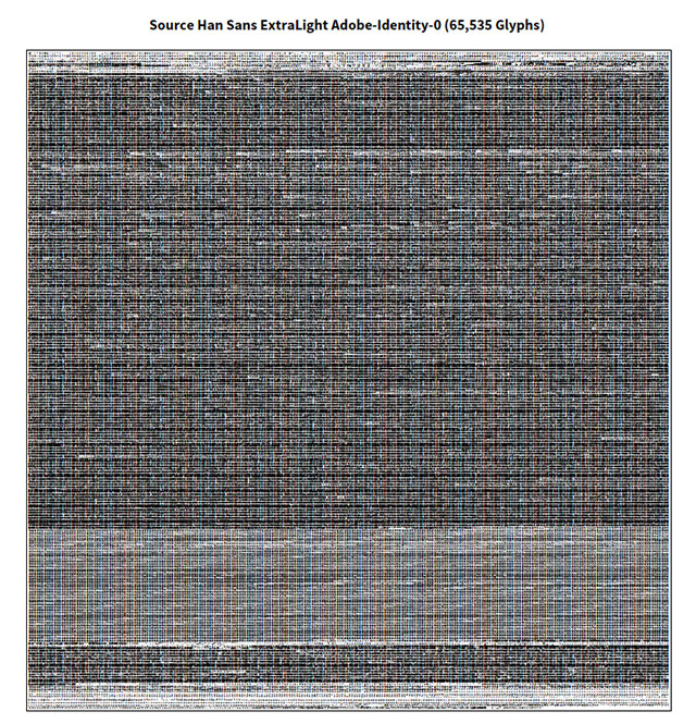
Caption: A table showing all 65,535 glyphs from one of the Source Han Sans fonts. Click it to view a single-page PDF.
What advice would you have for a foundry that wants to go about creating a Pan-CJK font? Is there any place people can go and find out more information about your tools and process?
First and foremost, while it is important to follow or adhere to standards, in terms of character sets and glyphs, it is equally important to be able to recognize when a standard has an error. Standards are made by humans, and humans, by definition, make mistakes. There’s nothing magical about standards, except that they should be relatively error-free, which is a result of the processes that are used to compile them.
I also feel that it is important, for practical reasons, to limit the scope of the font, in terms of character set and language coverage.
As for tools and best practices, I write frequently on this topic over on the CJK Type Blog, and you can also follow me on Twitter at @CJKType and @ken_lunde.

Ken and his wife, Hitomi, aboard the Napa Wine Train on Valentine’s Day of 2010. Photo taken by Kiyotaka Taki.
One Response
Comments are closed.
Feom: http://www.douban.com/group/topic/61886123/ 1996zauri: 现在觉得思源黑体真是中文黑体史上最失败的黑体之一… Ca®dinal: 甚至我觉得字数多也不是优点而是神经病。如果一款字体有带窗户框子和不带的我当然装那不带的。