Sites You Like: Our Clubhouse, The Sports Column, & Lango Hansen
We love hearing about the fonts that catch your eye on the web (or anywhere, for that matter). This week, we’d like to highlight a few that you mentioned to us over on Twitter. You’ve got some great taste!
Our Clubhouse

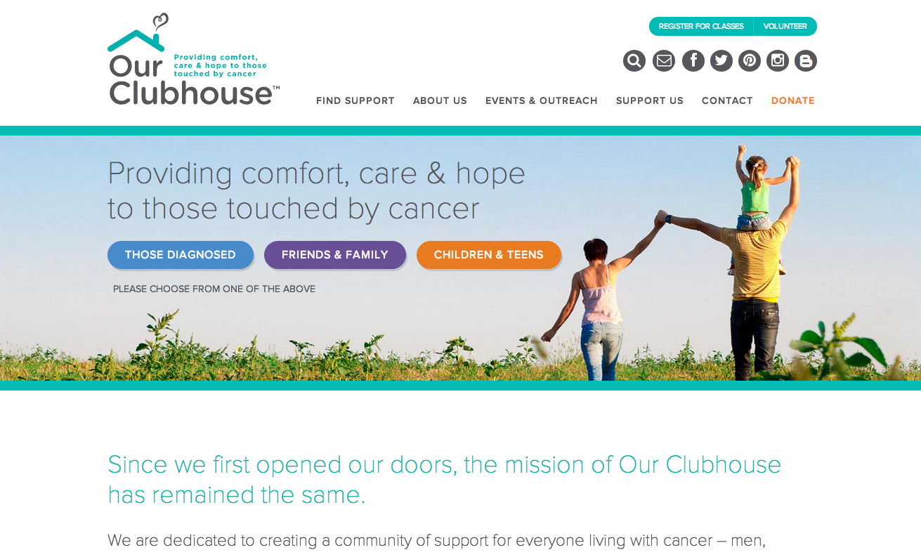
A community hub for people with cancer — as well as their families — Our Clubhouse takes just the right tone of warmth mixed with clarity to help people through difficult times. The site is well organized with straightforward language, and Proxima Nova fits nicely here, unobtrusive but not detached. (Thanks to @dmcgrew for the suggestion.)
The Sports Column

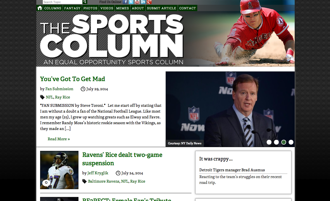
The Sports Column features regular columnists alongside outside contributors in an “equal opportunity” venue for sports reporting. Body text and navigation is set in steady Skolar, a lovely serif choice that is as easy to read as it is attractive. Cronos appears in the footer text. (Thanks to @jeffrey_powers for the suggestion.)
Lango Hansen

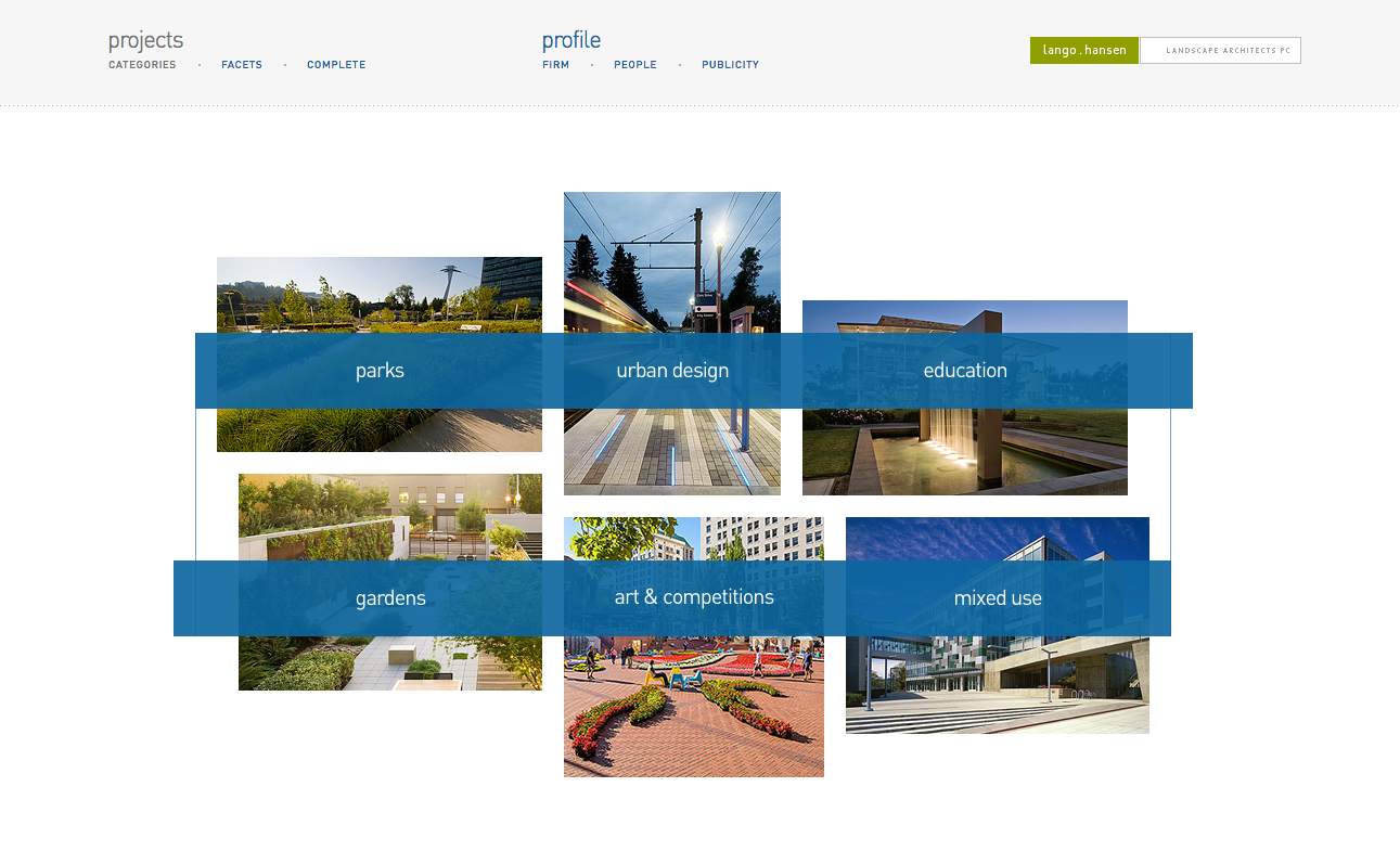
The understated website of Lango Hansen, a landscape architecture firm based in Portland, nearly belies the impressive breadth of their portfolio of work. FF DIN is used for all text on the page, emphasizing the tidy, restrained character of the overall design while giving it a slightly modern edge. (Thanks to @benish for the suggestion.)
That’s it for this week; share sites you like in the comments!
One Response
Comments are closed.
A shameless plug for a site I like – http://alexdeckard.com