Sites We Like: New Yorker, Offscreen, & Elsewhere
We’re in the dog days of summer now, the perfect time to dig into those summer reading lists. Can’t bear long-form reading with subpar type? We’ve got a few suggestions for you to check out this week.
New Yorker magazine
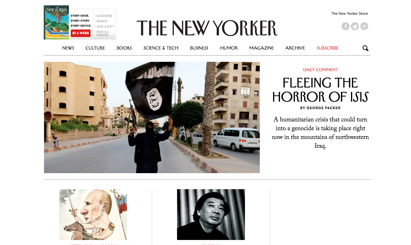
The recent site redesign for the New Yorker features Adobe Caslon for all the article text, a bookish typeface whose texture gives the words just the weight you’d expect from the renowned publication. The iconic header font, recognizable from the printed magazine, was designed early in the New Yorker‘s history by Rea Irvin. (Learn more about custom font hosting options with our Enterprise plans.)
Offscreen magazine

Offscreen magazine takes its name quite literally; the magazine is print-only, but has nonetheless put together a thoughtful website to show screen addicts a little of what they’re missing. It’s some of the best-looking “teaser” copy we’ve seen, and Adelle Sans performs beautifully in this space. The lovely serif on the page is Tiempos Text from Klim Type Foundry.
Elsewhere
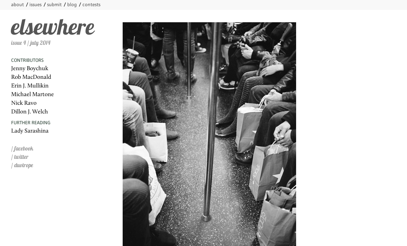
The makers of Elsewhere magazine felt such pride at their type selection (and rightly so!) that they shared their thoughts in a blog post. Lobster sits front and center, and is exceptionally well-balanced by the restrained site layout and minimal color. Body text is in classy Calluna, and JAF Facit makes for unobtrusive subheads and navigation.
That’s it for this week; share sites you like in the comments!
One Response
Comments are closed.
Thanks for the mention. However, it’s spelled “Tiempos Text”.
–K