The Adobe Originals Silver Anniversary Story: How the Originals endured in an ever-changing industry
This is the seventh in a series of articles from Tamye Riggs, a longtime lover of type who is working with us to celebrate the twenty-fifth anniversary of the Adobe Originals type design program. This post explores multiple master fonts and OpenType, and how the Adobe Type team continued to innovate in type design and font technology.
It was certainly one of the striking and exciting things about being there and working with everyone — everyone was passionate about the craft, about making good stuff that would be reliable, and, at the same time, represent an advance in type design. Percentage wise, there’s just a huge amount of finely crafted workhorse typefaces and classic display faces that have already stood the test of time, and I’m sure will for decades, probably centuries to come. Whether it’s Adobe Garamond or Trajan, these typefaces are going to be around indefinitely.
— Thomas Phinney, former Product Manager for Adobe Type
Knowing what I know now, I would have fought very hard outside of Adobe and within Adobe to make sure the [multiple master] business model made sense. John [Warnock] and Chuck [Geschke] thought it was cool. Steve Jobs thought multiple masters were cool. But it didn’t work out that way — wanting to do something, and then really doing it. But it’s cool stuff. I love it. Everyone is using it to come up with fonts.
— Fred Brady, former Manager of New Type Development for Adobe
OpenType solved some very compelling problems and also offered some really fascinating capabilities for type designers, offering the kind of technical challenge that Adobe had become very good at confronting and implementing.
— Christopher Slye, Type Licensing Manager for Adobe Typekit
The early days of the Adobe Originals program were also golden years for the company in general, and a boon to typographically savvy graphic designers who embraced desktop publishing. With digital type gaining broader acceptance throughout the early 1990s, the Originals team was continually challenged to produce high quality type quickly and efficiently.
In addition to expanding its typeface library, Adobe was constantly developing font technology. Much of this development was driven by sheer necessity: Adobe had to push hard to stay competitive in the “Font Wars” that began brewing in the late 1980s. After two years spent in development, Apple engineer Sampo Kaasila completed what would become known as the TrueType font format in August of 1989. This format, which would be popularized through a partnership between Apple and Microsoft, had every chance of toppling Adobe from its font technology throne by replacing PostScript Type 1 fonts.
“Sampo went to Apple because he’d been developing font technology for Imagen, one of the companies that had competed with Adobe in the page-description language space,” said David Lemon, Adobe’s senior manager of type development. “When Imagen lost to Adobe, Sampo needed a new home for his innovation. The ‘law of unintended consequences.’”
Subsequent to Apple and Microsoft announcing TrueType in the fall of 1989, Adobe countered with the announcement that it would be publishing its PostScript Type 1 font specification. Adobe’s shift from a proprietary to an open standard would allow third parties to develop Type 1 fonts as long as they adhered to the spec, helping PostScript remain competitive in the battle for font tech supremacy.
The first version of Adobe Type Manager (ATM) was released in 1990. ATM was a utility designed to improve font handling and appearance on screens and printers that didn’t use PostScript. ATM was also necessary for proper functionality of multiple master fonts.
To further combat Apple and Microsoft’s efforts to knock down PostScript fonts, in 1990, Adobe released Adobe Type Manager (ATM), which gave accurate real-time previews of type on a user’s screen. “Prior to that, one had bitmapped ‘screen fonts’ that were scaled to approximate any sizes that weren’t prebuilt, so they looked awful,” Lemon said. “ATM was rasterizing on the screen (and on printers that didn’t use PostScript). This was a capability we knew Apple would have when they shipped TrueType, so we got it out nine months before they did.”
Circa 1996, ATM Deluxe would be released as a monetized product, with the software expanded into a robust font management and troubleshooting tool. With increasingly sophisticated non-PostScript publishing tools and a viable alternative font format available, continually improving font handling was essential to keeping type users — the paying customers — happy.
ATM played another important role in the Adobe Originals story: it was an essential utility for type users who wanted to take advantage of the flexibility of an emerging font format.
Introducing multiple masters
In 1991, the multiple master format was introduced as an extension to PostScript Type 1. Multiple master fonts, or MM fonts, were built with two or more design masters — outline typeface styles — with font “instances” generated through interpolation along one or more design axes (such as weight, width, and optical size). MM fonts allowed end users greater flexibility and more precise control of their typography than was possible with standard PostScript fonts.
“Interpolation is a mathematical term borrowed by computer graphics, where one things morphs into another through a smooth continuum,” Lemon said. “Multiple master fonts were another cool way to use computer power to improve font technology. A single multiple master font offered untold potential for typographic fine-tuning, without compromising the aesthetics or readability of letterforms.”
Typographer and lettering artist Stephen Harvard, a member of Adobe’s Type Advisory Board, sparked the team’s interest in typographic interpolation early on in the Originals program. At a 1988 board meeting, he brought along a printout he had made that displayed a series of interpolated letters.
“[Stephen Harvard] had digitized two letter a’s, one a large optical size — probably Garamond’s Gros Canon type — and the other from a small size of Garamond type, running a series of interpolated letters between them. Interpolation was not new, but the progression of intermediate sizes that his test revealed remained in my mind. Later that year, while viewing various sizes of Garamond and Granjon type at Plantin-Moretus Museum, I began to pay close attention to this aspect of their work which fueled my interest to eventually produce a Garamond with a range of size-specific fonts.”
— Robert Slimbach [1]
Slimbach and fellow lead type designer Carol Twombly developed the first multiple master typeface designs: “sibling” fonts Myriad MM and Minion MM, both released in 1992. Minion MM was a reworking of Slimbach’s popular serif family, while Myriad MM, its sans text companion, had been a collaborative project initiated by Sumner Stone, Adobe’s first director of typography. It was Stone who drove the concept of multiple master fonts within the company.
“I promoted it at Adobe, but I left soon after,” Stone said. “I said it should be called the Mother Hubbard project: she had so many children, she didn’t know what to do. I’m not the one who thought up the interpolation — that person was Peter Karow [co-founder of URW]. Peter put it to use in IKARUS [in the early 1970s]. The thing I thought up was putting the interpolation in the interpreter. [John] Warnock was enthusiastic because of Acrobat, and what about fonts? They got away with embedding, which was incredible finesse. But initially, we’re going to imitate every font with some basic font.”
On putting the power of multiple masters in the hands of typographic novices:
“The purists are going to say, ‘Whoa, wait a minute.’ My guess is that the scribes and monks didn’t think Gutenberg had such a good idea, either.”
— Allan Haley, Director of Words and Letters, Monotype [2]
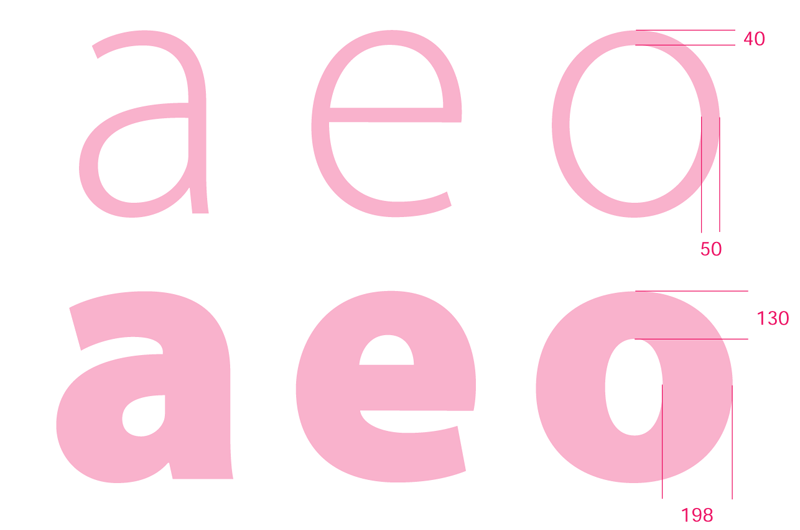
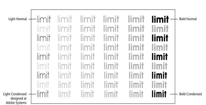
The stroke weight ratio between the light and bold weights of of Myriad MM. Originally shown in “Designing Multiple Master Typefaces,” published by Adobe 1995, 1997.
Myriad MM and Minion MM were ambitious designs, developed in tandem in order to have both a sans and serif family to show the multiple master font technology to its best advantage. Myriad MM included four masters and 15 primary instances in each font, ranging from Light Condensed to Black Semi Extended, with expansive weight and width axis ranges. Minion MM also featured weight and width axes — from Light to Bold and Condensed to Regular — and it was the first family to use the optical size axis, ranging from Caption to Display. “This component included some pretty cool technology itself, approximating a curve to apply the interpolation non-linearly,” Lemon said.
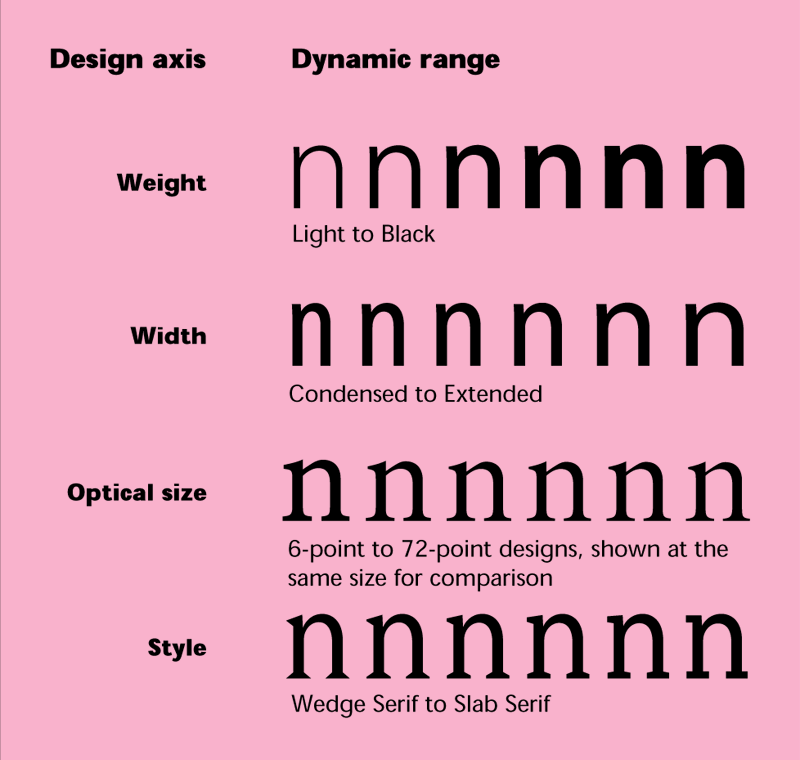
Some of the potential design axes and dynamic ranges that can make up a multiple master typeface. Originally shown in “Designing Multiple Master Typefaces,” published by Adobe 1995, 1997.
Inspired by the possibilities of the new font format, the Adobe Type team set to work developing MM fonts. Over the next six years, the majority of multi-font families by Twombly and Slimbach would be developed as multiple masters, including Caflisch Script, Adobe Jenson, and Warnock (Slimbach), and Chaparral, Nueva, and Viva (Twombly). A number of outside designers were also recruited to develop MM fonts: the late Michael Harvey (Mezz and Conga Brava), Lance Hidy (Penumbra), Richard Lipton (Bickham Script), Jim Parkinson (Jimbo), and Julian Waters (Waters Titling), among others.
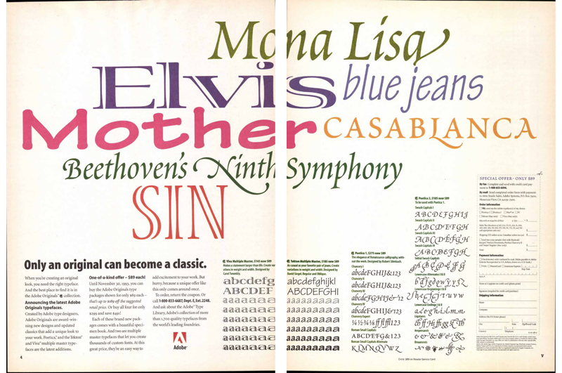
Two-page advertisement for Adobe’s multiple master fonts, published in “U&lc,” Vol. 20, No. 1, Spring 1993, by International Typeface Corporation. Image courtesy of Monotype. (Click image to access a PDF of the entire issue.)
Lemon recalled Adobe Type worked on designs from early foundry partners to expand available multiple master font offerings: “We also made MM ‘retrotfit’ versions of some existing Berthold and International Typeface Corporation [ITC] faces as a way to help promote the technology.”
One such retrofit was the making of ITC Avant Garde into a multiple master font. Herb Lubalin and Tom Carnase’s expressive geometric sans was an ad typography staple of the 1970s, and highly successful in the hands of skilled typographers (but badly mistreated by less-than-talented practitioners). ITC Avant Garde MM was released to great fanfare in May 1993 as a two-axis typeface; the Light Normal, Bold Normal, and Bold Condensed master type designs were taken from the original PostScript family, while the Adobe Type team created the Light Condensed master to complete the design.
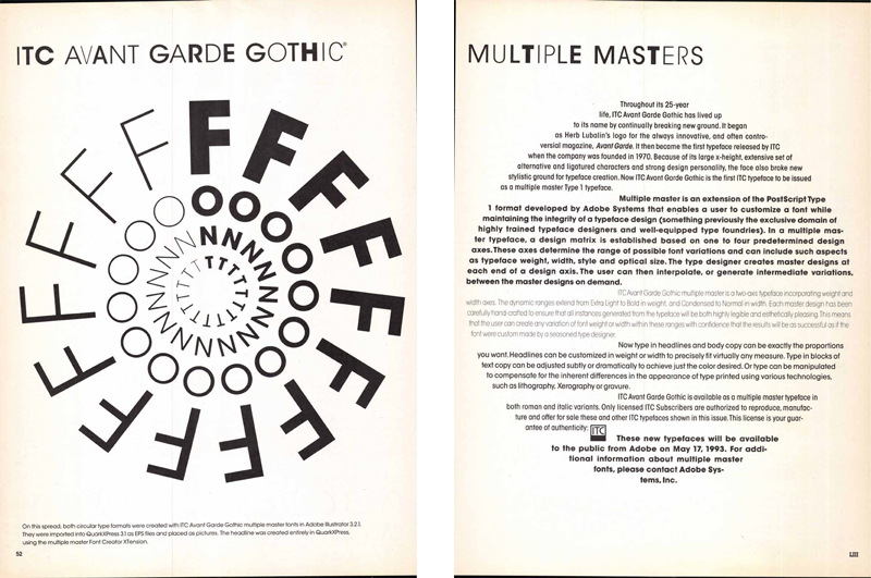
ITC Avant Garde was “retrofitted” for the multiple master font format, and was the first ITC family to be released as an MM font. This two-page announcement was published in “U&lc,” Vol. 20, No. 1, Spring 1993, by International Typeface Corporation. Image courtesy of Monotype. (Click image to access a PDF of the entire issue.)
ITC Avant Garde MM, “retrofitted” for the multiple master font format. The primary fonts are highlighted in black. Originally shown in “Part 2: Adobe’s Typeface Design Process,” published by Adobe 1995, 1996.
Although the technology was exciting, multiple master fonts were daunting for end users to work with. Application developers were slow to show real support of multiple masters, and in software that could use MM fonts, working with the format was invariably a painful process. Users were forced to generate instances for each variation of a font they wanted to try, resulting in a hard drive littered with font files bearing such arcane names as MinioMM_578 BD 465 CN 11 OP. Rather than deal with such cumbersome logistics, users would often stick with the pre-generated instances that shipped with MM fonts, missing out on all that glorious technology.
“The multiple master format was a wonderful idea,” said Read Roberts, font tools engineer for Adobe Type. “The obviously wonderful thing about is you had a font file that let you explore a whole design space. The end user could end up with any instance they wanted in a range from heavy to bold, expanded to condensed, cap height variations, optical height variations … whatever you wanted to throw in as a developer.”
While a handful of third-party type designers and foundries released MM fonts, the format wasn’t widely embraced by developers outside Adobe. Fred Brady, former manager of new type development for Adobe, recalled that other foundries didn’t want to design multiple masters: they were a lot more work, and it made better fiscal sense to use interpolation to create static masters for fonts and sell them separately.
“When we came up with multiple master font technology, I think that was probably — for me — the most exciting type-related tech thing other than scaleable fonts that happened in all the time I was doing fonts,” Brady said. “It was a great innovation that Adobe had done, allowing you to interpolate fonts on the fly. It died because of a lack of total commitment from the market and in educating people. It could have been very useful for any market if seamlessly integrated.”
In the mid-1990s, while the type team was still working to promote multiple master fonts to the masses, another font technology with far-reaching potential was peeking over the horizon. Font War alliances shifted when Adobe and Microsoft mended fences and announced their joint OpenType initiative in 1996.
The OpenType initiative
The globalization of design and communications necessitated a more robust font format, one that could provide international language support and enhanced typography. Built to accommodate Unicode character encoding, multiple world scripts, and up to 65,536 glyphs, OpenType could easily support typographic layout features like ligatures, small caps, multiple figure styles, and many other niceties. What’s more, OpenType fonts consisted of a single file that could work across platforms (as opposed to Type 1 fonts, which needed two files to run on the Macintosh operating system, and a completely different pair of files to run on Windows). Adobe and Microsoft intended for OpenType to replace PostScript Type 1 and TrueType.
Robert Slimbach’s broad-edged pen exercises and pencil sketches from the development of Warnock Pro. Slimbach was an early advocate of broadening language support in the Adobe Originals, inspiring him to learn to design Greek, Cyrillic, Arabic, and Hebrew in order to extend his Western character sets.
The same OpenType functionality that enables advanced typography for Western languages is necessary just to do basic typesetting of languages such as Arabic and the Indic languages. “What’s rarely clear to Western typographers is that many of the ‘cool’ features of OpenType are enabled by an architecture that’s essential for many non-Western systems,” Lemon said. “This is critical because Microsoft would never have gone down the OpenType path if it weren’t for the need to support ‘complex scripts,’ as they were called then.”
Hampered by memories of the less-than-spectacular response to multiple master fonts and Apple’s advanced GX font technology, OpenType would have a great many obstacles to overcome before it would gain acceptance by developers and end users alike. About a year after Adobe and Microsoft announced their initiative, Adobe Type was fortunate enough to recruit a new employee who would become one of OpenType’s biggest proponents.
Thomas Phinney, who had completed his master’s in graphic arts publishing at the Rochester Institute of Technology (RIT) in the spring of 1997, was considering his career options when he became aware of an opening in Adobe’s type group.
“I almost didn’t apply for it,” Phinney said. “The job description called for someone to do software mastering: the official key duty was to do the final crank-turning steps and throw the fonts on a disk, [along with] other bits they had to put on the floppy; ATM Light, EULAs, etc. It didn’t sound that exciting at first.”
But Phinney recalled that, in the job description, Adobe asked for some more advanced skills that had little to do with the job described. “It wasn’t clear whether this person would get to do something more exciting,” he said. “They emailed me the job opening because I managed to get the attention of the manager of the group at the time, Dan Mills. I looked at it and said, well, the job duties aren’t exciting — but it’s at Adobe, which is my dream place to be.”
“Dan was a strategist, so he approached Thomas with the question: ‘Do you know someone who’d be a good fit … ?’ It looked like we were asking about Thomas’ students but Dan was really angling for Thomas,” Lemon said.
Phinney, who had taught a font production class at RIT, encouraged a few of his students to apply, but his interest in Adobe got the better of him. “Eventually, I had a little more back and forth; Dan made it super clear that while it was entry level, there would be real opportunities for advancement. I applied for it, and — long story short — they flew me out and eventually hired me.”
Phinney joined the type team in June 1997, at a time when the Originals program was in a major transition. “Adobe type had gone through dramatic downsizing in 1994. They hadn’t hired anyone new in the type group in three years. A month later, they hired Christopher [Slye] as well. He was always the new guy to me!”
The type team began the migration away from multiple master fonts to OpenType, a move that would require a tremendous time investment. In addition to revising and expanding the Adobe Originals for OpenType, the type team had another Herculean task ahead of them. The Alchemy project, as it was dubbed, was the planned conversion of the entire Adobe library — then consisting of more than 2,700 fonts — into OpenType.
“This was no straight conversion,” Phinney said. “Characters such as the euro were added, kerning enhanced, and supplemental fonts merged into base fonts (with all the OpenType features such merging required). In the most extreme case, that of Poetica, 21 fonts merged into one.”
The Alchemy project afforded the type team an opportunity to greatly expand and make technical and aesthetic enhancements to a number of the existing Originals. “Some of the Originals were seriously reworked for OpenType, including Minion (Robert refined the design and added Greek — he had already done the Cyrillic in 1992) and Utopia (optical sizes added),” Lemon said. “We extended the Latin in Bickham and added extensive contextual behavior rules for its many alternate glyphs.”
“I did a lot of work developing the layout features in those first OpenType fonts, and it was a chance to combine very straightforward software programming techniques with typographic considerations — which seemed to me at the time like a perfect job,” said Christopher Slye, type licensing manager for Adobe Typekit. “Those first fonts also served as models for subsequent third party developers, so it was very satisfying to be establishing new standards while also engaging in serious typographic problem solving. Combining all of the old expert sets, putting the pieces together into a single font, and writing instructions to let each feature work in an intuitive way — it all seemed very much like the next natural step for digital type. Doing it at Adobe with the cooperation of other product teams was really fun and satisfying.”
The Alchemy project took more than two years to complete, with the last fonts converted to OpenType in 2003.

Richard Lipton’s elegant Bickham Script lights the edifice of Macy’s in Herald Square, New York City, during the 2012 holiday season. Bickham was a multiple master type design that made a successful leap to OpenType, becoming one of the most popular scripts in use since it was first published in 1997. Photo by Nick Sherman.
“The transition to OpenType was technically challenging, of course, but challenging on all sorts of levels,” Phinney said. “On the outside, it looks like the production of Adobe Originals plummeted. These OpenType fonts got way bigger; [we were] designing for more languages and so on. We went from having fonts that had 220-some glyphs to the smallest new fonts having 384 or so, while these days, a typical new Adobe typeface has 3,000 glyphs per font. Yes, there are a lot of accented glyphs you can compose without much work, but when you have twelve times as many glyphs per font, it takes substantially longer.”
In the literal sense, the perception of reduced typeface output was partly true, Phinney said. “Although the ones that come out are so much more: richer typographically, more depth linguistically … you can’t produce as many.”
The migration to OpenType was the kiss of death for multiple master fonts. The last Adobe Original MM font family was Reliq, designed by Carl Crossgrove and released in 1998. The OpenType revolution had begun in earnest. But would this new format succeed where multiple master technology had failed?
“There are all sorts of smart talented creative folks on the team,” Phinney said. “I think one thing I brought to the mix when looking at everything was just some particular analysis and thinking about OpenType. We were putting everything into this new font format, and, if it flopped, it was going to be bad for us in many ways: wasted work; horrendous for morale; and a huge lost investment.”
“I was sitting there looking at this. Even before I started the MBA [at Berkeley], I was looking at it like you would a business case study. I was thinking about two things: Apple GX typography (now Apple AAT fonts) and multiple masters. Both were awesome font technologies; both MM and GX were brilliant ideas, both better mousetraps. But in neither case did the world beat a path to that new technology’s door.”
Phinney recalled spending a lot of time thinking about why GX, MM, and AAT failed. “I was trying to think if these same factors did apply to OpenType,” he said, “and to the extent that we had any control over it, trying to make sure we did what we could to make sure we didn’t repeat those errors.”
What did Adobe do wrong with multiple masters? “Adobe, for the most part, did not get multiple master support into its applications. Illustrator took advantage of sliders, but not Photoshop or Pagemaker,” Phinney said. “Partly as a result of previous fumbles, by both Adobe and Apple, it wasn’t obvious at the beginning that OpenType was going to be successful. [There was a] lot of skepticism. People thought it was cool; font geeks remembered GX that was similar — where did that go? Remembered multiple masters — Adobe’s own technology — that Adobe’s own apps didn’t adopt.”
Phinney knew he and the rest of the type team would need to evangelize OpenType fonts and typography to Adobe’s internal groups to generate support from within. He also became one of OpenType’s most vocal cheerleaders outside the company, giving talks at conferences, writing articles, and promoting the merits of this robust technology.
“I don’t think there was enough outreach about multiple masters to foundries: that you needed this, it was good for you, it would be cool, and here was how to make the fonts,” Phinney said. “But there really was for OpenType. I was deeply involved in trying to sell foundries on the idea, [espousing] best practice issues on how to make it work.” Phinney was also passionate about getting end users on board right away — no small feat when introducing a complicated new technology.
A determined cadre of Phinney’s colleagues also threw their collective weight behind OpenType. Mills, then director of typography, pushed hard for the technology internally. Lemon and Slye also talked nonstop about OpenType’s potential inside Adobe’s walls, and to outside type and application developers and standards groups. Unsung heroes from the engineering side helped drive the initiative.
“I was the type engineering manager when the OpenType effort was at its peak — that spanned roughly 1997–2000, with the peak of the work in 1998–99,” Roberts said. “Part of the problem we were trying to figure out what it was and how to make it work. In the beginning, nobody knows what they need to know — you have to figure it out.”
“Something the type team did differently for OpenType was tools support,” Phinney said. “Adobe had long used proprietary internal tools to make fonts, and had never licensed the code freely. But this time, not only did Adobe license their tools for creating (and testing) OpenType fonts to other font developers, but also to the makers of font creation software, all at no charge. Read Roberts developed the code and supported its use internally and externally. Today, all the major competing font editors use the Adobe feature definition language for OpenType features, and most use Adobe code to compile those OpenType features.”
Phinney said that InDesign was a critical nut to crack. “InDesign had a big jump in OpenType support in version 2.0,” he said. “Because I noticed a general lack of enthusiasm from InDesign product management to do more OpenType support in InDesign, I ended up talking directly to Eric Menninga, one of InDesign’s lead engineers, about how incredibly easy it would be. It was like, ‘gosh, from a programmer standpoint, they work like features you’re already doing. It’s just switches to turn on — easy to do.’ InDesign was between cycles, and the specs for the next big version weren’t out yet.”
“I didn’t specifically tell him go off and do it — I was trying to sell how easy it would be to do. But in a weekend, Eric went off and did it. He put it all on this flyout submenu. Because he’s not a user interface guy, he needed somewhere to throw all this stuff. At the time, InDesign product management was a little horrified. But they didn’t pull it out, because hey, it was done and it worked. Then again, it never got a UI either, other than what Eric hacked in over that weekend.”
Phinney admits egging Menninga on, but has no regrets. “I caught heck about that once or twice years later. I was told, ‘That’s not how it’s done.’ I might have burned some bridges, but key to OpenType being successful was InDesign supporting the format. It may have been clunky, but having feature support in InDesign was critical to foundries being convinced to add those features to fonts, and users buying the fonts and using those features.”
A new landscape for type design
One of the benefits of OpenType was that it afforded Slimbach the opportunity to reach new typographic heights, particularly with a new take on his classic revival, Adobe Garamond. Since visiting the Plantin-Moretus Museum in Antwerp, Belgium, during a 1988 research trip, Slimbach had been interested in developing a new family based on the types of Garamond and Granjon, one that would feature a range of size-specific fonts, and cover the full gamut of the French masters’ designs. Over a period of 13 years, beginning in 1992, Slimbach worked on what would become Garamond Premier, crafting the optical sizes, adding a wealth of expert typographic features, and harmonizing the design for contemporary use.
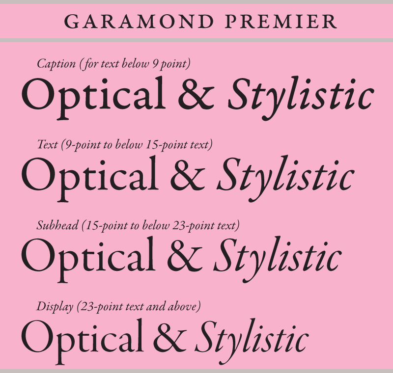
The optical masters of Garamond Premier, each shown at 99 point for comparison.
Garamond Premier was originally conceived as a multiple master family with design axes for weight and optical size. The family’s optical size axis was defined by four individually-designed sizes (roughly caption, text, subhead, and display size ranges), with each size modeled on an equivalent Garamond or Granjon design. Each master, except the display range, was linked through interpolation. The display designs were isolated as a separate multiple master font with a single weight axis. With the discontinuation of multiple master fonts, these optical masters formed the basis for Garamond Premier’s four fixed size ranges.
— Robert Slimbach[1]
While the advent of OpenType opened up a world of typographic possibilities, the loss of multiple master fonts caused grief to those who worked so hard to make the format a success. One such team member was Twombly, who, in the middle of OpenType’s rise, was growing tired of the downside of working for a software giant.
Twombly made the decision to leave Adobe while her star was still on the rise. While there was no one single catalyst, she recalled a number of things precipitated her departure. “I think one was not feeling like there was a whole lot of real vision since Sumner left — we were really struggling, I think. Adobe was going more and more toward web-related things by the time I was leaving, and it sounded like we were going to have to design fonts for use on screen. I had done that in college or graduate school and it was a nightmare, because you can’t get any subtlety when you’re dealing with screen fonts, and you’re really limited.”
“I really didn’t like computers much; they were a tool I had to use, and I got conversant with them so I could do what I needed to do, but I didn’t enjoy being in front of of one at all, especially for eight or ten hours a day,” Twombly said.
“[And] that whole multiple master [thing] … we put so much effort into those! God, that was a lot of work, and we thought that was going to be a really great way to make it more flexible for the user to get what they wanted out of one font. We couldn’t get all the application people to really design their apps to support how big and beautiful those fonts were. They just became a big dinosaur, so we had to watch those die. That was tough. So I think I was a little demoralized by that. We’d had a few layoffs; it was like we weren’t as cherished as we were at the beginning. Plus the pressure to do more teaching or speaking, and I just needed to get out. I needed to get away from that whole electronic buzz down there.”
Twombly left in 1999, leaving Slimbach to blaze his own trail as visionary leader of the Adobe Type group. Meanwhile, Phinney was determined to not only keep OpenType from failing, but to see it become as universally accepted as PostScript type was in the early days.
“I was pounding the pavement pretty hard, trying to get the word out,” Phinney said. “We had to do that with end users so they wanted the fonts and were using the new functionality, and getting foundries making the fonts, and getting support into the apps. All three were critical. Not just having a better mousetrap — that no one knows about, and no one supports — that was not going to sell. It’s probably pretty freaking obvious now, but at the time … the way that multiple masters got marketed: in the later years they just slashed the prices so people would buy them, because they had failed to communicate the other benefits successfully (or to create those benefits with app support). That was the biggest ‘marketing innovation’ with multiple masters.”
Phinney recalled that the originally-released OpenType specification included multiple masters — at least in theory, as this was before OpenType fonts had really been produced other than for test purposes. Before releasing fonts, Adobe ultimately, albeit reluctantly, made the decision to remove multiple masters from the spec. Microsoft was only too happy to go along.
“It’s a shame about killing multiple masters — that was a tough point,” Phinney said. “It was Dan Mills’ call. There were two choices ahead of Adobe at that time: either we’re going to do OpenType and evangelize it and Unicode and so on. Or, we’re going to do OpenType with multiple masters, and have to evangelize everything else, plus multiple master functionality, and try to do what we should have done in the first place with multiple masters and overcome entrenched skepticism about MMs, plus all the other stuff that comes with OpenType. That was a tough call. Internally, of course we were all deeply saddened by the decision not to make multiple master OpenType fonts. I might have been one of the few people who thought it probably made sense, but I was as bummed as anybody — I’d done my Master’s thesis on this cool tech.”
“Dan Mills decreed the end of multiple masters as a shipping font format,” Lemon said. “This was explicitly aimed at removing a substantial piece of engineering overhead so we could do justice to the work that would be required for OpenType. We fought hard to change his mind, because we loved the idea and potential of MM. It took me at least ten years to see he was right.”
“The loss of multiple master font support at Adobe was very disappointing to me, personally,” Slye said. “The reasons were understandable on a general level, but we lost a very powerful typographic tool, and something that was uniquely digital and progressive. It was also discontinued at a time when multiple master technology seemed to be maturing. Adobe Illustrator finally had an amazing UI for manipulating fonts directly in a layout, and designers outside Adobe were picking up on it too. To this day, one of the most common questions I get at conferences is, ‘When are you bringing back multiple masters?’ Type designers (and type-savvy designers) have always appreciated multiple masters and still desperately want what it can offer.”
“Dan was probably — in retrospect — right,” Phinney said. “In the decision he balanced the increased chance of OpenType succeeding against the lost value of multiple masters — it was probably the right call, but, man, it was painful. We were giving up on extra typographic sophistication. There was a lot of unhappiness at the time. There was still a lot of excitement about OpenType, but it was bittersweet. Yet, I think it might have swung the difference between us having a one-third chance of success with OpenType to a two-thirds chance.”
Although multiple master fonts went away, the underlying technology is still used as a tool in designing type. All of Adobe’s designers — as well as many non-Adobe designers worldwide — use the tech for font development.
Phinney, who moved up through the ranks from that first “entry level” position to product manager during his eleven years with Adobe, was laid off in December of 2008, but he recalls his eleven-plus years in the type group with great fondness.
“There were fabulous people there back then, and more who have joined since. It’s good to talk about,” he said. “I loved evangelizing this stuff: whether OpenType or Unicode or extended language support, or doing things right so more languages would work out of the box with the software. This was very fun for me. I really cared about it. I still do.”
“I realize that typography is a small part of the world,” Phinney mused. “I like making things better. There’s the language support to help make software work out of the box — including fonts — for more of the people of the world. There is making more legible fonts for easier reading and better user interfaces. Finally, the aesthetic part may seem like a small thing, but it’s good too. Don’t forget, studies show that minor aesthetic differences in type may not make a difference for peoples’ reading speed, but they actually affect mood, which in turn affects all sorts of things. People actually function better on creative problem-solving tasks, after being exposed to better typography.”
“I like to tell myself that, in our small way, we’re making a better world.”
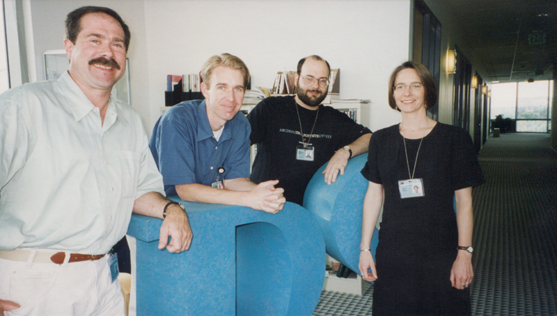
Carol Twombly’s departure spelled a big change for the close-knit Adobe Type team. Pictured from left to right: Jim Wasco, Christopher Slye, and Thomas Phinney with Twombly on her last day in 1999.
[1] Robert Slimbach: Garamond Premier specimen, published by Adobe in 2005.
[2] Allan Haley: “The Executive Computer; In the Latest Type Technology, an Echo of Gutenberg,” Peter H. Lewis, “The New York Times,” March 17, 1991.
Up next: Love letters — type designers and other type fanatics dish on their favorites from the Adobe Originals collection.
Keep up with the Adobe Originals celebration via RSS by bookmarking this series. And, in case you missed any posts, check out the rest of the series!
3 Responses
Comments are closed.
A terrific series that – so well – tells the story that needs to be told.
Fantastic piece! Thoroughly enjoyed it and brought an incredible insight into the business in the 1990s.
I’m loving reading these behind-the-scenes stories! I was a big fan and supporter of Multiple Master fonts in the day, and if I’m not mistaken, InDesign actually still quietly supports them. You can’t make any new MM instances, but if you have an instance around, I believe you can put it in InDesign’s Fonts folder and it can use it.