New fonts from TypeCulture
Typekit is happy to introduce TypeCulture as our newest foundry partner. Designer Mark Jamra is now offering a number of new families at Typekit for web, with select styles available for Creative Cloud desktop sync, and a few more font families to come soon.
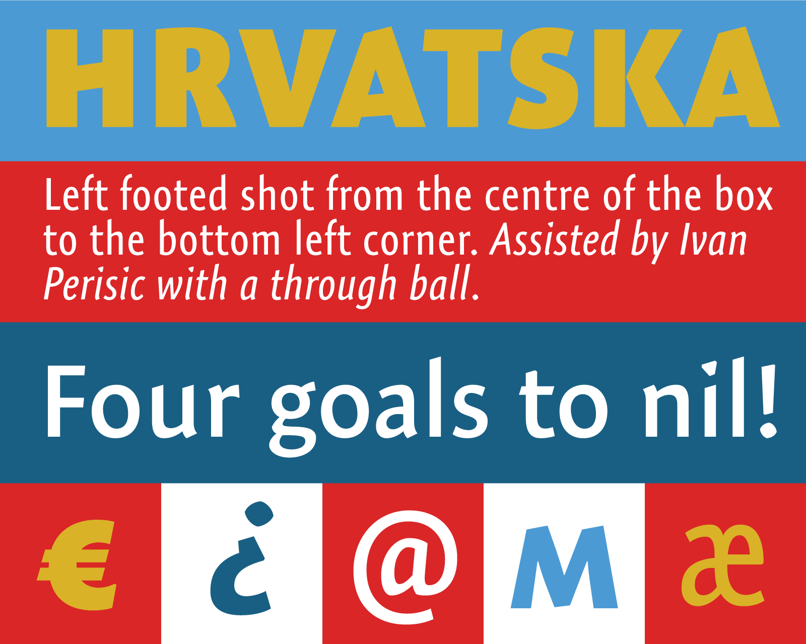
Expo Sans Pro and Expo Sans Pro Condensed
Expo Sans performs wonderfully in both display and text. Its contemporary humanist proportions and letterforms read well at smaller sizes, while it has a decidedly quirky edge when set larger, thanks to unique glyph characteristics like triangular i-dots and angled terminals and crossbars. Expo Sans is also available in a Condensed width. Multiple styles of each are available for desktop sync.
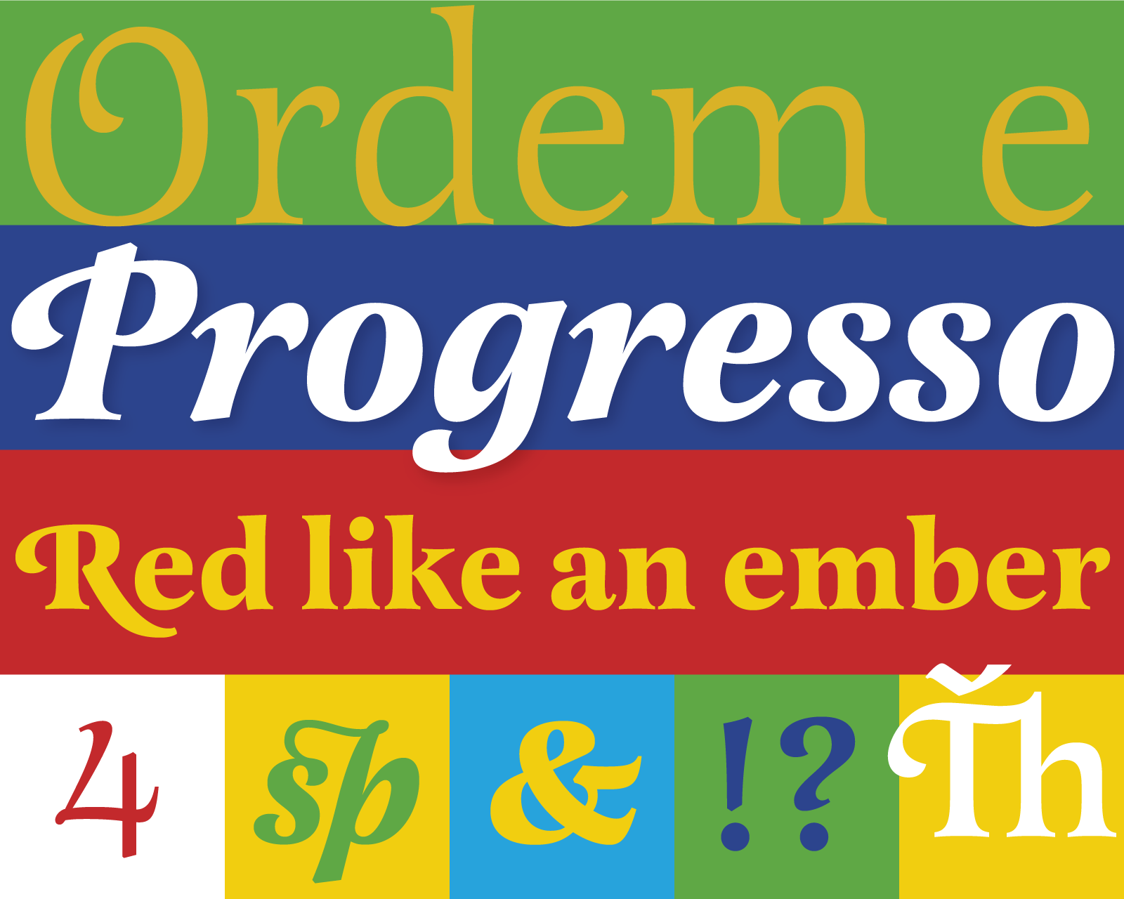
Latienne Pro
Latienne is a serif face inspired by the 19th century Latines, with a gentle, slightly playful character. Go all-out with the swash caps if it’s a big, swooping header you’re after, or scale it down for body text. The triangular serifs give a sense of gravity to the letters. Select styles are available for desktop sync.
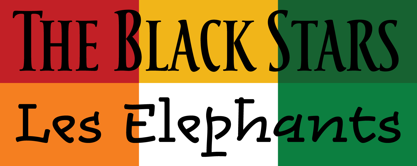
Tacitus Pro (“The Black Stars”) and Alphatier Pro (“Les Elephants”)
Tacitus is based on a fifth-century brush-written letterform (the Capitalis Rustica) and painstakingly adapted for our modern alphabet. The all caps typeface has soft brushy edges and gentle curves, while retaining a rigid verticality exemplified by its condensed width. Meanwhile, Alphatier takes inspiration from runes, shorthand, and archaic letterforms — among other sources. While it’s an experimental departure from most traditional letterforms, the result is casual, loose, and accessible.
We’re excited to welcome TypeCulture as a new foundry partner, and this set is just the start — more fonts are coming soon. If you’ve never tried Typekit, sign up and take a look around, and upgrade to a paid plan when you’re ready.