The Adobe Originals Silver Anniversary Story: Stone, Slimbach, and Twombly launch the first Originals
This is the third in a series of articles from Tamye Riggs, a longtime lover of type who is working with us to celebrate the twenty-fifth anniversary of the Adobe Originals type design program. This post focuses on the first game-changing typefaces developed under the program. The Adobe Type Advisory Board, put together by Sumner Stone, worked with the type team to help further Adobe’s reputation as a creative, quality-driven organization and a serious contender in the realm of type design.
In the late 1980s, as desktop publishing was just taking off, there was a tremendous opportunity at Adobe to create new digital types that stretched the boundaries of quality, technological sophistication, and scope. The playing field was wide open, and we were very fortunate to be in the right place at the right time.
— Robert Slimbach, Adobe’s first Principal DesignerIt really was Sumner coming in saying, yeah, we’re gonna need some really solid historical revivals to prove that this new medium can live up to the metal type and the phototype industries. Because nobody really knew if that was true yet — even us.
— Carol Twombly, former Adobe type designer
In the mid-1980s, Sumner Stone, Adobe’s first director of typography, was heading a busy team working in font editing and production. The Adobe Type group worked at breakneck speed to increase its PostScript font offerings, which consisted mostly of existing typefaces licensed from established foundries.
“Digitizing high-quality type designs from Linotype and ITC [International Typeface Corporation] was key to the early success of PostScript. It demonstrated what this new technology could do,” Adobe Type’s David Lemon said. “As PostScript took off, Adobe quickly began releasing more PostScript fonts, and typesetting manufacturers that had previously dismissed PostScript agreed to digitize their libraries.”
But Stone envisioned much more for Adobe than rehashing typefaces that were already on the market. “He wanted to revive the art of fine typography by doing original designs and show how this new technology could surpass the old one,” Lemon said.
Robert Slimbach begins his life’s work at Adobe
With Stone determined to move into original type development at Adobe, he needed skilled designers capable of making new typefaces at the highest level of quality. In March 1987, Stone brought Robert Slimbach to Adobe. They had both worked at Autologic, where the self-taught Slimbach redrew typefaces for proprietary typesetting systems. In the two years immediately prior to joining Adobe, Slimbach had been working as a freelance type designer. He had already released his namesake type family, ITC Slimbach, and was finishing what would become ITC Giovanni.
“I was doing freelance type design for ITC,” Slimbach recalled. “I wasn’t really making enough money to live on, so I either had to alter my career plans or find a full-time job within the type industry, which were few and far between. I was very much open to the idea of working at Adobe.”
Stone recognized Slimbach’s skill at drawing type, and felt his passion for original design dovetailed nicely with his own vision.
“I initially split my time between font production and original design work,” Slimbach said. “That only lasted a couple of months — after that, I began to focus full-time on new designs exclusively.”
The Adobe Type Advisory Board comes into the mix
While Slimbach was busy developing new typefaces, Stone decided to put together an advisory board of established experts to help strengthen Adobe’s reputation among serious type users: “A bunch of people from outside who were well thought of in the field who would come together once or twice a year,” Stone said. “Every six months, we had a meeting. They would advise on what we should be making. What kind of innovations we should have. Critique the work. Offer feedback.”
The Adobe Type Advisory Board included Alvin Eisenman, then head of Yale’s graphic design department. “Yalies were really dominant in graphic design at that time,” Stone said. “A number of big NYC designers were graduates of the program. He had the best people — like Hoffman and Paul Rand — teach.”
Other members of the advisory board were Roger Black, “a big name in newspaper”; book designer and fine printer Jack Stauffacher; poster designer and Yale alum Lance Hidy; Stephen Harvard, book designer and then vice president of Stinehour Press; and Max Caflisch, “a very highly thought of Swiss teacher and writer about type design.” During the advisory board’s approximately three-year tenure, the group would expand to accommodate notable guests such as Erik Spiekermann, Gerard Unger, Louise Fili, and Julian Waters.
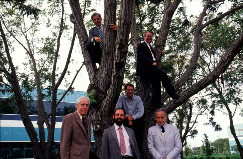
Members of the Adobe Type Advisory Board in 1988. Clockwise, from top right: Roger Black, Lance Hidy, Jack Stauffacher, Sumner Stone, Alvin Eisenman, and Stephen Harvard.
The advisory board was instrumental in helping Adobe shape the scope of the Originals program, Stone said. He recalled Eisenman saying, “We need more characters, caps, old style figures, etc.” That philosophy of prizing quality and typographic richness was mirrored by the key players on the Adobe Type team, who defined the eventual standard for the Adobe Originals.
“It was at a time when DTP [desktop publishing] type was very much frowned upon, because it was so immature as a medium, and the designs available were crude and lacked subtlety,” Slimbach said. He viewed the advisory board mainly in terms of a marketing asset, with prominent figures chosen to lend credibility to Adobe’s efforts to elevate digital typography to a new level. “It was more of a publicity thing — it worked,” Slimbach said.
“I was working with the type board, going through lists of fonts they needed to do,” Black said. “I kept pushing and pushing and pushing. […] I said, ‘You have to have the main standards, or you’re not a real library.’ It’s all fine and well to have contemporary type designers doing what they think is a great serif or sans serif, but we need Caslon and some kind of Clarendon; Garamond and Bodoni and those things.”
Under the direction of Stone, who was mindful of the suggestions of the advisory board, the Adobe Originals program was in full swing. “Robert turned out Utopia, [which was] quite widely used in the newspaper field,” Stone said. “[It was] an original design — not historical; some things in common with Melior, but definitely original. It was actually difficult to get people to come up with concepts about original designs — it’s not easy to make originals.”
Lemon recalled there was an ambitious list of potential revivals from the board. But Garamond was ultimately chosen as the companion release to Utopia.
Taking on Garamond
“I had thought for some time that the existing Garamonds, especially those that were popular in America, were far removed from the original, and that it was ripe for a revival,” Stone said. “My prior favorable impression of the type had come largely from the Egenolff-Berner specimen of 1592, which showed some of Garamond’s original work.”
Garamond was a natural selection for Slimbach to take on. “I see Utopia as somewhat of an extension of ITC Slimbach, while Adobe Garamond followed my work on ITC Giovanni, continuing my interest in humanist book types,” Slimbach said. “Sumner approached me to ask if I’d like to also work on a revival. I said that I’d like to do a Garamond.”
Slimbach drew early versions of his Garamond based on a number of published specimens. The first samples he could get were poor reproductions, which limited his design. Fred Brady, former manager of new type development at Adobe, found better material, which helped settle the question of which of Garamond’s designs to use. Harvard supplied still better images of the size Slimbach had chosen.
“Vraye parangonne seems to be a sweet spot for Garamond as a punchcutter — not too big and not too small,” Slimbach said.
“In the end, it became clear that still better images were needed,” Slimbach said. “The only way to get them was to visit the Plantin-Moretus Museum [in Antwerp, Belgium].” Slimbach, Brady, and type expert and historian John Lane visited the institution, studying the types of Claude Garamond and Robert Granjon.
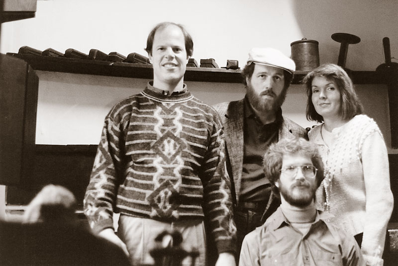
Research trip to the Plantin-Moretus Museum in Antwerp, Belgium, during the development of Adobe Garamond, 1988. Clockwise, from left: Robert Slimbach, Fred Brady, Joy Redick, and John Lane.
“We took pictures of their collection of Garamond and Granjon types,” Brady said. “We took those images and had those enlarged and used those as starting points for design, Rob did, taking the right pictures of the right fonts. There were lots of choices; some were better than others. Sorting through all that stuff, it was very exciting. That institution was very open. [We] opened a book and took pictures — we didn’t have to use white gloves.”
“[With] historical revivals, you should go look at as much of the original material as you can, the place they were done,” Stone said. “You should try to absorb as much as possible of the spirit of the letters.”
As a result of his research in Belgium, Slimbach chose Granjon’s Saint Augustine, a slightly smaller size than the Garamond vraye parangonne, as the model for his italics.
“Each improvement in source material led to a complete redrawing,” Slimbach said. “The Plantin-Moretus trip also inspired me to add swash caps, ornaments, ending glyphs, additional ligatures, and titling caps late in the project to go along with the small caps and oldstyle figures.”
“I think Robert redrew that face over at least three or four times,” Stone said. “He is a man obsessed, which is the right kind of person to do type design.”
“Rather than a [completely] new design, Garamond was a design with a lot of respect,” Brady said. “There were a lot of Garamonds out there that didn’t hearken back to the original design. This was [based on] a beautiful model.”
Bay Area type designer Mark van Bronkhorst, who worked in graphic design and production during the shift from conventional typesetting to desktop publishing, recalled his first glimpse of Adobe Garamond in one of the type department’s marketing publications. “I said, ‘What is that!? I have to have it!’ That was the most important typeface they put out at the time. It had expert sets, old style numerals, true small caps — things real typographers wanted to use that weren’t available at all in the current PostScript fonts.”
Along with crafting fully fleshed-out families with all the bells and whistles needed for fine typographic work, the Adobe Type team was committed to getting the details right.
“I remember using Adobe Garamond,” Black said. His design studio, Danilo Black, did work for Colombian-born author and journalist Gabriel García Márquez. “I used it to set a book, [and] I remember his criticism of the font. He was primarily not happy with the tilde. He explained that the tilde must not be looking like it’s taking off or coming in for a landing; it must be an equilibrium flight, or level flight, he said. I emailed that to Sumner, and he said, ‘Right. We’ll fix it.’ And they did.”
Carol Twombly joins the team
With it apparent that the Adobe Originals program would be critical to the acceptance of digital fonts by high-end users, Stone made another key hire when he brought Carol Twombly on board in 1988. Twombly was a graduate of the Rhode Island School of Design (RISD), and had been through the (now-defunct) masters program in digital typography at Stanford University.
“I knew of her from Chuck Bigelow and Kris Holmes, old friends of mine. [Bigelow was instrumental in forming the Stanford program, and had hired Twombly to work in his studio.] They had high praise for her. I hired her originally to test whether we could use Adobe Illustrator to give to outside designers we wanted to work on the Adobe Originals. We had written software to edit fonts but had gotten digital outlines for Linotype and ITC and URW. Then we had to make them ready for PostScript.”
“[Fellow Stanford type program alum] Dan Mills had already moved over to Adobe and was already working with Sumner,” Twombly said. “So I pretty much followed Dan. He said, ‘Yeah, it’s happening over here, so if you want something to do, come on over.’ And I started as a freelancer in 1988. I had designed one font of my own [the Morisawa prize-winning Mirarae, 1984], but, other than that, I had only really worked with Chuck and Kris on their projects.”
The making of Trajan
Sensing Twombly’s potential, Stone gave her a critical historical project to tackle. “I had Carol digitize this typeface that came to be called Trajan. Trajan is probably the most popular display typeface today — it was incredibly successful,” Stone said. “That was the first thing that Carol worked on. She did, of course, a beautiful job.”
“Sumner gave me the task of drawing some beautiful classical roman letterforms from an inscription on Trajan’s column in Rome,” Twombly said. Letter carver Christopher Stinehour provided a vital piece of inspiration. “He gave us a copy of a full-sized rubbing of the inscription, and we had that up on the wall in the hallway. So I got to work with that and make scans from that.”
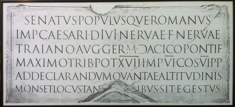
Facsimile of a rubbing taken from the inscription found at the base of Trajan’s column, located on the Via dei Fori Imperiali in Rome. This Roman triumphal column was erected in AD 113 to commemorate Emperor Trajan’s victory in the Dacian Wars.
That was the beginning of Twombly’s eleven-year career with Adobe. “That was the first project. It was like Sumner saying, hey, we’ll test her out, see how her drawing skills are,” she said. “We were using Adobe Illustrator to do the drawings, one page per letter. It’s not set up at all as a font design program.”
Twombly, who preferred working by hand to drawing on the computer, recalled the logistical difficulties of designing type with early production tools. “I don’t even remember how we worked that out,” she said. “I remember having three different computers in my office that would do different parts of the task, and you’d have to transfer data from one to the other to do different stages of the process. I always started with hand drawings; so did Robert. The first ideas were always drawn by hand — I wouldn’t be able to do it any other way.”
“It wasn’t as though you could take the rubbing and turn it into black and white and just use that,” Twombly said. “We came up with a series of sketches for our keyword, ‘HAMBURGERVONS,’ and just worked with it on the computer from there.” The forms had to be modified and perfected in order to work as a digital font, while remaining true to the spirit of the historical source.
“It was beautiful working with those letterforms, because those Romans — they really had it figured out,” Twombly said. “So lovely.”
Impressed with her work on Trajan and two other designs making up the “Modern Ancients” series (Lithos and Charlemagne), Stone gave Twombly a different historical period to conquer.
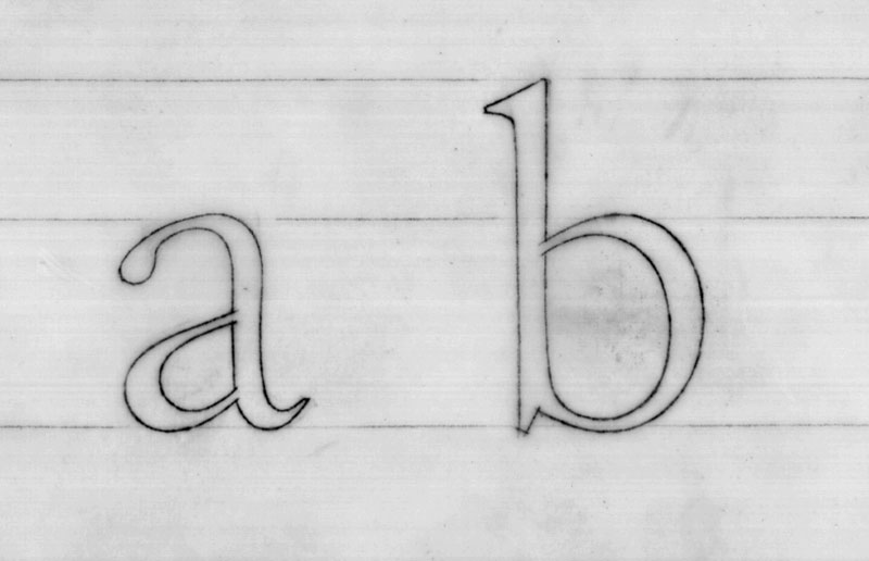
Adobe Caslon hand drawings by Carol Twombly.
“I assigned her to do the Caslon,” Stone said. “The Garamond and the Caslon were our first sort of running the flag up saying, look, we’re doing serious typography here. I talked to a lot of people — quite young graphic designers — who were early adopters. When Caslon and Garamond came out, they were very happy; it was an indication we were going to do serious typography. The DTP world was going to be successful and supported by good type. A number of people have told me that.”
“Both Caslon and Garamond were kind of watersheds,” Stone said. “And Trajan just kept getting more and more popular. It’s everywhere, and its popularity is still on the increase.”
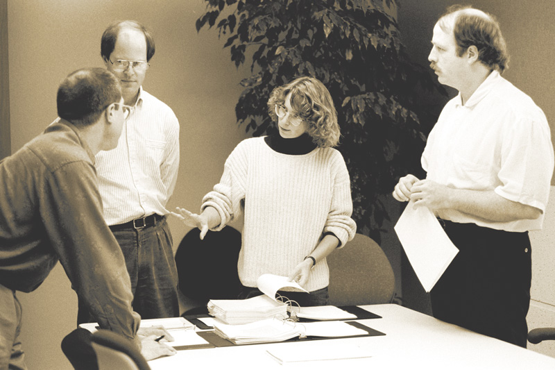
Members of the Adobe Type team. From left: Jim Wasco, Robert Slimbach, Carol Twombly, and Fred Brady.
Keep up with the Adobe Originals celebration via RSS by bookmarking this series. And, in case you missed any posts, check out the rest of the series!
One Response
Comments are closed.
Excellent work Tamye. Just two minor corrections. Robert Slimbach did not participate in the decision to design the Adobe Garamond. I assigned him to do it. Also, the Adobe Type Advisory Board actively participated in the development of the Adobe Originals and in advising and suggesting actions to enrich the program. They were not assembled for the sake of publicity for the Adobe Originals. Rather, they were positively engaged in the process of critiquing the work and suggesting directions we might follow. I am glad you have written about them. They made very important contributions on many levels.