Celebrating Twenty-Five Years of Original Type at Adobe
Good typography is something everyone sees but no one notices. — John Warnock, Adobe co-founder
In the mid- to late 1980s, designers rapidly embraced the brave new world of desktop publishing, and demanded more and better typefaces to use in their projects. In response to those cries for creative help, Adobe launched the Adobe Originals program in 1989, resulting in one of the world’s finest libraries of quality digital typefaces.
To celebrate the twenty-fifth anniversary of Adobe Originals, we’re exploring the world of type at Adobe, and showcasing the talented designers and visionaries contributing to this amazing body of work. You’ll hear typographic tales from the original Originals team—Sumner Stone, Carol Twombly, Robert Slimbach, and Fred Brady—along with other current Adobe type team members and illustrious alumni.

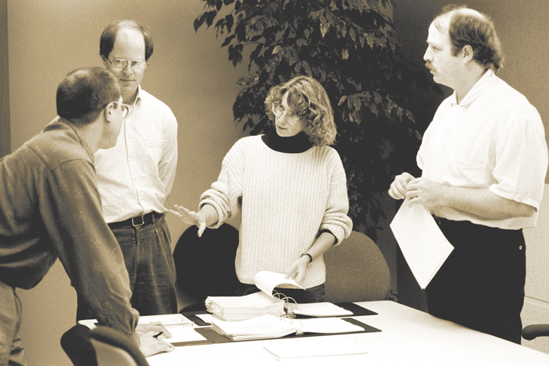
Members of the Originals team, from left: Jim Wasco, Robert Slimbach, Carol Twombly, and Fred Brady.
People known for their love of type, including Stephen Coles, Roger Black, Marian Bantjes, and Jessica Hische, will offer their thoughts on the Adobe Originals and how these designs have helped shape the modern typographic landscape. We’ll delve into the history of type at Adobe, and highlight some of the exceptional typefaces we’ve released over the past quarter-century. Miguel Sousa, Paul Hunt, and Frank Grießhammer, the most recent additions to our team, will talk about what it’s like to design type at Adobe today.
Introducing Source Serif: A New Open Source Typeface from Adobe
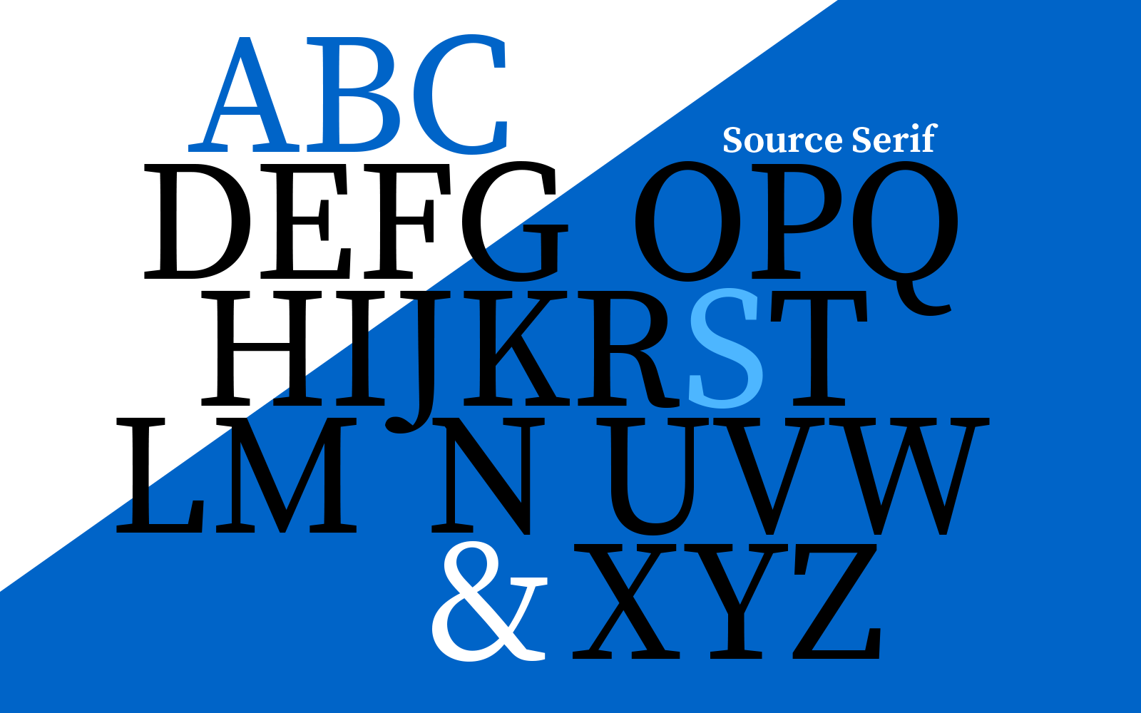
What better way to celebrate 25 years of typeface design at Adobe than to release a new typeface? Source Serif, our 100th typeface family and our gift to the community, is now available for web and desktop use through Typekit. Read our post on Source Serif to find out everything you could ever want to know about this new open source typeface and how it works with its partner, Source Sans.

An Adobe Originals Summer
We have an exciting summer of typographic content planned for our blog readers. I’m especially pleased to introduce Tamye Riggs, our author for the upcoming Adobe Originals series. Tamye and I have been having a fantastic time conducting interviews and finding wonderful things to share with you. She’s the perfect type-obsessed writer to help us tell the story of Adobe Originals. The fun begins later this month—stay tuned!
Want to keep up with the Adobe Originals celebration via RSS? Bookmark us here.
9 Responses
Comments are closed.
It´s always been a pleasure to work with Adobe´s products, and of course everything related to typo. Thank you all for your excitement and your contributions for the industry. You have made the design world easier, better and great!!!
Congratulations.
Alex Vega.
The first program I learned as a designer was Adobe Illustrator 88 and it changed the way I worked with type forever.
Thank you, Adobe for providing the tools to realize our creative visions.
thank you all friends for giving such experience….. its great to work wit the products… 🙂
.
Thank you Adobe, I love your products!
Congratulations Adobe. I Love your products too.
I don’t just use your products, I experience them.
Thank-you Adobe
Hi all, it would be great that Adobe could offer a webinar just to know the way it is supposed to use all the new type kit resource. Please Adobe!! Let´s do something ´cause we want to learn all the capabilities of the system.
I’ve spent the first 25 years of ‘Adobe typography’ able to experience it firsthand and believe me, the first years were nothing close to celebration 😉 Spacing was poor, you needed the ATM-extention (Adobe Type Manager) for fonts to appear more realistically on your screen and there was an ongoing discussion weather desktop typography was really good enough and going to make it over time. Today, typography for many ‘designers’ is no longer an issue. Fonts are often randomly chosen and rules about spacing, line spacing, number of words on a line, to name a few, are flouted because of a lack of knowledge and interest. The times when I see good typography are becoming scarcer and scarcer. A challenge for Adobe to devote themselves to good typography. But hey, you are definitely on the right track.