Adobe Originals rubber stamp alphabet debuts at Big Omaha
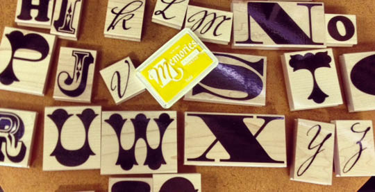
We’ve just finished building a new rubber stamp alphabet, based on five of our favorite display fonts. We are more than pleased with the results, and are excited to be previewing the Typekit Stamp Station at the Big Omaha conference in Omaha, Nebraska, this week. We’ll supply the paper, the ink pads, and the stamps. All you have to do is show up and play!

For this initial set of rubber stamps, we chose four Adobe Originals — Madrone, Rosewood, Cottonwood, and Voluta — and one classic display face, Cooper Black.
The characters ‘A, N, Q, S, X’ and ‘!’ are set in Madrone, a fat-faced Roman display font. Madrone was originally digitized by Adobe in 1991 from the wood type collection at the National Museum of American History in Washington, D.C.
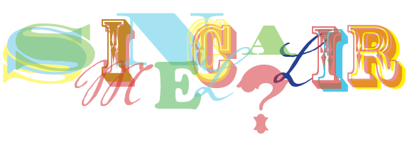
We chose these characters because they offered a lot of entertaining possibilities for interplay with the other type faces and glyphs.
In this set, the ‘S’ is unusually elongated, while the Q has the most entertaining tail.

The characters ‘D, E, G, H, O’ and ‘&’ are Oswald Cooper’s Cooper Black. As with the wood type variations like Madrone, Cooper Black got its start as a sign painter’s letter-form. It shows hints of Art Nouveau and Art Deco while still reflecting the industrial inspiration of its hometown, Chicago.
The ampersand is particularly wonderful.

‘B, C, J, I, R’ and ‘*’ are from the Rosewood type face. This design was inspired by Clarendon Ornamented, which appeared in the William Page “Specimens of Wood Type” catalog.
These characters highlight the simultaneous novelty and clarity of this typeface.

The characters ‘F, P, T, U, W’ and ‘?’ are represented in Cottonwood. Designed in 1991 by Kim Buker Chansler, Barbara Lind, and Joy Redick, Cottonwood is also inspired by ornamental wood type.
Also, just look at that question mark.

Finally, a curveball: the characters ‘K, L, M, V, Y’ and ‘Z’ are from the script face Voluta. Originally designed for a guide to the Austrian Gallery at Castle Belvedere, Voluta has great eccentric swashes and curls. We think it’s a fun complement to the more stately display faces. The ‘K’ is a particular favorite for us.

If you’re at the Big Omaha conference, come by and try out our stamps! We hope to bring them to more conferences in the future, too.
