Sites We Like: Vickers Bicycles, Rookie, and Otter Surfboards
This week’s sites we like make us want to get up and get moving. Whether focusing on the court, the surf, or pair of wheels, they’ll get your typography flowing.

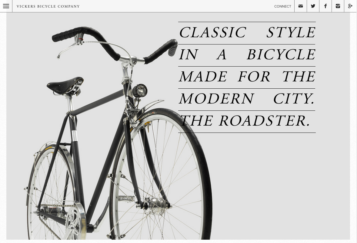
Vickers Bicycles is all about classic style, which is neatly reflected in their font selections. Headers are set in Adobe Garamond, making nice use of its italics, and the product prose relies on the perpetual favorite, Proxima Nova. Even if you’re not in the market for a new bicycle, we think you’ll enjoy perusing the site.

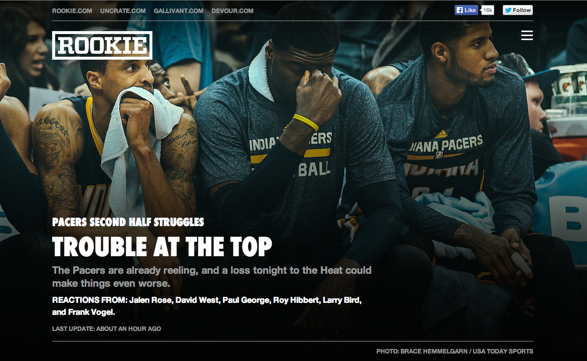
Rookie is a sports site that looks at the stories and people behind the scores and stats. They’ve paired the sturdy Futura PT Condensed with some beautiful photos for (we have to say it) a slam dunk.

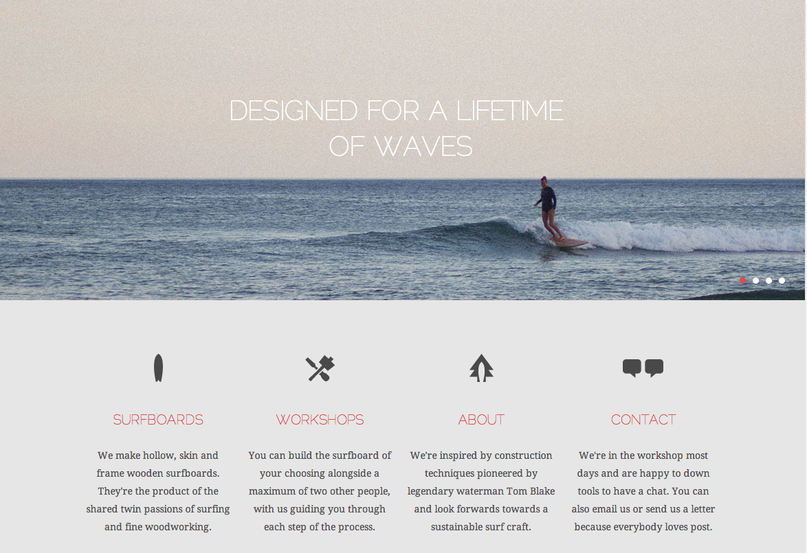
If you’re looking for a new board or even want to learn to craft your own, Otter Surfboards is the place to be. Header text is set in
Raleway, another one of your favorites, and the body text is Droid Serif. The attractive pairing puts the information you need front and center, leaving you plenty of time to get back to the beach.
That’s it for this week; share sites you like in the comments!
3 Responses
Comments are closed.
Love Rookie. Excellent execution on a very specific concept.
Futura PT Condensed (Extra Bold, all-caps) was a solid choice, particularly for “quote detail” pages (cf. http://rookie.com/1PF ) where the copy ends up on top of photos and needs to retain not only readability but also prominence.
Yes, Rookie is great, really love it!
Bicycles and surfboards?…hmm, prolly old news to you but how about those + great motorcycles by Deus? http://deuscustoms.com/