Sites We Like: Sam Willis, Stuff & Nonsense, & Fubeca Labs
In the deep weeks of winter, it’s helpful to think of cheerful things—like the fact that the days are already getting longer, and that you only really need one perfect typeface to make your website feel balanced. To round out this chilly week, we’re looking at a few bright, sunny sites that recently caught our attention.

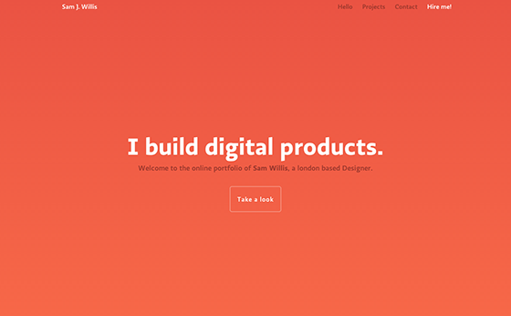
Bold color blocks are a simple, effective backdrop to designer Sam Willis’s portfolio site, and subtle Ratio performs beautifully in this setting. Multiple weights of the single typeface give a clean, cohesive feel to the page, while unobtrusive animations keep the navigation fun.

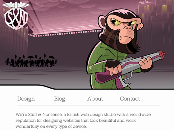
We’ve been fans of previous iterations of the Stuff & Nonsense website, and with their fresh redesign featuring lovely Jubilat, we’re smitten all over again. “Fashionably flexible” appears with good reason in the page title: fans of responsive design will be rewarded with a very well-done scaling header image—and the text scales nicely, too!

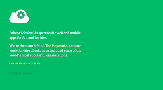
One big color, a short and playful description, and a link to get in touch by email: Fubeca Labs makes minimalism look pretty smart on their single-page, no-scroll website. Tisa shines here as the leading body text, giving just enough heft to the brief description, with Nimbus Sans in an understated pairing.
That’s it for this week; share sites you like in the comments!
One Response
Comments are closed.
Stuff & Nonsense has always been a beautifully designed site!
As for one I like, I’m rather partial to http://devinhalladay.com/