Languages, logos, and letters: Frank Grießhammer and his road to type design
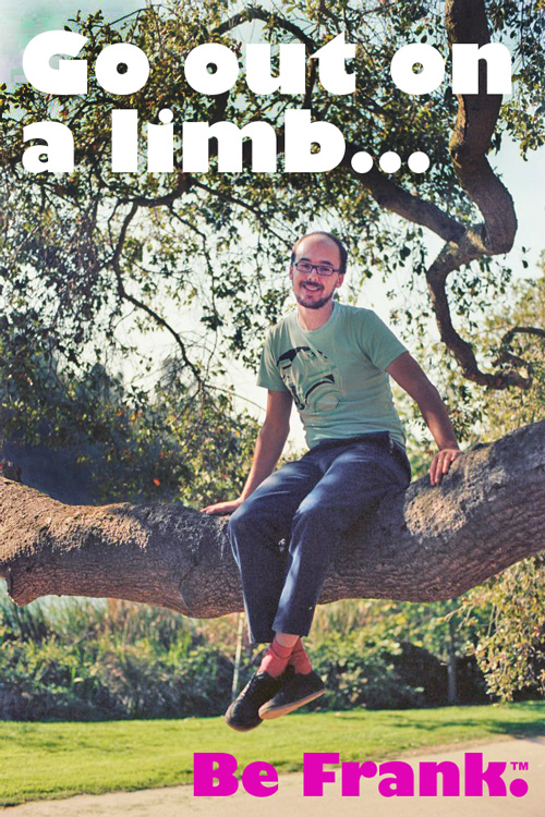
“Be Frank™.” Photo by Tânia Raposo. Motivational composition by Stephen Coles.
“Many things just happened by coincidence in my life. In fact, practically everything.”
—Frank Grießhammer
Born in Nuremberg, Germany, in 1983, Frank Grießhammer is many things: a pianist and lover of jazz music with an affinity for languages; a photographer with a toolkit of obsolete film cameras; and a thoughtful curator of a singularly splendid adapter collection. His career might have gone in any of a dozen different directions, but an early obsession with logos and a series of happy coincidences led Frank to his home with the Adobe Type Team.
What was life like growing up in Germany?
My childhood was great. I grew up in Hof, a mid-sized town in the north of Bavaria. My parents brought their two boys up in a creative household, where a lot of tinkering and building stuff was going on. I was given the possibility of musical education, and the family just traveled a lot. This may seem like nothing, but it really shaped my path for the future, and my view on the world. Of course, this is something you don’t quite realize as a kid—only much later did I come to understand how important it was.
I would describe my family as artistic, but even more, I think there was a feel for nice objects—the ability to value good and homemade things—and a general sense of creativity. I have one younger brother, Frieder, who is a computer genius, and he is awesome. He is studying Computer Science in Germany right now.
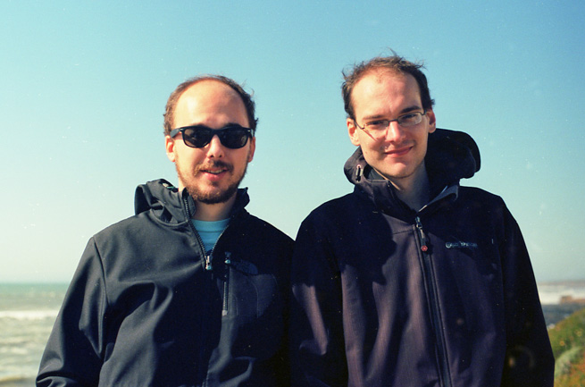
The Grießhammer brothers at Pigeon Point Lighthouse, Pescadero, California, April 2013. Photo by Tânia Raposo.
What’s your home life like these days?
I am based in Santa Clara, in the suburban sprawl known as Silicon Valley. It’s a very short distance to work, which is quite convenient. Right at this moment, however, I am spending two months in Palma de Mallorca, where my girl, Tânia Raposo, is working in a design studio. This stay in Europe was not planned, but I really enjoy my time here, and the telecommuting part is not as big a problem as I would have feared. The biggest issue about this extended stay in Europe (I am here since ATypI Amsterdam!) is that friends have to take care of our cat, Kayo, who I really miss a lot! Thank you so much, friends!
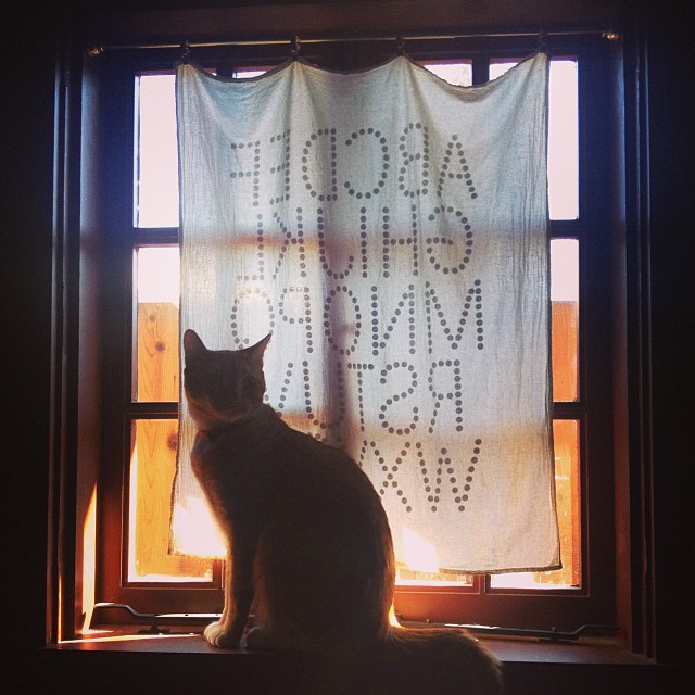
Kayo the cat. At home in Santa Clara, California, October 2013.
How did you first get interested in graphic design, and, more specifically, type design?
Like many, I got interested in graphic design by way of drawing, and also by just creating stuff. I was fascinated by logos early on, and remember looking through an amazing book of logos in the local library. Only later I found out this book was Per Mollerup’s Marks of Excellence. As a kid, I once found a type specimen book from a local copy shop. I remember being very impressed, especially by the snow-capped typefaces.
In Germany, a designer well known to the general public is Otl Aicher, who became quite famous for the pictograms and corporate design of the 1972 Munich Olympic Games. Reading about him was a great discovery, and it opened my eyes to the possibility of earning a living pursuing a job in graphic design. I would not count Aicher among my heroes—and there are many things quite dogmatic about him—but he certainly has earned his place in design history. I decided to study communication design, deliberately because it included working with type. That really was one of the things I was truly interested in and curious about.
Where did you begin your formal design education?
I studied at HBKsaar in Saarbrücken from 2003–2008. Saarbrücken is a a city in the southwest of Germany, right at the French border. I purposefully decided to go to someplace entirely different from where I had lived before.
HBKsaar really is a great school. It is very small, but there is a lot going on, simply because the students make it happen. I liked the broad approach to education this school offers. I could not only learn all kinds of graphic techniques or stuff that is immediately design-related, but also work in a wood shop, learn about art history, photograph, and engage in many activities which make studying at this university a very nice experience.
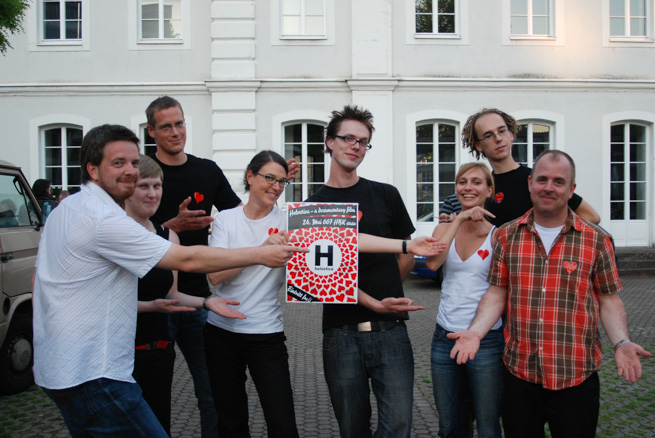
HBKsaar students and teachers with Gary Hustwit (far right), director of the documentary film Helvetica. Photo by Olja Ilyushchanka.
In Europe, students are encouraged to spend some time abroad, in order to learn about the culture of different countries. I applied for an Erasmus grant, which allowed me to study for half a year in Florence, Italy, during the winter of 2005–2006. Not only did this experience help me better my Italian, but it has resulted in some long-lasting friendships. It also made me aware how different design education can be across different schools.
When I returned to Saarbrücken, Indra Kupferschmid had replaced the previous typography professor at the university, and she was really full of energy, which she passed on to her students. With her, we attended type conferences and traveled to exhibitions, and she invited many great people (e.g., Paul van der Laan) for workshops. Indra introduced her students to the type scene, which I am really thankful for. I don’t think I would have pursued my way as I did had it not been for her encouragement.
You went on to post-graduate studies at the Royal Koninklijke Academie van Beeldende Kunsten (KABK) in The Hague. What made you decide to go for the Type and Media Master?
Going to KABK was a very lucky coincidence for me. After finishing my studies in Saarbrücken (2008), I went to Berlin for an internship at FontShop International (FSI). My time there was significant in the sense that it showed me what a job at a type foundry is really like. In March 2009, the Robothon conference was happening in The Hague, and I tagged along with some of my FontFont colleagues.
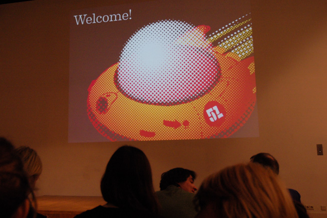
Welcome to Robothon 2009! KABK Den Haag, March 2009.
Robothon 2009 was a real important event for me. Not only did I realize how awesome the Type and Media class at KABK is, I also was hooked by all the talks and possibilities demonstrated at the conference. I decided to apply to the Type and Media program on the spot. Back in Berlin, I worked on my application with full commitment. Luckily, I was accepted for the same year.
Spending the year at KABK, pursuing a project with such dedication, was a fantastic experience. The teachers are really great, and every one of them is communicating their individual views on designing type, which is a very enlightening experience. Tânia, who is now my wife, was my co-student at The Hague. I was worried that our blossoming relationship might jeopardize our projects, but it was quite the opposite.
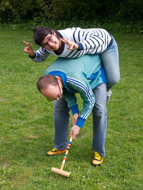
Frank and Tânia redesign croquet as a contact sport. At the Typnic at Golden Gate Park, San Francisco, April 2011. Photo by Stephen Coles.
My graduation project, Quixo, was about experimentation with different writing tools. I used brushy markers to create different weights of a typeface that makes use of the pointed-pen construction model. My idea was influenced by manual lettering; for writing a thicker letter, I would also choose a thicker pen, and thus give the letter the characteristics of that pen.
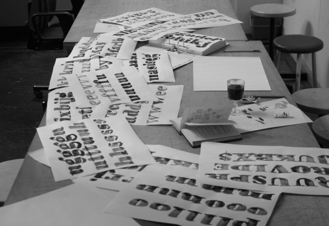
Work on Quixo, KABK Den Haag, April 2010.
It was a fun project to work on, and it certainly taught me a lot. I have since taken the idea further and expanded the concept to a whole typeface family, which was released as FF Quixo by FontFont last month.
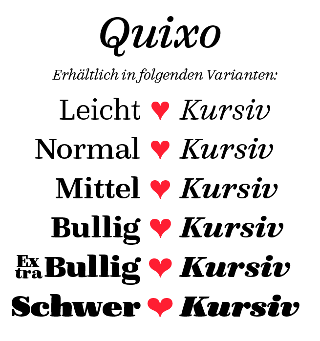
FF Quixo, released in November 2013.
I have described the year at KABK as the ‘greatest year of my life,’ and it is true! It is a year of experimentation—very challenging and very exhausting. Much of what I do today is thanks to what I learned there. I had a great time, and I enjoyed working hard in a class of skilled people who were all totally in love with type! It really cannot get any better!
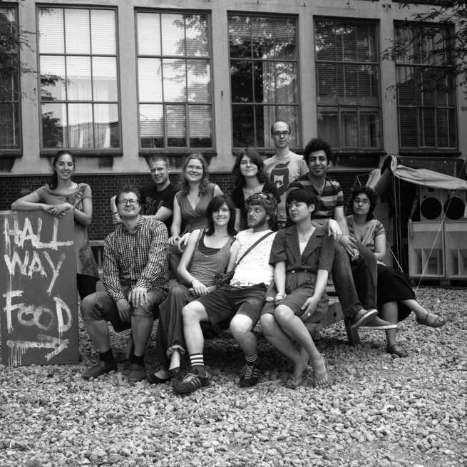
Type and Media class of 2010. KABK Den Haag, June 2010.
How did you make the big move from Europe to Silicon Valley?
I ended up at Adobe also by matter of coincidence. After KABK, I was working at FSI again on a limited-time project. I was on the lookout for new opportunities (as you know, there are always plenty for type designers). I just responded to the job opening posted on the Adobe Type Team blog, although I never expected to get the position in the first place.
At the same time, I also applied for a different type job in Europe, and even interviewed with the company. Walking out of that interview, it was clear to me that I would probably not work for them, which I did not feel too sad about. However, at the same time, I also received a very nice email from David Lemon, who rejected me for the position at Adobe. I was super-bummed! I decided to take my chance and responded something like:
“Wait a minute … I think I forgot to show you this one project!
Also—have another look at that one here!”
This response led to an interview invitation in San Jose, and then, two months later, I was on my way to California. Pretty lucky, if you ask me!
From the beginning, the small type team has been very welcoming, and my colleagues have grown to be more than just teammates. I owe a lot to our team, which helps me to continue learning all kinds of new things every day. The projects I work on are diverse and quite interesting.
For instance, we have produced handwriting fonts for use in Adobe Acrobat, which is great, since I now can electronically sign documents in my own handwriting! Designing those fonts was quite a challenge—they needed to support Greek and Cyrillic, which is difficult to emulate if you are not a native. I attended several weekend courses at a Greek School in San Jose to work on my Greek Longhand, and tracked down Russian employees to show me actual samples of handwriting in Cyrillic letters. For details like handling the Polish Ogonek, I could just email people from Adobe Warsaw, who were all very happy to help and proud to show me some of the most diverse examples of the Polish hand.
How do you like living in California?
Apart from the general craziness it is to live in the United States, the Bay Area seems a very relaxed place. I have made some great friends both inside and outside the type world. For instance, Antonio Cavedoni and I have formed the South Bay Book Society (SBBS); we specialize in finding the best (or worst) books on type in the numerous used book stores all across the Bay Area. Preferably, we do that after a hearty Sunday morning brunch. After that, we will sometimes indulge in amateur calligraphy and/or lettering.
Generally, living in the proximity of San Francisco has been very nice, because the type scene is very active there. I have been able to meet all kinds of amazing people, and have made friends with many of them. Especially, I have to thank my friend Stephen Coles, who really made adopting to that new place much easier for me.
Meeting Jim Parkinson, Bay Area Original, and also a wonderful person. Photo by Tânia Raposo, August 2013.
Something unexpectedly great about California is that you can buy all kinds of fun pens at Japanese stationery stores—a treat for the amateur calligrapher like me!
Aside from all things type related, what are your hobbies?
Crocheting, knitting, embroidery.
No, seriously—I really enjoy making things. It is great to build stuff either in real life or with code, and, fortunately, there is quite bit of overlap between my private interests and the things I do at work. Like every type designer, I like looking at letters, and frequently photograph the letters I see all around me.
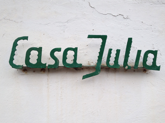
“Casa Julia.” Lettering found in Port de Sóller, Mallorca, November 2013.
Tell us something about yourself that is completely out of the ordinary…
Everything about me is perfectly normal.
…and what are you looking forward to most in the future?
Coincidences.
Frank Grießhammer, who joined Adobe in early 2011, juggles multiple projects in type design and font production, taking copious team meeting notes along the way. He is eagerly anticipating his upcoming reunion with Kayo the cat and the next meeting of the SBBS. For more fun with Frank, check out his personal site and the Flickr stream where he documents his travels and type in the wild.
2 Responses
Comments are closed.
A very accurate portrait of the only man who can really Be Frank.™ The only major omission I see is a mention of his best friend, Gill Kayo, after whom Kayo the cat is named.
i want an invitation to the SBBS!