Sites We Like: Electric Diner, Fuel Cafe, & Vermont Salumi
We’ve worked up a bit of an appetite looking through this week’s sites we like, which rounds up a few menus we’ve noticed recently—showing both delicious-sounding dishes and (of course) tasteful use of type.
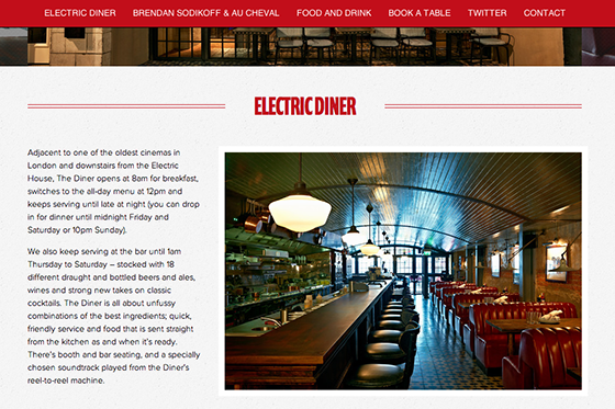
The Electric Diner menu boasts “unfussy combinations of the best ingredients” in their London restaurant, and we might use the same phrase to describe the pairing of typefaces they selected for their website. Proxima Nova is a dependable choice for clear body text, and we love the bold, precise look of Prenton Ultra Condensed in the headers.
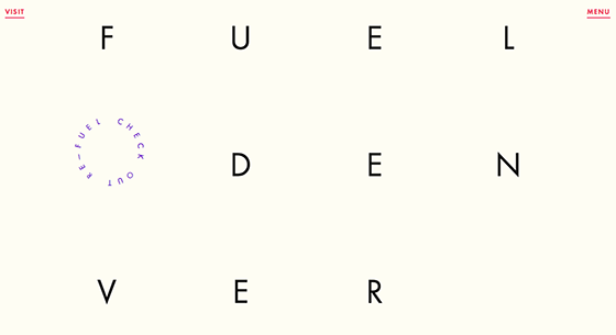
Futura gets center stage on the Fuel Cafe website, its geometric shapes working in good visual harmony with the clean design and navigation. Brandon Grotesque adds a touch of warmth to the menu descriptions—not that it takes much to make a “cheddar scallion biscuit with homemade sausage gravy” sound pretty appealing to us. (We’ll take 30, please.)
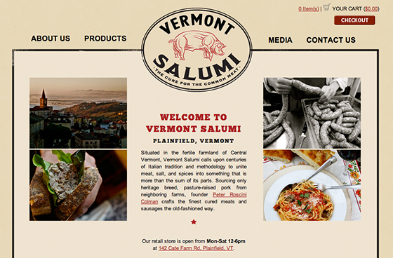
Not full yet? Let’s head over to Vermont Salumi, purveyors of fine cured meats with an evident flair for type. They use Chunk for an old-fashioned woodcut aesthetic in their standout headings, and News Gothic for no-nonsense navigation—and see if you can detect the tiny traces of Bello and Aviano Sans in there, too.
That’s it for this week’s sites; share sites you like in the comments!
One Response
Comments are closed.
Fuel Cafe has a nice design 🙂