New and updated fonts from TypeTogether
In case you missed our tweets about some of these updates from TypeTogether, here’s a roundup showing off some of their latest. If you’re looking to revamp a blog or personal site, you’ll find some great inspiration here.

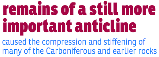
Ronnia Condensed in its Heavy weight (top) and Ronnia in its Light weight (below).
You might need to set aside the better part of an afternoon when designing with this typeface, because both Ronnia and Ronnia Condensed are available in seven different weights apiece and can be combined in nearly endless configurations that all look great. Perfect for magazine layouts and other editorial uses. (For some advice on designing with multiple weights and styles of the same font, check out Brian Warren’s guest post on the topic.)

Bree Serif.
A seriffed cousin to Bree, Bree Serif retains the bold character of its predecessor, but with a slightly more subtle approach that’s designed to work well for intensive editorial settings.

Edita in Book weight.
Edita makes for a beautiful typeface to display long-form writing, and we’ve recently added its Book weight to the Typekit library in addition to the Regular and Bold weights already on offer. The Book weight almost has a letterpress feel to it, even on screen.

Capitolium 2. Text for all specimens from Project Gutenberg.
Capitolium 2 takes its name from a typeface designed back in 1998 to help with wayfinding around Rome, which was in turn inspired heavily by the centuries-old tradition of lettering on Roman buildings. TypeTogether’s updated version here works just about anywhere chiseled stone won’t reach, and can serve as a nice alternative to Times New Roman.
We hope you enjoy using these new typefaces. If you’ve never given Typekit a try, sign up (it’s free!) and upgrade to a paid plan whenever you’re ready.