Recent additions to Typekit’s library: Azo Sans, Courier Prime, & Sketchnote
We’ve made some new additions to the Typekit library recently—and they cover quite a bit of ground stylistically. Here’s a few to consider for your next project.
Designer Rui Abreu brings us Azo Sans, a geometric sans that takes heavy inspiration from Futura but with softer angles that lend, in Abreu’s words, a “humanistic quality” to the typeface. The result is polished at any size, with the bolder faces making for exceptionally dynamic headlines. Available in five different weights, with corresponding italics for each.

Courier Prime from Quote-Unquote Apps.
Screenplays are traditionally written in a monospace typeface, which generally means Courier. Frustrated by this status quo, John August at Quote-Unquote Apps set out to build “the best damn Courier ever,” enlisting Alan Dague-Greene for the design. Courier Prime is optimized for 12-point display, and works nicely onscreen or in print. Don’t miss the gracefully-done italics, either.

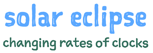
Sketch Square and Sketch Type from Delve Fonts. Text for all specimens from Wikipedia.
Sketchnote emerged from a project between Mike Rohde and Delve Fonts proprietor Delve Withrington to develop the typeface for Rohde’s The Sketchnote Handbook. The hand-drawn style is clean and restrained, with the Text font designed to be legible at smaller sizes, while Square works nicely as a headline counterpart.
We hope you enjoy using these new typefaces. If you’ve never given Typekit a try, sign up (it’s free!) and upgrade to a paid plan whenever you’re ready.
One Response
Comments are closed.

Signing Up now!
I really need some new exciting graphics for my websites 🙂