Sites We Like: Pure CSS, Powershop, and Plain
In this week’s sites we like, we’re looking at a few businesses who want to help you get down to the simple essentials—whether you’re building a website or paying your power bill.

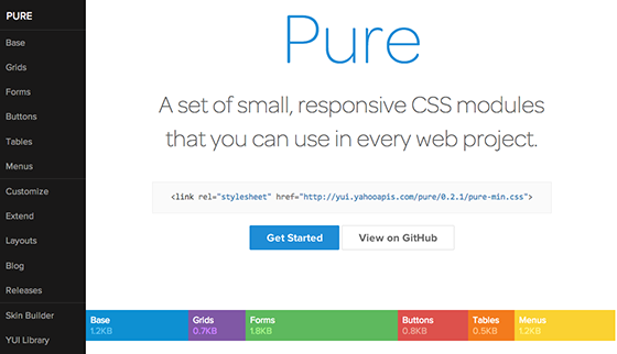
Responsive design just got even simpler, now that you can pop CSS modules from the open-source Pure CSS project right into your code. The header text in Omnes and body text in Proxima Nova underscore the clean, minimally-decorated site aesthetic.

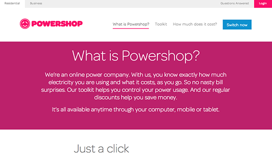
Ah, electric companies. Remember when you had to use a vacation day from work so you could wait around for someone to wave a gadget at your power meter? Powershop feels a bit more evolved than all that. Not to mention that they’re using ever-classy Omnes on their site.

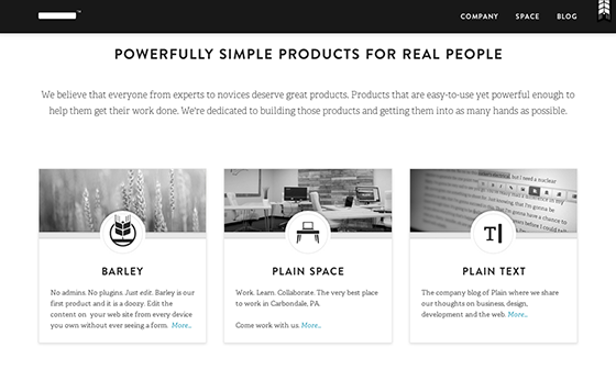
Simplicity is the word at Plain, a small company dedicated to making intuitive, straightforward products like their Barley web editor. Brandon Grotesque makes for lovely, warm header text, and Adelle is a great serif counterpart in the body text.
That’s it for this week’s sites; share sites you like in the comments!
2 Responses
Comments are closed.
I like my company’s site, which uses Nimbus Sans and Tisa Web Pro: http://fube.ca
I like the simple layout of the last image, really nice design.