Sites We Like: Notchcode Creative, Saus, and FortySeven Media
This week we’re looking at how three design agencies bring personality to their online presence. All are powerful examples of self-expression through design.
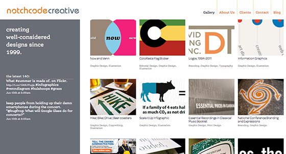
When your design work includes belt buckles and beer coasters in addition to regular print jobs, how do you create a cohesive portfolio? Colorado-based design firm Notchcode Creative has risen to this challenge with a neatly-organized gallery page and type selections that support the visual design. FF Ernestine is a clean slab serif whose various weights can accommodate both bolded headings and lighter body text, while the rounded shapes of Omnes provide an attractive contrast in the subheads.
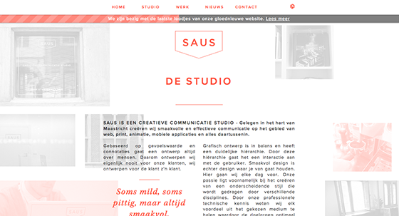
We had a lot of fun exploring the website of Dutch design firm Saus, whose minimal color scheme works beautifully with the thoughtful visual effects throughout. The ever-flexible Proxima Nova fits effortlessly into this order, with Kepler Std as an elegant alternate for asides and subheads.
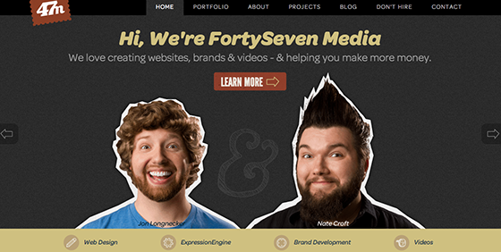
Packed with energy, the FortySeven Media website is highly expressive and enthusiastic—but not at the expense of usability, which is no simple accomplishment. Omnes in Black Italic makes a powerful impression as a header font, with lighter weights in place for text throughout the site. Meanwhile, Futura PT and League Gothic add a twist of personality to the navigation and subheads.
That’s it for this week’s sites; share sites you like in the comments!