Sites We Like: Social Forces, Open Society Foundations, and Soho Fixed
This week, we’re going to spend a little time looking at League Gothic close up. From The League of Moveable Type, League Gothic is a redesign of the classic Alternate Gothic No. 1, which is now in the public domain. Attractive and matter-of-fact, League Gothic shines exceptionally well in headings and is neutral enough for a variety of layouts and font pairings—as we’ll see in the following sites.

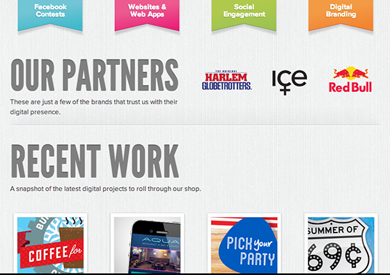
An interactive web agency based in Tampa, Social Forces covers a lot of ground on their homepage, but does so with convincing style. League Gothic appears big in the headings here, and we love the effect of that slight shadow—in combination with the textured background, the letters appear lightly embossed, but not in a distracting manner.

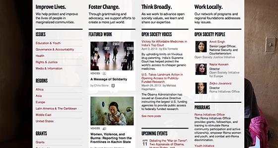
For an organization as broadly expansive as Open Society Foundations, it’s easy for a website to descend into complete disarray—so it’s refreshing to see such a clean, organized page that nonetheless communicates a lot of information about the nonprofit and its initiatives. League Gothic shows off its condensed properties here, making for efficient and balanced subheads. Prenton Condensed also features as a header, lending a bit of rounded dynamism to the page without confusing its rhythm (or its readers).

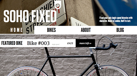
Photography dominates on the website for Soho Fixed, beautifully profiling their small collection of hand-built single-speed bicycles. League Gothic matches the attitude perfectly in bold headlines, with FF Meta Serif placed as a thoughtful counterpoint to keep the page nicely balanced; the page makes a strong impression without feeling overwhelming.
That’s it for this week; share sites you like in the comments!
One Response
Comments are closed.
League Gothic is definitely one of my favorite fonts to use in design.