Sites We Like: The Why Axis, Acko.net, and Pi Day
Who knew that math could inspire such creatively interactive website designs? In this week’s sites we like, we dive deep into the world of data and mathematics.
The Why Axis covers data visualizations in the news with an organized, straightforward approach—not to mention a terrific interactive site design. Proxima Nova brings a clean aesthetic to the in-depth reports and makes them extraordinarily easy to read (though the excellent writing plays no small role in that, either).
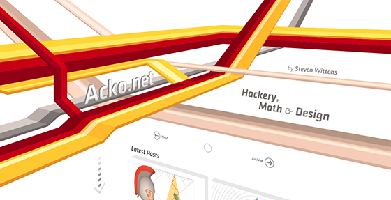
Steven Wittens discusses programming, design, and mathematics on his mind-expanding site, acko.net. Klavika from Process Type Foundry features in headline and body text, its angular-yet-fluid appearance working nicely in longform while still appearing distinct in the navigation. It’s hard not to love that ampersand.

Are you ready to celebrate Pi Day on 3/14? If you’ve found yourself short a few party favors, or need to brush up your math skills, piday.org has your back. We were entranced by the Million Digits of Pi section, which is perhaps the best illustration of Freight Sans and its dashing numeral set that we could’ve asked for. Headings add a bold rhythm to the page in Futura PT Condensed.
That’s it for this week! Share sites you like in the comments!
One Response
Comments are closed.
Still stunning at acko.net… Thanks for the inspiration!