Sites We Like: Rosemary Butcher, Hamacama, and Santa Monica Pier
A choreographer, hammocks, and the Santa Monica Pier in this week’s sites we like.

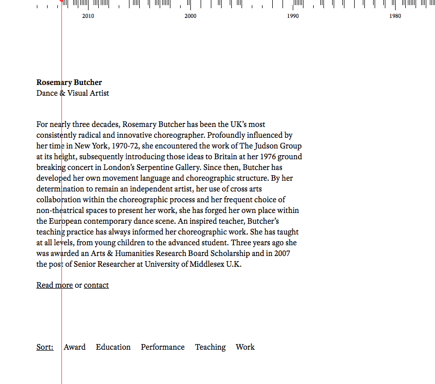
The website of Rosemary Butcher is a beautifully simple representation of her career, with a clever scrolling timeline to contextualize the expansive scope of her résumé. Adobe Text lends an appropriate elegance and is a welcome departure from the web-standard Georgia.

Hamacama sells what we all wish we were laying in right now: hammocks. Museo Slab and Museo Sans unify the site, and the superfamily’s relaxed aesthetic pairs well with the subject matter.

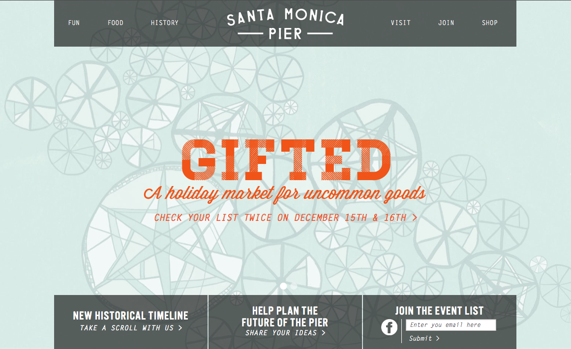
The storied history of Santa Monica Pier takes on a fun, quirky attitude with this attractive site. Letter Gothic, Futura PT, and Alternate Gothic No. 3 D work together to achieve a spunky retro vibe.
That’s all for this week; share sites that you like in the comments.
3 Responses
Comments are closed.
while rosemary website is interesting, I found the red like behind the content quite annoying.
what everyone else think?
Reblogged this on Julian Echeverry.
I think rosemary is unique touch of design.. but not yet responsive design 🙁