Museo Sans Condensed from Exljbris

Museo Sans, a perennial Typekit favorite, now comes in a Condensed width. Like its wider predecessor, Museo Sans Condensed is a neutral, steady geometric sans with few frills. Five weights, each with an italic, make this slender style very versatile — and a great addition to projects already using fonts in the Museo superfamily.

Left: Museo Sans Condensed with Museo Slab; Right: Museo Sans Rounded with Museo Sans Condensed and Museo Sans
The 100 and 900 weights of Museo Sans Condensed are served with PostScript-based outlines for smooth rendering at display sizes, while the 300, 500, and 700 weights (plus italics) have been manually TrueType hinted for crisp rendering at small sizes.

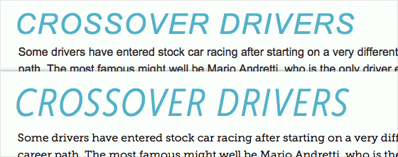
Condensed typefaces take up less horizontal space, so they can be set larger.
h2 {
	font: 400 italic 2.5em/1 Arial, Helvetica, sans-serif;
	text-transform: uppercase;
	letter-spacing: 0.05em;
	}
.wf-active h2 {
	font-family: "museo-sans-condensed", sans-serif;
	font-size: 3.375em;
	font-weight: 300;
	}
Finding a fallback for condensed web fonts is a tall order. Be sure to revisit our series of blog posts about font events, which provide conditional hooks (like the .wf-active class, above) for styling elements differently based on the presence of web fonts.
Museo Sans Condensed, like many exljbris fonts, is available to all Typekit users — so, enjoy the new fonts! If you’ve never given Typekit a try, sign up (it’s free!) and upgrade to a paid plan as you need to.