Sites we like: The Twitter Political Index, Pilot and Captain, and Form and Future
An election, a travel plan, and the road ahead in this week’s sites we like.

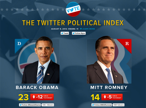
Twitter jumps into the election season with a supplement to more traditional polling: the Twitter Political Index, which measures “the sentiment of Twitter users feelings about the candidates.” Proxima Nova and Proxima Nova Condensed combine with a spare layout and large type for a design that feels presidential but not staid.

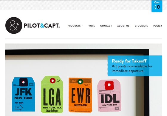
Pilot & Captain recalls the golden age of travel with typographically-focused prints and tees. The responsive design puts Brandon Grotesque to the test, using it for headings, subheads, and text alike. The result is retro without veering into kitsch.

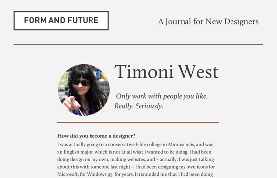
And last but not least, Form and Future is a new journal for new designers. The minimal layout lets Calluna shine, making for a pleasing (and inspirational) reading experience.
That’s all for this week; share sites that you like in the comments, or submit your best work to gallery@typekit.com for consideration.
4 Responses
Comments are closed.
Wow, serendipity. Thanks for posting about Pilot & Captain. I hadn’t heard of them before, but I do love all things retro and travel and am totally going to buy a T-shirt (at least!) from them now.
Brandon Grotesque looks great on the Pilot & Capt site. I’m currently using Proxima Nova for headings on my site, might have to give Brandon a tryout.
Brandon Grotesque looks beautiful in uppercase*! Might have to steal that as an alternative to Futura Std on my new site design.
*Not a fan of the lowercase characters, the x-height is far too small.
Looks like a good design.