Designing data
This is part of a series of posts from Typekit’s resident data analyst, Mike Sall. In this installment, Mike shares best practices for designing data.
A central part of analyzing data is thinking about how we need to look at the numbers to understand them. Data visualization is powerful because it can condense a lot of complicated information into a small space and so answer important questions. But this can only happen when the design allows those answers to show through.
The variety of charts out there may seem endless, but they really boil down to six core visual elements: grouping, size, position, angle, color, and annotation. When we visualize data, these elements are our building blocks. In this post, I’ll step through each of these visual elements and show how we can use them to design thoughtful visualizations of our data.
Grouping
The most basic element we have in data visualization is grouping: how we aggregate all the underlying data into individual data points. This might sound obvious because we often go through this process without thinking about it. If we want to show quarterly revenues, for example, then clearly our data points are the revenue totals for each quarter. But why not monthly, or weekly, or daily, or even hourly?
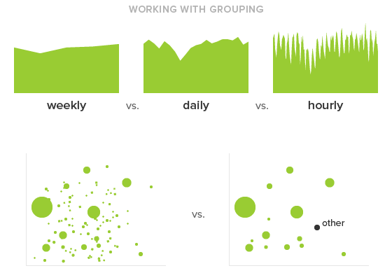
Let’s say we’re charting user sign-ups and need to decide between daily and weekly granularity. If we’re trying to see whether we’ve improved over the last few months, then the fact that sign-ups naturally dip every weekend doesn’t matter; in this case, a weekly rather than daily grouping will help us more easily compare one week to the next and observe the overall trend. But if we announced a major feature on Tuesday and want to see how that affected sign-ups, then a weekly grouping isn’t going to help. We need to see sign-ups by day or perhaps even by hour to understand what effect the announcement had.
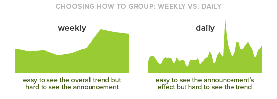
At the most basic level, the data points are the things we can distinguish in a chart, so they should represent the differences that actually interest us. By reducing them to the minimal granularity we need, we can ensure the design will focus on the differences we care about while filtering out the ones we don’t.
Size
Once we have the specific data points we want to show, the next visual element we can use is size. Size simply refers to the amount of space a data point takes up. For example, to represent larger values, we can make the bars taller in a bar chart or the bubbles bigger in a bubble chart. When we make these distinctions, what we’re really doing is increasing the amount of visual mass a data point has, giving it more pixels or ink.
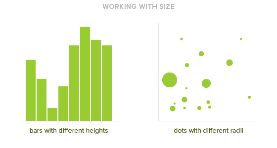
The visual element of size excels at representing quantities of stuff: people, dollars, orders, clicks, tweets, and so on. This compares with metrics that aren’t quantities, such as inflation rates, miles-per-hour, clickthrough percents, and other rates and calculated values; often, position is better for these kinds of values. But for quantities, we usually want to compare how much more or less stuff each point represents, and size shows these proportions.
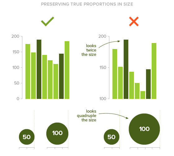
To correctly see the differences, though, we have to be careful to maintain true proportions. If we were to change the y-axis of a bar chart so the bottom of every bar began at 100 instead of 0, then suddenly we’d be interfering with the proportion: a bar taking up twice as much space would no longer represent twice as much stuff. Similarly, if we’re using circles to represent size, we can’t just double the width to represent double the value since that would actually quadruple the circle’s area. Instead, we have to make sure the relative sizes of the data points preserve the true proportions of the values they represent. Only then can we accurately compare them.
Position
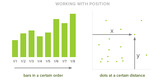
At this point, we have determined which data points we want to show and how big or small they need to be. The next step is to decide where they go. This is our third visual element — position — and we can use it in different ways. In a bar chart, we can put the bars in chronological order to represent time. Or, in a scatter plot, we can place the dots at certain horizontal and vertical distances from the axes. By putting data points in specific places, the distance between them is what matters: if two data points are near each other, we know they are similar in some way, such as occurring at around the same time or representing comparable values.
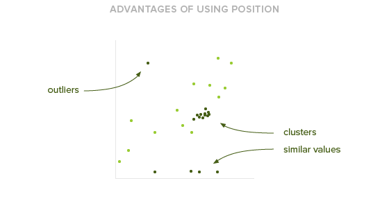
Whereas size helps us observe proportions, position helps us observe proximities. We can easily see clusters of data points, or find the ones that sit closest to the axis, or spot the outliers. Because position helps us understand these relationships, it works best for representing distances, time, and calculations such as percentages and rate-per values. With more abstract or sequential values like these, position makes it easier for us to quickly see the landscape of values and relate the data points to each other.
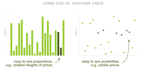
Of course, sometimes the lines are blurry. Let’s say we wanted to compare a bunch of prices. Technically, we could think of that as a quantity: the quantity of dollars spent on each product. But we could also think of prices as a rate-per value: the price per product. Both size and position seem applicable here. To help us choose, we should consider our goals for the analysis. If we’re trying to understand how much more expensive certain products are than others — that is, to examine those proportions — then using size probably makes the most sense. But if we want to quickly point out which products are the most expensive or see which ones have the most similar prices, than position will help us better see those relationships. When there doesn’t seem to be an obvious answer, we should always refer back to the analytical questions we’re asking.
Angle
So now we have our separate data points of specific sizes, and we’ve decided where to put them. The next thing we can do is connect them — literally, draw lines from one to the next. Like grouping, this is something we often do without thinking about it. A line chart, for example, is simply connecting the dots of a scatterplot, and an area chart is connecting the bars of a bar graph.
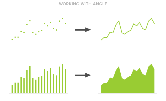
When we connect data points like this, we’re not actually showing more information about the data points themselves but rather revealing the changes between them. We’re producing an angle. Angles are the fourth visual element at our disposal, and we can use them to see shifts and trends. But while they help show how something changes, they can also hide the individual values, making it more difficult to see where one point ends and another begins. So they come with a sacrifice: we should only use angles when we care more about overall trends than specific values.
A good example of this is stock price. When we plot a stock’s price over time, we often connect the dots to show a line graph. That’s because we care more about a stock’s return — how much the price has risen or fallen over time — than its specific price at any given moment.
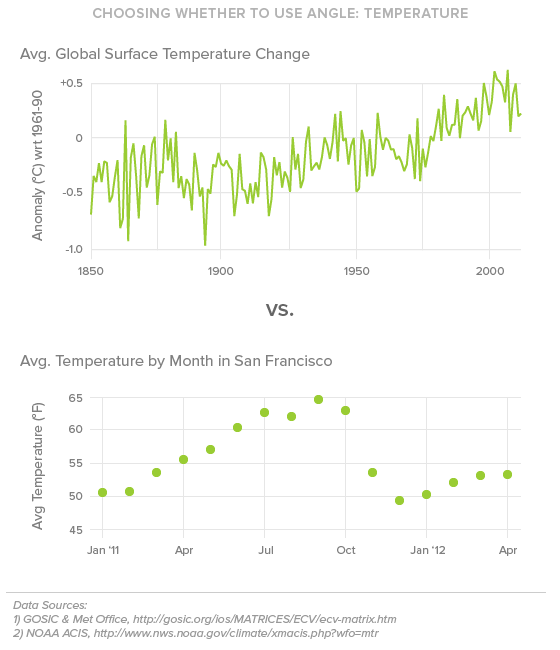
Sometimes, though, it’s more difficult to decide whether or not angles are appropriate. For example, if we are graphing temperature over time, our visualization might differ depending on our objectives. If we wanted to examine global warming, then we would care more about the overall trend, so we would connect the data points to produce angles. But if we wanted to see what the average temperature was each month over the past year, then angles wouldn’t make sense: in this case, we care more about examining the individual values. As with the question of using size versus position, we have to think carefully about whether angles are useful for the questions we’re asking. Just because we can make an angle doesn’t mean we should.
Color
After we’ve determined size, position, and angle, we have one more visual element we can use to represent data: color. Common uses of color include the blue versus red regions of an election results map or the separately colored categories of a stacked area chart. The nice thing about color is that, unlike size and position, we don’t have to make any extra room in the chart to accommodate different values. It’s an easy way to provide additional information without moving the data points around.
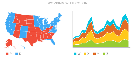
At the same time, though, we are limited by how well we can perceive differences. It’s difficult for us to interpret numeric figures from color — when we see a darker blue, we don’t think, “Oh, that’s about 20% darker.” Plus, we should always be cognizant of potential color blindness; the whole point of data visualization is, after all, to make information more universally readable.
Given these limitations, color works best as a tool for simplification, to help group data points into categories or gradations. When we see data points of the same color, we visually merge them together, allowing us to see broader differences. A choropleth map, for example, uses different colors and shades to represent different values on a map, helping us visually group geographic areas. In the below chart of US unemployment rates by county, the use of color groups granular data points into larger regions that are easier to digest, such as the lighter area in the Midwest.
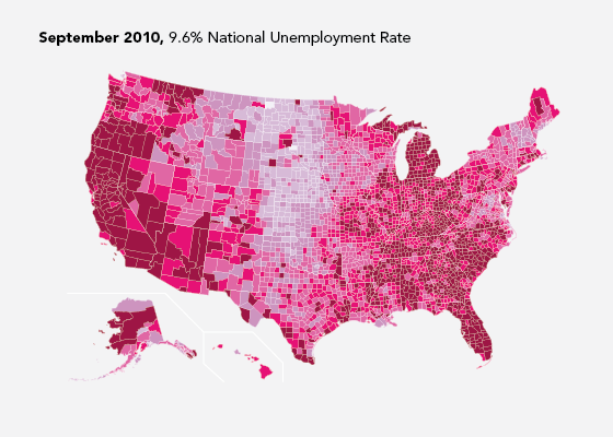
But we walk a fine line when we use color, and we should always be aware of the limitations. When we use color to represent gradation, such as in the choropleth map, we do so at the expense of interpreting specific values. So, while color is helpful, we need to use it sparingly — only a few colors at once, and as a grouping mechanism rather than a way to indicate specific values.
Annotation
Lastly, any information on a chart that is not itself data is annotation. Annotation is what helps us understand the data, and it can mean anything that serves this purpose: axes, grid lines, labels, titles, even comment blurbs that help point out specific things.
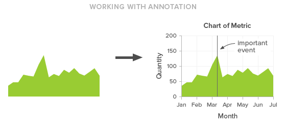
Generally, we want to keep annotation to a minimum. The point of a visualization is the data, and we should provide only as much annotation as necessary to understand it. If we have vertical grid lines for each week, can we do monthly instead? Or yearly? Or, for that matter, do we really need the grid lines at all? Perhaps just a couple value labels along the axis can do the trick. Or, to really simplify, maybe the whole point of the visualization is to show what happened on a particular date, so the only annotation we need is a single label.
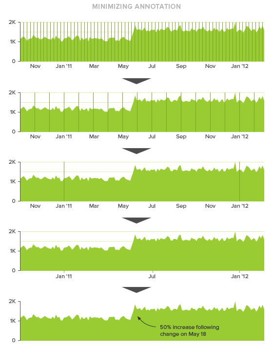
Or maybe we really do need all those grid lines. This isn’t to say that the standard titles, labels, and grid lines we’re used to seeing are bad. Often they are necessary — they have become standard for a reason. We just need to be deliberate about the decisions we’re making, to make sure we’re using annotation on purpose rather than by default. Because ultimately, the less annotation we have, the more we can focus on the data itself.
Putting it all together
Of course, the most frustrating phrase that can come at the end of all this is: it depends. And it does. The rules aren’t airtight. Sometimes we should use size instead of position, sometimes not. Sometimes we need an angle, sometimes we don’t.
But the key is that it always depends on the questions we’re asking. That’s why we can’t just run some calculations and plop the results into the first chart we find. When we’re crafting a chart, we’re also examining what the numbers mean. These guidelines give us a place to start, but we must always remember that we visualize data to answer questions. Keep those questions in mind and the design will follow.
6 Responses
Comments are closed.
Fantastic post Mike. I’ll be sure to pass this onto our design team. Thanks 🙂
Really great overview. I love the focus on the key question. Might add shape to the list of fundamentals, but I understand its exclusion.
Thanks! Yes, shape is an interesting question. I excluded it purposefully because it can make it hard to compare size and position. If the basic elements are enough, shape often just adds unnecessary complexity.
Thanks Mike for posting this. There is always a challenge representing the data in an easy to understand way. Most of the people I work with find it hard to interpret the graphs in the analytics tools. I’ll incorporate these tips next time and see how I go!
Love this piece Mike. And as @Noah said earlier, shape is also interesting. But this is a great post that I’ll share with my colleagues (Dear Lord, I sound like a spam bot now)
Wonderbar!