About Face: Prenton
Today’s About Face was written by Nick Cox, a front-end developer and designer from Seattle, Washington.

Spend enough time obsessed with type, and you begin to yawn halfway through the marketing blurb of new font releases. You’ll often hear a sensational new type family referred to as a “workhorse family,” suggesting that it can be used in myriad contexts, express a wide range of emotional tones, and perform reliably in text settings as well as headlines. You start to wonder if a font can really deliver on everything the copy seems to promise.
Prenton is one family that makes good on all these claims. Designed by British designer Roy Preston, Prenton offers four widths from normal to ultra condensed. Further, normal, condensed, and ultra condensed each contain five weights, normal with matching italics. As if that weren’t enough, add to this a lovely and elegant display variant, perfect for large and expressive headlines.
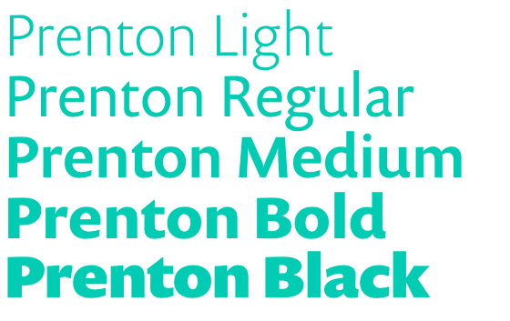
The weights of Prenton from light to black.
Though Gill Sans is one of the most widely used and recognizable typefaces in use today, not everyone agrees that it is necessarily deserving of that honor. Under close scrutiny, the idiosyncracies of Gill’s eponymous face reveal some potentially curious aspects of the letterforms you may have taken for granted. Preston offers another take on one of Britain’s most celebrated faces; compared with Gill Sans, Prenton’s glyphs feel much more consistent in their details, giving the font a more harmonious feel.
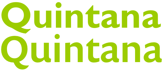
Gill Sans (top) compared with Prenton (bottom). Compare the consistency of Prenton’s lowercase a and u exit strokes with the same glyphs in Gill Sans.
To round out Prenton’s already impressive resume, the humanist sans recently saw a vast improvement in its rendering quality, thanks to a hefty dose of manual hinting. Now, Prenton is safe to use virtually everywhere, from subtle paragraphs to loud headlines.
Now let’s take a look at some diverse text settings to demonstrate Prenton’s impressive versatility. Prenton Display Light looks elegant paired with LTC Bodoni 175. Bodoni’s extreme stroke contrast offers a stunning counterpoint to Prenton Display’s light and consistent weight. And because it is so light, Prenton Display offers the added benefit of allowing you to set it extremely large without overpowering the reader with boldness.
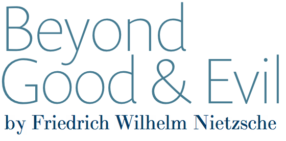
Prenton Display and Bodoni are a sophisticated duo.
But Prenton isn’t exclusively about refinement and charm. Prenton Regular, for instance, boasts a weight range from light to black, allowing a surprisingly informal tone in the right context. Set with Prenton Condensed and Schoolbook Web, Prenton retains a conversational tone while communicating with ease and comfort.
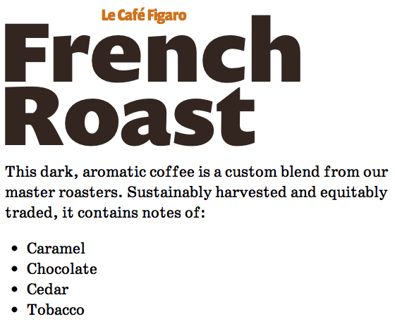
Prenton and Schoolbook Web: a friendly twosome.
While Prenton is comfortable in the limelight, this unselfish sans doesn’t demand center stage. Combined with a couple of Veer’s retro fonts, Hellenic Wide and Corner Store, Prenton Condensed plays an excellent supporting role, even reinforcing the vintage feel of its partners.

And the award for best typeface in a supporting role goes to… (source text)
It’s hard to decide whether Prenton is more compelling in headlines or in body. Paired with an angular slab serif like Jubilat, Prenton’s understated roundness becomes more apparent, and it adds a substantial measure of personality to the mix. In this setting, the unique details of the glyph terminals like the exit strokes of the lowercase a and d really shine.
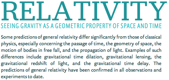
Pairing with an angular slab serif allows Prenton’s curvaceous character to shine. (source text)
As a text face alongside Renaissance serifs like Adobe Garamond Premier Pro Display, Prenton keeps the tone from getting too stodgy. Its rhythm and generous counters, particularly in the lowercase a and the bowl of the lowercase g, keep the aesthetic fresh and dynamic without sacrificing professionalism.
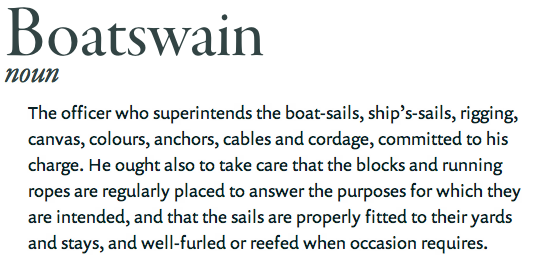
It takes a special sans to feel as at home in the 16th century as in the 21st. (source text)
Adobe’s Caslon Pro is another excellent companion to Prenton. In this pairing, Prenton’s solid x-height keep the text readable and fluid, while highlighting Caslon’s historical and calligraphic details.
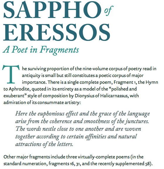
Prenton’s humanist qualities work beautifully alongside Caslon’s handwritten feel. (source text)
The Prenton family offers one of the broadest range of weights and styles in the Typekit library. And with its manual hinting, you can set type at virtually any size and in most any context in any member of the Prenton family without worrying about its rendering across platforms. As an alternative to Gill Sans and in its own right, Prenton shows a unique flexibility, handling any typographic challenge comfortably and reliably.

Nick Cox is a front-end developer and designer from Seattle, WA. He writes about web fonts and web typography at Everyday Type and @everydaytype. He is currently developing Archtype, a typographic reference for the iPhone.
One Response
Comments are closed.
Typefaces need not be pretty. They need not be balanced. They need not “correct errors” in other faces. Gill Sans is a good example. No one ever seems to admit that this is evocative of England. Why not? British signage and advertising have used this or a variant for many years. Prenton erases most of the idiosyncrasies that make Gill Sans recognizable. The charm is gone. Similarly, genuine old Letter Gothic was great for technical examples. The original book on the programming language Lisp used it to good advantage. Letter Gothic Std by Adobe adds odd curves and loses utility and charm.