Myriad Extensions: Arabic and Hebrew

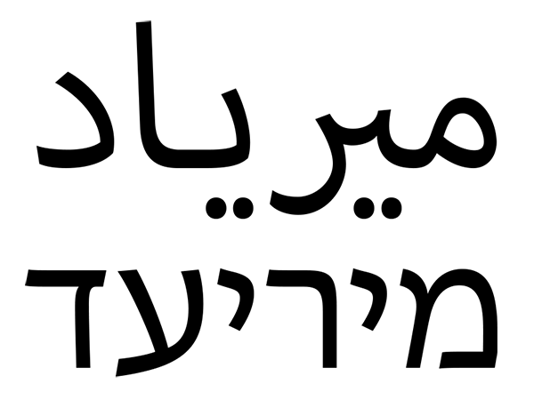
‘Myriad’ in Arabic and Hebrew scripts
The ever-popular Myriad type family now has new Arabic and Hebrew members! These have recently been added as part of a suite-wide effort to provide better support for languages of the Middle East and North Africa (MENA). These new typefaces were designed and developed by the Adobe type team in San Jose and have already be recognized for their excellence as one of the winners of the Letter.2 competition conducted by the Association Typographique Internationale. A core set of styles from these type families is bundled with Adobe Creative Suite 6 applications. This core set includes four basic styles: Regular, Bold, Italic, and Bold Italic. However, the type styles bundled with CS6 include only a small subset of the new Myriad Arabic and Myriad Hebrew type systems that were created to provide a wider range typographic options for designers. To preview and purchase additional styles or the full families, see our pages for Myriad Arabic and Myriad Hebrew. In the future, these pages will include glyph complement showings for the fonts, likewise full digital specimens with text showings are still forthcoming.
The initial impetus for extending the popular Myriad family to cover these scripts was that as the world of publishing is moving more and more to the digital realm, and we wanted to create a set of fonts that hold up well in screen-based reading environments. Our assumptions were that low-contrast fonts would hold up better in a wider set of these environments and that it would make sense to base these on the existing visual grammar of our popular Myriad typeface. However as Robert Slimbach took on the task of designing these extensions for Myriad, his primary goal was to design the Arabic and Hebrew so that they would function in the same manner as Myriad within the same environments. That is to say that these new additions were designed to work primarily in text, but also given enough character so that they will function well in display settings.
Arabic and Hebrew text types are almost exclusively calligraphic in nature. In approaching the work on this project, Robert applied the same design principles as were applied to the original Myriad design: he focused on incorporating subtle calligraphic undertones while adhering to the rules of formal sanserif letter construction. He experimented with finding just the right middle-zone heights for the Arabic characters, trying to retain the appearance of traditional proportions within a sanserif design without sacrificing clarity and legibility at reading sizes. Likewise, he took great care to match the apparent sizes of each script with the Latin so that they would all give the same relative impression in mixed script settings.

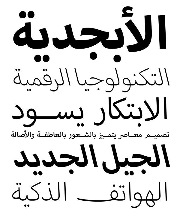
Various styles of Myriad Arabic
For Myriad Arabic, the fonts were necessarily set on a larger body to allow for sufficient interlinear space when typeset using default leading values. This means that the Arabic fonts will appear smaller when set at the same point size as other Myriad fonts. To compensate, the Myriad Arabic fonts should be scaled by a factor of 1.4 to match the size of Myriad Pro or Myriad Hebrew. Myriad Arabic supports Arabic script orthography for Arabic languages, Farsi, Urdu, Uyghur, Kazakh and Kyrgyz. The family comes in a range of five weights, from Light to Black. Although italics are not typically featured in Arabic typography, these styles are also available should they be desired.
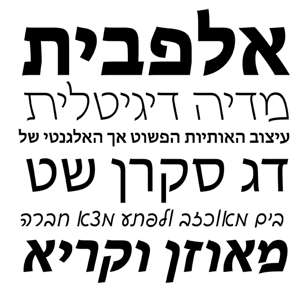
Likewise, there is not a strong tradition for italic usage in Hebrew. In fact, there was no consensus even for which direction italics for Hebrew should incline. Again in an effort to make new typographic options possible, Robert designed both right- and left-leaning italic styles. And he didn’t stop there; he also designed a complementary cursive family with upright and oblique styles. Each of these variants features a range of four weights from Light to Bold. Myriad Hebrew supports Hebrew, Yiddish, and Ladino languages and features careful nikkud placement for all styles. Fonts for Arabic and Hebrew also include Latin transliteration glyphs for a variety of latinization schemes.

Some variations of Myriad Hebrew
In order to get all of the script-specific details correct for Arabic and Hebrew, the Adobe type team worked closely with native design experts. Robert’s design efforts and the production team’s engineering work was guided primarily by Mamoun Sakkal on the Arabic and by Scott-Martin Kosofsky for the Hebrew. Additional input was provided by Tiro Typeworks and Monotype’s resident Arabic expert, Kamal Mansour. I was personally involved throughout this process on a more technical level. I worked with our advisors to iron out technical issues and complex Arabic script implementations. I myself was aided in production support by Miguel Sousa, who helped me with scripting and developing solutions for complex font issues. I would personally like to thank these people along with our beta testers who provided invaluable input to us. I am very proud of the results of our efforts and hope that many of you will appreciate what I see as a valuable contribution to Arabic and Hebrew graphic arts.
6 Responses
Comments are closed.
Any plans to support Pashto and Kurdish Sorani?
Not being an Arabic speaker, I’m probably not best qualified to comment, but I’d say that the way Myriad Arabic achieves a “sans” look while retaining the fluidity of a more traditional Arabic style is excellent.
Being a Hebrew speaker from Israel, I’m somewhat disappointed with Slimbach’s Myriad Hebrew. It lacks the rare sense of his original Latin Myriad.
I do agree that Hebrew text types are almost exclusively calligraphic in nature. So is every other language. It’s just that they developed since then. I don’t know about Arabic (from what I do know, Myriad Arabic look pretty good), but Hebrew has past it’s “exlusively challigraphic” stage long ago. Modern Hebrew typographers know how to manage geometrical shapes and lines almost as well as Latin one’s do. There is no reason to make a Hebrew version of Myriad calligraphic, since Myriad is not a calligraphic font. It is a good idea to be inspired by Hebrew calligraphy, but part of the procces is to find a way of transforming ideas from traditional letters into modern ones.
Just the same as nobody thinks Latin Myriad was hand-written, Hebrew Myriad shouldn’t be considered hand-written either.
This is the big problem of Myriad Hebrew: for hebrew speakers, it is not related to the Latin Myriad. If, for example, Apple would decide to advertise itself in israel and would use Myriad Hebrew for the task, it will lose it’s entire commercial image. It would become a joke among it’s competitors. This is how Myriad Hebrew looks to Hebrew speakers:
http://www.myfonts.com/fonts/redrooster/badger-pro/
And who else would it be used for? There are better calligraphic hebrew fonts, and better sans hebrew fonts:
http://www.myfonts.com/fonts/masterfont/narkiss-new-mf/
The saddest part is that probably, there won’t be another Myriad Hebrew version. The font is out, the money was paid, and Slimbach is hardly to give it a dramatic (neccesary) change. Its sad because he was one of the minds behind the original Myriad. He actually had a chance to achieve that rare sense for the Hebrew version (which is hard even for Israeli typographers), that magical sense. I think it would have been better if he hadn’t decided to take it towards the traditional calligraphic way, and if he was assisted with someone who had more experience with modern Hebrew type-faces that the traditional Hebrew letters expert Scott-Martin Kosofsky.
My wish is that Robert Slimbach would rethink pushing the font more to the direction of his original font, and that he will get help from an Israeli type designer. If he doesn’t, the font would be left, missing the whole point.
well said, shay …
i could not agree more with you … spot on review …
100% Agreed.
100% Agreed.