Type study: Techniques for using novelty fonts
Type study is an ongoing series of guest posts about typography on the web. In this article, Meagan Fisher dishes up advice on novelty fonts.
Ah, novelty fonts. They make up the majority of free fonts available on the web; usually they are pre-grunged-up and have exciting names like “fallen angel” or “cowboy whisper.” You used them liberally on your LiveJournal, but now that you’re a real designer you avoid them like the plague. Right?
Maybe not. When used well, decorative, display, or handwritten fonts can make the difference in a design. We’ll take a look at a blog design, and examine techniques for swapping standard fonts and novelty fonts to make the design more…well, novel.
The case study
I have a confession to make: I am a huge fan of dribbble. Whenever I have a spare second, am stuck for inspiration, or just need a little beauty in my life, I turn to the dribbble everyone feed. I’m amazed how many designers I’ve discovered who I wouldn’t have known about otherwise. For some time now I’ve wanted to create a blog that catalogues my favorites. Hence, bbballer.
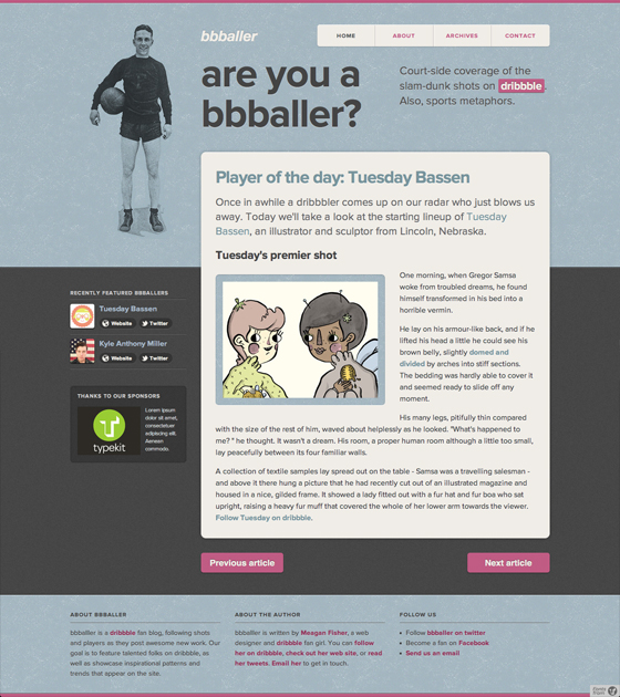
I whipped up this mockup rather quickly, and felt pretty good about it as an early design. However it’s relatively sparse in terms of imagery (with the exception of the winsome mascot), and I’d like to give it more personality.
Technique 1: A logo that isn’t really a logo
There have been plenty of times when I’ve wanted to give the title of a site a little added flair, while also ensuring that the text remained dynamic. If you’re crafting a theme or template, you can’t use static images for the blog name, but that doesn’t mean it can’t have style. Using a typeface with a little flamboyance sets the site name apart in situations where you can’t incorporate an actual logo. For bbballer, I decided to set the site title in the delightful FF Prater Script, a nod at dribbble’s scripty logo.
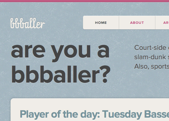
You’ll notice the site title has a subtle embossed effect; this detail is added using CSS3’s text-shadow property. The CSS reads as follows:
#header h1 {
  text-shadow: 0 -1px 2px rgba(0,0,0,.2);
  }
Let’s break down that syntax, since text-shadow is used throughout this design in a variety of ways:
- The first value, set to 0, represents the horizontal offset of the shadow.
- The second value, shown here at
-1px, represents the vertical offset. In this example I decided to set the shadow above the text, so it appears to be pressed into the page. - The third value, shown here at
2px, determines the amount of blur. Since I want the effect to be subtle, I chose to make the shadow fairly soft. - The fourth value determines the color of the shadow. I’ve used CSS3’s
rgbaproperty to set the color to a transparent black, so that the background shade will blend through.
Now that our site title is looking lovely, let’s give our headlines a little character as well.
Technique 2: Let your headlines do the talking
I love crafting interfaces that call for gorgeous photography, whimsical illustrations, or engaging videos, but sometimes media-rich designs can distract from the content. One way to maintain a minimal approach, while still injecting personality into the design, is to selectively use fonts with lots of character. Here I chose a font that fits the vintage athletic theme of the design: LTC Squareface.
Display fonts are meant to be on display; cramming them into body text or tiny headlines will create an illegible mess. So be selective, and use ornate fonts at larger sizes. The striking slab serif used in bbballer gives a nod to varsity letter jackets, but it’s only used once in the design to avoid overpowering the content. It’s also set at a large enough size for the reader to enjoy all those thick serifs.
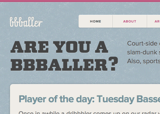
You’ll notice that we’re using text-shadow once again; in this case we have a light shadow coming from the bottom of the headline. Again, this detail creates the illusion that the text is letter pressed, and adds an extra layer of visual interest. Here’s the markup for the text-shadow applied to headlines:
#masthead h2 {
  text-shadow: 0 1px 0 rgba(255,255,255,.5);
  }
As you can see, here we’re using a sharp 1px vertical shadow, set in a transparent shade of white. It’s a simple addition that makes our headlines just a bit more interesting.
Technique 3: Amped up ampersands
One of my first assignments as Deputy Designer at SimpleBits back in 2008 was to help Dan Cederholm with a post about using the best available ampersand on the web. The goal of the article was to highlight the ampersands available with web-safe fonts. If I were given that assignment today, four years later, it would be a completely different undertaking. Today there are hundreds (if not thousands) of ampersands available via @font-face.
Even with the explosion of fonts available for use on the web, Robert Bringhurst’s guideline still applies:
Since the ampersand is more often used in display work than in ordinary text, the more creative versions are often the more useful.
While researching this article I found many fonts which would rarely have an appropriate use in everyday contexts, but contain gorgeous, attention-worthy ampersands. These can be sprinkled throughout headlines to add elegance or playfulness to a design.
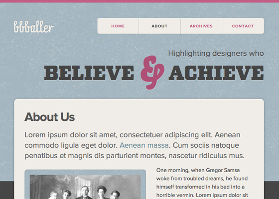
I’ve marked up my lovely ampersand using the technique recommended by Dan back in 2008. The ampersand is wrapped in a which is given a class of amp. Then this is styled by our CSS. Here are the styles from the example shown above:
#masthead h2 .amp {
  font-family: "bello-caps";
  font-size: 2em;
  color: #ae5076;
  }
Our ampersand is displayed in the lovely Bello Caps font, at a slightly larger size than the rest of the headline. It’s also rendered with bbballer’s signature pink, for a little extra pizzazz.
A note about semantics
After taking an informal Twitter poll, I’ve found that there’s some debate amongst web developers about the most semantically correct way to mark up an ampersand. It may be that there is no absolutely right answer, but here are a few approaches you might consider:
- Jeremy Keith made the case for using
instead offor markup, since some consider the ampersand to be an abbreviation. Ethan Marcotte concurs. - Mat Marquis suggests we use the
tag, since it is used for content that is “stylistically offset from surrounding text,” according to the W3C. - Jonathan Snook wrote an article for 24ways suggesting that we embed only a single character (in this case, the ampersand), rather than the entire font.
- Drew McLellan also wrote a 24ways post about styling ampersands. His approach uses the
unicode-rangedescriptor to style ampersands, thus negating the need for additional markup.
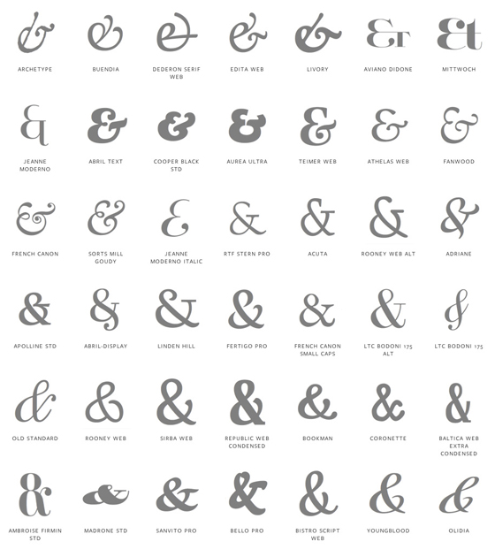
Whichever approach you settle on, be sure to choose an ampersand that fits the tone of your design. To help with the search for the best possible ampersand, I’ve used my Deputy Designer training and assembled over 200 of my favorite ampersands on Typekit. There’s a preview below, and you can view the full page as well.
Technique 4: Notable notations
Handwriting fonts are one of the trickier novelty fonts to utilize successfully. When overused they can be illegible and ugly. However, when incorporated selectively, handwriting fonts can make a design more usable, playful, and engaging.
One technique that’s been emerging in app and web design is the use of coach marks. These phrases, usually set in a handwritten font and paired with an arrow, can help guide a user through the setup process of an app, or draw attention to key content in a site. (Note: it’s important to consider how and why to use coach marks in a design; Khoi Vinh wrote an interesting post discussing the pitfalls of coach marks, which is worth checking out.)
One recent redesign which employs this technique is the Basecamp marketing site.
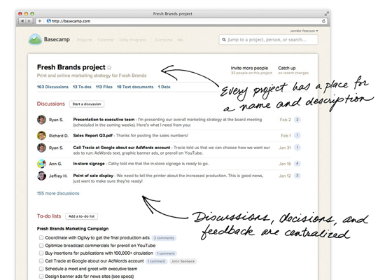
Basecamp is using images to achieve this affect, but with font-face friendly handwriting and a few hand-drawn arrows, we can create coach marks that use dynamic text.
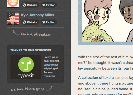
In the bbballer design I’m using this technique at smaller sizes, so I want to choose a typeface that’s clear and legible. At larger sizes a handwriting font that’s more stylized may be appropriate, but here we’ll use the simple Felt Tip Woman.
Along with the typeface, we’ll adorn these elements with hand drawn arrows. You can draw and scan your own, or use one of the many sets that are available freely. Here we see bbballer with coach marks added:
For a last little detail to reinforce the handwritten feel, we can use CSS3’s transform property to rotate these little notes a bit. It’s an understated way to set these elements apart, and adds to the slightly quirky feel.
The syntax for rotate transform reads as follows:
.notation {
  -ms-transform: rotate(2deg); /* IE 9 */
  -moz-transform: rotate(2deg); /* Firefox */
  -webkit-transform: rotate(2deg); /* Safari and Chrome */
  -o-transform: rotate(2deg); /* Opera */
  transform: rotate(2deg);
  }
As you can see, we’re using vendor-prefixes to ensure that this effect appears in as many cases as possible. The syntax is fairly straightforward; simply use CSS3’s transform property, along with the type of transform you’d like to apply. There are a number of transform functions available, including scale, rotate, and skew. In this case, rotate is the most appropriate. After the transform value, state the number of degrees the element should rotate. Here we’re using a subtle two degree rotation. With this technique in place, your design has an added level of personality and warmth.
Technique 5: Fun forms
Oftentimes forms on the web can feel impersonal; handwritten fonts are a great way to bring some character to a simple contact form. By applying a handwritten web font to our form’s input and textarea fields, we remind users of the good ol’ days when people still wrote each other notes. Perhaps using this technique will remind the author of their humanity, and discreetly encourage them to be polite in their message.
I first noticed this technique on the gorgeous Foundation Six web site:
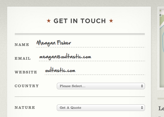
Adapting this style for bbballer, our form might look something like this:
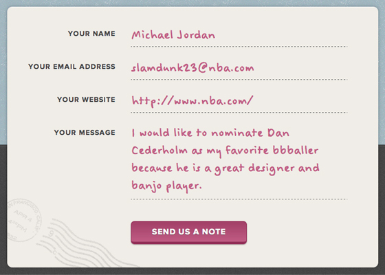
You’ll notice that in both cases the input font size is set to be fairly large, which is important for legibility. This technique may also be too difficult to sustain for long forms, so I’d recommend reserving this style for quick interactions.
So there you have it! Five techniques for using once cringe-inducing novelty fonts. Perhaps you are now inspired to broaden your range of go-to typefaces; at the very least you’ve found a great excuse to spend the afternoon browsing type. Now if only we could find a way to use Comic Sans unironically.

Meagan Fisher is a web designer living in Brooklyn. In her seven year career, she has partnered with legendary design firms such as SimpleBits, Happy Cog West, Hoefler & Frere-Jones, and MetaLab. She writes about web design at Owltastic.
6 Responses
Comments are closed.
Great showcase of how to add subtle personality with web Typography. My issue would be loading all these different fonts add a significant kilobytes to the page… most of what you designed could be best included as an nicely compressed image…
Indeed. You may not want to use all of these techniques on one page. But one or two of them (especially if the fonts are also used in other elements) could be very effective.
Great article, less is more.
Great article, but how about a link to the actual site? Or did I miss it?
Answering my own question: seems the site is not live yet. Can’t wait to see those fonts in action!
http://bbballer.com/
Great tips and interesting read. Love the tips regarding the ampersands &&