About Face: Ambroise
Today’s About Face was written by Nick Cox, a front-end developer and designer from Seattle, Washington.

This week’s installment shines the spotlight on Ambroise, an elegant serif titling face from Paris’s Jean-François Porchez. Porchez is a national instituion at this point in his career, having designed the faces for France’s leading news source, as well as the Paris Métro.
With Ambroise, Porchez continues the national tradition, developing the much loved style championed by the Didot family across 19th century France. This face has created an eponymous type classification (Didone), characterized by extreme contrast in the stroke widths; straight, bracketed serifs; and a natural elegance in the letterforms. Whereas many versions of Didot’s work could be seen in both headings and text, Ambroise’s vivacious qualities can only come alive when set large. As such, it is designed for use solely as a titling face.
Rather than a mere redrawing of Didot’s classic face, however, Porchez puts a distinctly modern twist on the romantic masterpiece. Five particular glyphs stand out as dramatic departures from the original: Q, K, y, k, and g. These glyphs are flamboyant and stark in comparison to the letters that are more faithful renditions of Didot’s own face, and though they create a new direction for the font, they still retain something of the original; Porchez’s Didot bridges the gap between traditional and unorthodox, understated and boisterous, classic and modern.

The uppercase Q and K are uniquely Porchez.

The lowercase y, k, and g are provocative reimaginings of Didot’s face.
If these features didn’t make it a provocative enough choice for any setting, it comes in a wide range of weights, each of which have their own distinct character. From light to black, Ambroise masters several aesthetics.
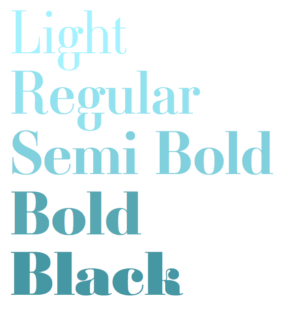
Each one unique: Ambroise’s five weights each have a distinct personality.
It is difficult to pair Ambroise with most serif faces — this creates a visually jarring sensation. Likewise, the often substantial contrast of humanist sans serifs is likely to compete with Ambroise’s thicks and thins. However, many slab serifs and geometric sans serifs complement it quite nicely.
Take Kulturista, for example. As a slab serif, its ovular counters create a geometrical contrast with Ambroise’s angular or rounded sides, while its blocky serifs reference its Didone partner’s straighter sides.
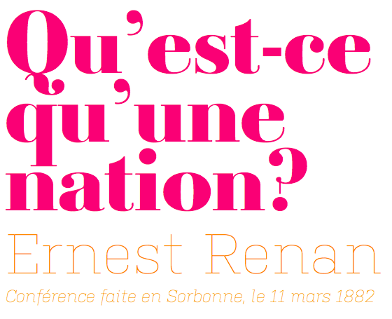
Ambroise and Kulturista are a shapely pair.
Adelle, a perennial favorite, is another lovely choice when coupled with Ambroise. Adelle elegantly covers the subheading or brief text duties, allowing Ambroise to radiate is charm. And Adelle’s subtle roundness references Ambroise’s voluptuousness and sensuality.
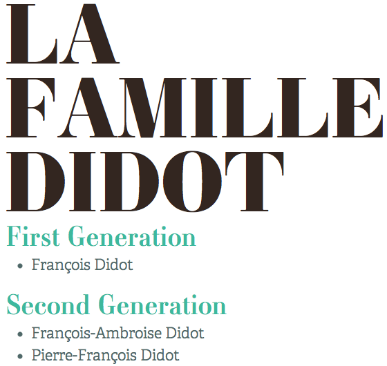
For heading-subheading pairs, Ambroise and Adelle are a stylish duo. (source text)
A dependable workhorse like Chaparral works well with a wide variety of faces, but it can really accentuate Ambroise’s elegance, supporting the French classic’s tone of sophistication and formality.
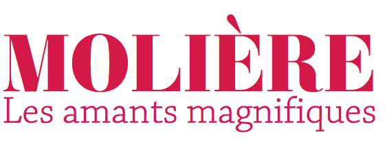
Chaparral allows Ambroise to be its cosmopolitan self.
The rounded quality of geometric sans serifs’ letterforms, on the other hand, plays an excellent counterpart to Ambroise’s hints at a subtly rectangular form. The distinct roundness of Proxima Nova creates this contrast while its cleanliness and readability amplify Ambroise’s modernity.
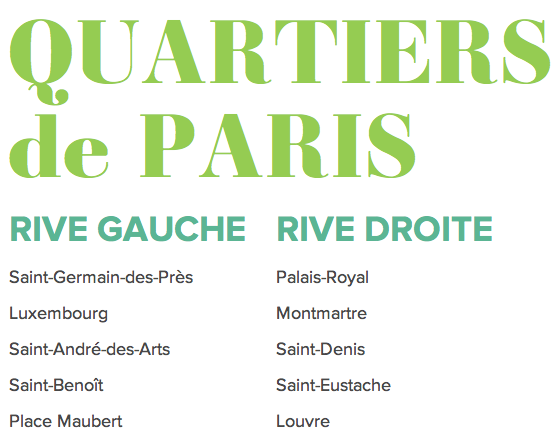
Around and around: Proxima Nova demonstrates how well geometric faces work with Ambroise. (source text)
The geometric shape of Museo Sans is much more understated than that of Proxima Nova, and, when set with its Didone companion, Museo Sans makes a great deal of room for Ambroise to take center stage. Museo Sans’s unassuming accompaniment allows Ambroise to truly sing as the French face is designed to.
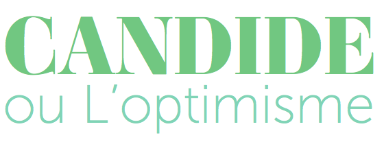
Museo Sans supports Ambroise in its lead role.
Finally, one of the joys of working with a typeface with such a sense of whimsy and personality is discovering the unexpected pairings it encourages. Calluna Sans has proportions reminiscent of the great Renaissance serifs, which should clash with Ambroise’s romantic sensibility. And yet there is a beauty that the pair create that has a certain je ne sais quoi.

Hard to say exactly how, but Calluna Sans looks gorgeous with Ambroise.
Its beauty, flair, and panache make Ambroise a charming and classy choice in many applications. Again, keep in mind that it is designed for use exclusively in titling applications; its thin strokes vanish at smaller sizes. But use it large and sparingly for short texts, and Ambroise will evoke all the romance, refinement, and posh qualities we’ve come to love and associate with France.

Nick Cox is a front-end developer and designer from Seattle, WA. He writes about web fonts and web typography at Everyday Type and @everydaytype. He is currently developing Archtype, a typographic reference for the iPhone.