Sites we like: Massive Health, Four Seasons, PandoDaily
Better healthcare, lodging, and tech news in this week’s sites we like.

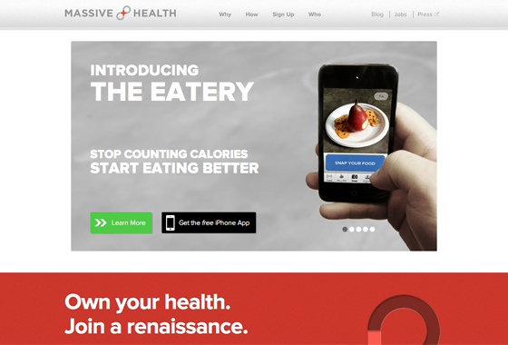
Massive Health aims to make health tools that people love to use. Proxima Nova delivers both headlines and body text, its geometric shape and friendly air reinforcing the positive, accessible message.

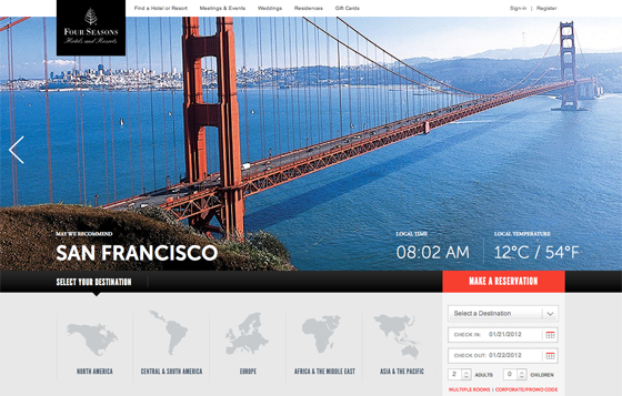
Four Seasons combines Museo Sans, League Gothic, and Adobe Garamond for an upscale and chic look. Museo Sans’ wide, open letterforms contrast nicely with League Gothic’s condensed headlines, while Adobe Garamond lends a bit of sophistication.

And new tech site PandoDaily features ARS Maquette. We noted ARS Maquette last week as well; here it joins up with SuperClarendon (and a responsive layout) for a design that feels both smart and current.
That’s all for this week; share sites that you like in the comments.
4 Responses
Comments are closed.
Proxima Nova rocks! I have just done http://lafinancieredeloctant.com with it!
Any idea who created the Four Seasons site?
Excellent sites. The only thing I would do with San Francisco site is to bring the “Find Rooms” form to the upper right. Usually people gravitate to the upper right side for call to action. The sliding banner distracts user from taking action. Otherwise it is beautiful web site. We learned that the hard way with our property management site. Now we are getting more leads.
Proxima Nova does indeed rock, I used it extensively for the site for my stag weekend.
http://stag.mattmitchell.co.uk/