About Face: Gesta
Today’s About Face was written by Nick Cox, a front-end developer and designer from Seattle, Washington.

In this installment of About Face, we’ll consider a versatile, low contrast humanist sans serif by Portuguese type designer Rui Abreu. If his recent win at Letter.2 for the lyrical serif Aria is any indication, Abreu knows type. And Gesta is no exception.
With its generous x-height, Gesta is remarkably legible. And thanks to its manual hinting, it renders well across platforms and browsers, which makes setting it at small sizes a sure bet.

Gesta’s x-height extends to about 70% of the cap height.
Also notable is the large range of weights and styles in Gesta’s repertoire. Four weights with matching italics promise to tackle most any situation facing the modern web designer. What’s more, Gesta is designed with a feature called weight duplexing. The same glyph in two weights of the Gesta family are exactly the same width, which gives it a balanced sense of proportion. This allows for the mixing of, say, regular and bold in the same sentence for adding emphasis without detracting from the text.
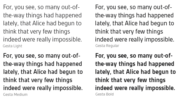
All four weights of Gesta take up exactly the same horizontal space. (source text)
If you’ve been looking for a face with excellent language support, Gesta is a solid option. We likely have Abreu’s Portuguese heritage to thank for the way Gesta handles diacritics. Given a touch extra lead, Gesta performs beautifully with most any European text, and, relying on its manual hinting, accents strewn below the baseline and above cap height simply refuse to be marred by even the harshest rendering conditions.
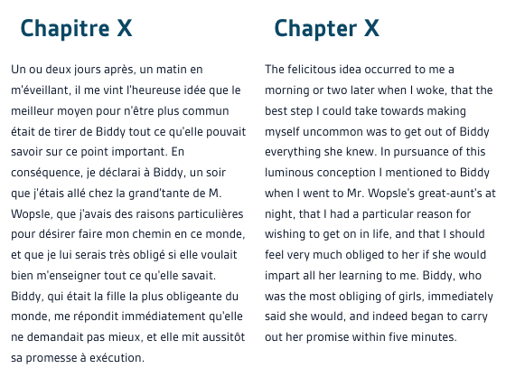
Gesta, ever the polyglot, reads well in any language. (source text: French, source text: English)
Yet even in light of all this attention to detail, perhaps the most subtle aspect of Gesta’s design is its slightly curved strokes. Reading about these strokes in Gesta’s description, I was intrigued, but even after a good bit of experimentation, I found the curvature to be more implied than overtly visible. My curiosity got the better of me: as seen below, a closeup of the Bézier curve of the uppercase W of the bold weight shows just how understated these curves are. It is this characteristic that gives Gesta its warm, friendly feel without sacrificing its modernity.
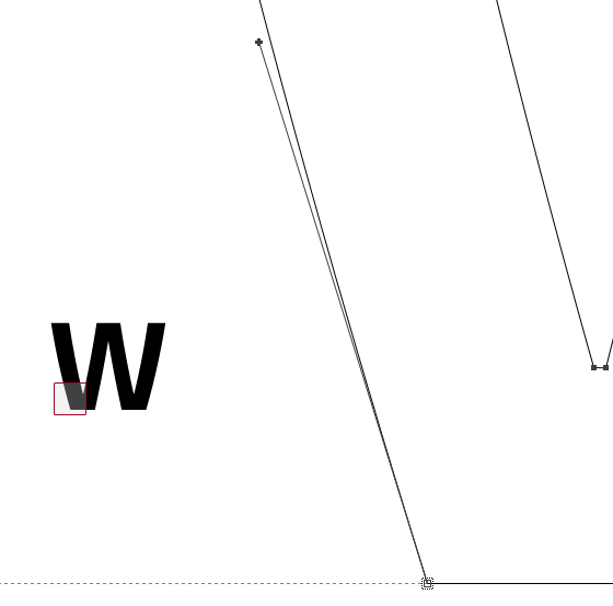
The extremely slight arc in Gesta’s W. The control point (the bold +, top center) meeting the stroke would render a straight line. Here, the slight angle of the bézier curve control line away from the glyph stroke creates a gentle curve.
In pairing considerations, Gesta brings this affable character to the table, particularly when placed alongside an equally warm face like Jan Fromm’s Rooney Web. In this duo, the two fonts play off each other and exude a childlike liveliness.
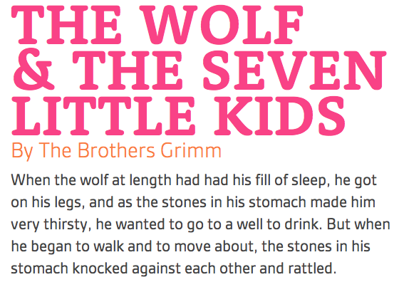
Gesta and Rooney romp together with downright exuberant consequences. (source text)
Gesta truly shines as a text face, as its pairing with Museo Slab demonstrates. In this couple, the roundness and angular serifs of Exljbris Font Foundry’s Museo Slab lend both similarity and difference to Gesta’s curvy letterforms, and the result is a balanced, casual feel.
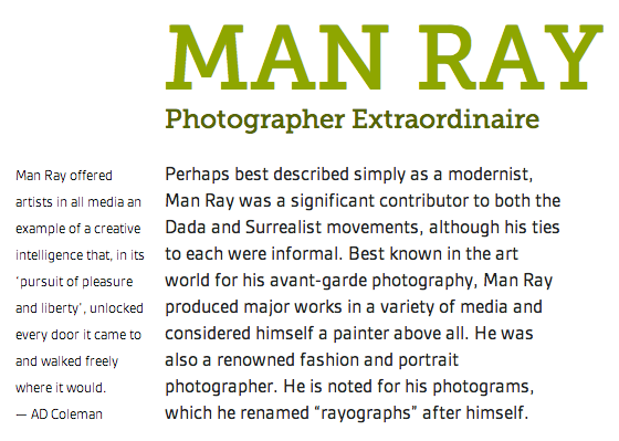
Dinstinct, yet similar: Gesta paired with Museo Slab. (source text)
A bouncy, jovial serif like Darden Studio’s new-to-Typekit Jubilat rounds out the slab pairings for Gesta. Here, Gesta’s round qualities egg on Jubilat’s cheerful whimsy, expressed in its ball terminals and stroke contrast. But Gesta keeps Jubilat in check with its mature, modern sensibility.
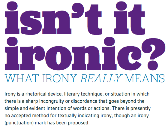
A Jubilant mixture: Gesta paired with Jubilat. (source text)
At the risk of asking the obvious, why not pair Gesta with Gesta? Though its strongest qualities shine most when used for text settings, Gesta speaks loud and clear as a headline font. In this context, the flexible sans makes evident its ability to play every role in the text setting. Headline, body, bold, italicized. Gesta wears many hats, and does so comfortably.
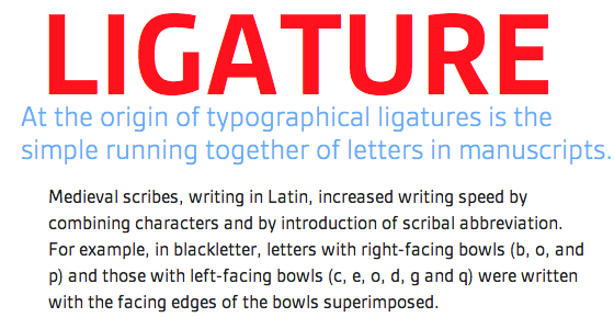
A natural match: Gesta used for both headlines and body copy. (source text)
When setting headlines in Gesta, consider a text face that will accentuate its qualities. A rounded serif like FontFont‘s iconic FF Meta Serif echoes Gesta’s rotund shape while asserting its own reputation and legibility to offer Gesta a surprisingly straightforward and direct quality.
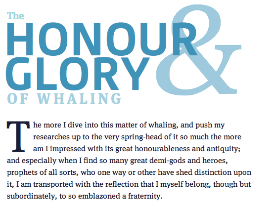
Who says Gesta can’t be serious? Paired with FF Meta Serif, Gesta shows its mature side. (source text)
A number of other serious faces can tease out Gesta’s maturity in this way. When paired with a Renaissance typeface like Adobe’s revival face Minion Pro, Gesta finds a frank and classy companion. Minion’s stroke modulation contrasts with Gesta’s comparatively unvaried widths. Both fonts have a distinctly human feel: Minion in its reference to scribal writing, and Gesta in its engaging and bright demeanor. Together, the pair communicate a uniquely sophistocated and personable atmosphere.
Two takes on humanity: Headlines set in Minion Pro and body copy set in Gesta. (source text)
Gesta is a delight to work with under any condition. And given how well it reads, renders, and pairs with a wide range of typefaces, it is sure to get more and more attention as setting text on the web becomes more and more demanding. Fire up a new kit, add Gesta, and find out how this excellent sans can add life, freshness, and versatility to your designs.

Nick Cox is a front-end developer and designer from Seattle, WA. He writes about web fonts and web typography at Everyday Type and continues the conversation on Twitter at @everydaytype.
4 Responses
Comments are closed.
great font, and mixes!
Gesta is a really nice font, thanks for sharing.
I like Gesta a lot, but I can’t agree that it shines as a text face.
To explain my comment …
You describe it as a humanist face, and, while humanist features are apparent at display sizes, the overall architecture is more that of a tech sans, which is what you see at small (text) sizes. It looks very technical and regular in this context, which slows the reader down in long copy (at least that’s my impression from the examples above).