Sites we like: The Great Discontent, Less than 100g, Readmill, and Inker Linker
The risk of creativity, tiny beautiful things, a new way to read, and great printers in this week’s sites we like.

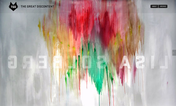
From Designing Monsters comes The Great Discontent, a journal focusing on creativity, risk, and what connects us as artists. FF Meta Serif makes for crisp, wonderfully readable text, with the size smartly adapting at different window widths. Process Type Foundry’s Stratum 1 fills in for headlines; its sharp terminals and angular curves are the perfect complement to the site’s restless, scrappy subjects.

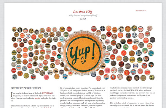
Less than 100g is a blog dedicated to things that are tiny and beautiful. The first issue looks at bottle caps, with (tiny!) text set in Garamond Premier. The very small size flirts with illegibility, but the short measure and ample whitespace (not to mention appropriateness to the topic) are redeeming.

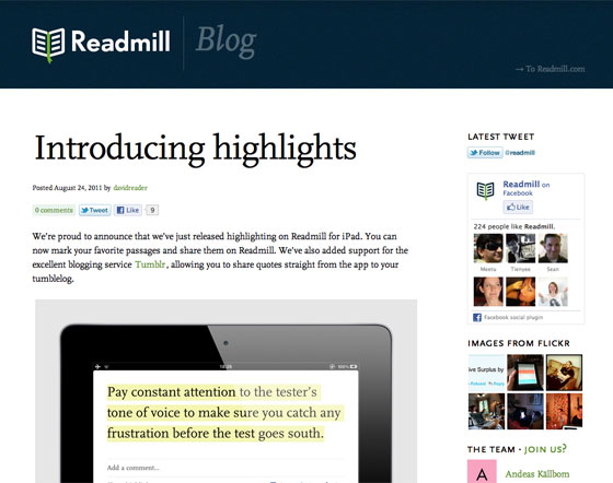
Readmill is a service for sharing what you read, and they lean on FF Scala to do the job. FF Scala’s calligraphic details (look closely and you can see remnants of the pen) make it wonderfully expressive when set large, but aid readability at paragraph sizes.

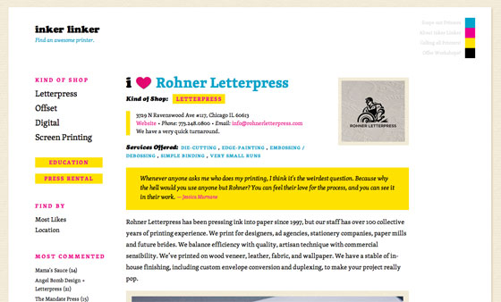
And from Jessica Hische comes Inker Linker, a service for finding a great printer. Skolar pairs with Cooper Black for a site that’s assertive but clever. A CMYK color palette completes the look.
That’s all for this week! Share sites that you like in the comments.
2 Responses
Comments are closed.
Wished to share my 2 cents of an interesting site –
http://www.artworkgift.com/ – where photos are made into unique art – really different in the online scene – nothing else like it….
Thanks for featuring my site less than 100g!